Lilura
RPG Codex Dragon Lady
- Joined
- Feb 13, 2013
- Messages
- 5,274
I shall also run a concurrent second series of posts treating all D&D user interfaces from Baldur's Gate to NWN2. It just helps me mix things up a bit so I don't get bored with either (it's really EZ to get bored writing about UIs).
The first part introduces the IE interface and treats it within BG and BG2:
Evolution of the D&D UI: BG to NWN2 - Part I
Excerpt 1:
Excerpt 2:
Enjoy.
The first part introduces the IE interface and treats it within BG and BG2:
Evolution of the D&D UI: BG to NWN2 - Part I
Excerpt 1:
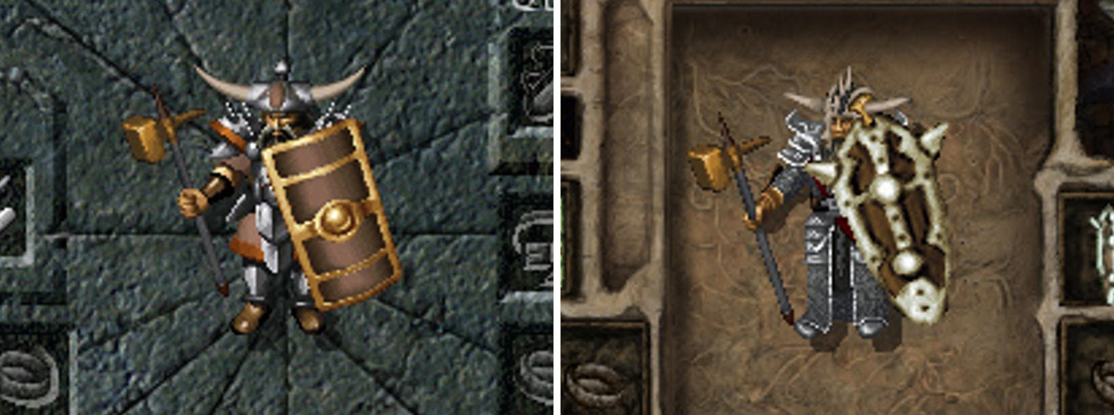
Paperdoll comparison: If you think the one on the right looks better than the one on the left, then you have appalling aesthetic taste.

Left: BG1, Right: BG2 (same rez , same char, same equipment)
Excerpt 2:
The IE interface originated in the "Renaissance" RPG known as Baldur's Gate; undergoing a few changes in subsequent releases by both BioWare and Black Isle:
First, it was heavily modified to accommodate the dialogue focus and originality of Planescape: Torment.
Second, it returned to the BG style but received a "timber" reskin in Icewind Dale.
Third, it received minor improvements, additions and an "elven forest" reskin in Baldur's Gate 2.
Fourth and finally, it underwent a major overhaul to accommodate the rules-heavy 3rd Edition, reaching its zenith of polish and functionality in Icewind Dale 2.
With the rare exception of PS:T's bungled portable pop-up, the IE UI is elegant, efficient, space-maximizing and a joy to use. In all incarnations it's a huge advancement over what predecessors offered, which - with a few notable exceptions - were primitive kludge and clunk. The rest of this post is given over to treatment of the IE interface, as it appeared in Baldur's Gate and its sequel. Black Isle's three efforts will be covered in the next post.
Please note that for the purposes of these posts I am unconcerned with UI mods or Beamdog's so-called Enhanced Editions; my concern is just with the official interfaces as shipped with the original games. I also don't charge UIs for their lack of native scalability to other resolutions and aspect ratios: they are a sign of their times and it's totally forgivable. I really tire of the scrubs who complain how UIs don't scale and the fonts are unreadably small, when they're running a 1998 game with settings straight out of Silicon Valley. It seems everything is about "4k" to these people, or whatever the current gen "standard" is... I just run these games using display driver scaling and can actually read the text without a magnifying glass. Funny, that..
Ok, so. Let's move on to the first entry, shall we?
Enjoy.
Last edited:


