Putting the 'role' back in role-playing games since 2002.
Donate to Codex
Good Old Games
  • Welcome to rpgcodex.net, a site dedicated to discussing computer based role-playing games in a free and open fashion. We're less strict than other forums, but please refer to the rules.

    "This message is awaiting moderator approval": All new users must pass through our moderation queue before they will be able to post normally. Until your account has "passed" your posts will only be visible to yourself (and moderators) until they are approved. Give us a week to get around to approving / deleting / ignoring your mundane opinion on crap before hassling us about it. Once you have passed the moderation period (think of it as a test), you will be able to post normally, just like all the other retards.

Capcom Resident Evil 4 Remake - out now for PC/Playstation/Xbox

Ivan

Arcane
Joined
Jun 22, 2013
Messages
7,757
Location
California
Fq9hq72WAAIx0Ne

Discuss
Efficient. I'd rather have this than overlay text or flashing/glimmering shit.
 

DemonKing

Arcane
Joined
Dec 5, 2003
Messages
6,585
Played 3 hours last night and enjoyed myself (never played the original but have done RE2/3 remakes and 7/8) - can't count the number of times the game has already trolled me into stepping on a bear trap though...

:negative:
 
Joined
Mar 3, 2018
Messages
7,436
You know what Resident Evil really needed? MMO tier side quests. Sure shooting the blue medals to get that pistol in base re4 was pretty stupid but here they've really improved on the formula. On your quest to save the presidents daughter don't forget to kill 3 rats!
 

ADL

Prophet
Joined
Oct 23, 2017
Messages
4,109
Location
Nantucket
I think color-coding is necessary in most modern games due to a lack of visual clarity and washed out color grading because everything is some shade of gray and brown. Without those indicators everything would be gray and brown. When everything's hyper realistic you need those sorts of indicators in static worlds. It's different when you're making immersive sims and shit where everything's interactive but I know I would hate going up to random barrels constantly and being disappointed that they're not lootable.

Perhaps there's a better way of doing it but not in the context of a RE4 remake. It would require a completely different artstyle.
 

TheHeroOfTime

Arcane
Joined
Nov 3, 2014
Messages
2,966
Location
S-pain
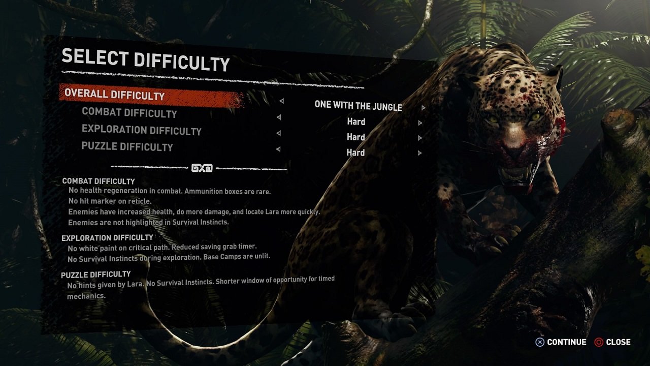
I don't mind that kind of visual help. But maybe they should make it optional at least. Shadow of the tomb raider for example does it, the "white jeez" that guides you can be removed completely.

Shadow-of-the-Tomb-Raider-Difficulty.jpg
 

kites

samsung verizon hitachi
Patron
Joined
Jan 30, 2015
Messages
575
Location
hyperborean trenchtown
Is it really necessary? I dunno. It was never a problem in the original, and wouldn't be in the remake. It's clear what is breakable for loot, those few models of boxes and barrels.
 

Wunderbar

Arcane
Joined
Nov 15, 2015
Messages
8,825
It's not just RE problem, every modern game looks busy and cluttered. Devs are aware of this problem, but instead of fixing it and making their games look clearer they opt for immersion-breaking solutions such as marking all interactable objects with a dye to make them stand out in the environment.

Capcom, however, took the worst elements from both worlds by introducing both the color-coded environmental objects, and adding ugly HUD prompts to every item that can be picked up.

And to be honest I don't how else they could've solved this problem - due to the use of photogrammetry tech all trash props in their games look just as hi-poly and detailed as the actually important items.
 

CyberWhale

Arcane
Glory to Ukraine
Joined
Mar 26, 2013
Messages
6,740
Location
Fortress of Solitude
Played 3 hours last night and enjoyed myself (never played the original but have done RE2/3 remakes and 7/8) - can't count the number of times the game has already trolled me into stepping on a bear trap though...

:negative:
Since I'm not paying 60 bucks for any game (especially a remake) I've went back and tried the GC original (on Dolphin) and also ended up playing several hours/chapters in. Say what you want about the game, but the moment to moment gameplay is decent enough to keep you playing the game for hours on end.
 
Joined
Jan 21, 2023
Messages
3,774
Highlighted items is just a symptom of software streamlining. People don't "dig" in software as they used to, not just games. "It has to be intuitive". The devs for Duck Tales talked about this. When the original snes game came out, kids would immediately start digging for secrets, but when the remaster came out, they had to include actual signs pointing at them, because kids of the same age range just didn't had the curiosity to try to look for secrets.

I think having detailed guides at the ready on the internet killed a lot of this gaming spirit .
 

racofer

Thread Incliner
Joined
Apr 5, 2008
Messages
25,863
Location
Your ignore list.
It's not just RE problem, every modern game looks busy and cluttered. Devs are aware of this problem, but instead of fixing it and making their games look clearer they opt for immersion-breaking solutions such as marking all interactable objects with a dye to make them stand out in the environment.

Capcom, however, took the worst elements from both worlds by introducing both the color-coded environmental objects, and adding ugly HUD prompts to every item that can be picked up.

And to be honest I don't how else they could've solved this problem - due to the use of photogrammetry tech all trash props in their games look just as hi-poly and detailed as the actually important items.
CTPghpB.png
 
Joined
Jan 21, 2023
Messages
3,774
I'd say that textures are getting "too" good and it's getting difficult to tell usable things from background stuff. I would say that there's a slow yet sustained decrease in interactive objects in action games.
 

Drakortha

Liturgist
Joined
Jan 23, 2016
Messages
1,916
Location
Terra Australis
I'd say that textures are getting "too" good and it's getting difficult to tell usable things from background stuff. I would say that there's a slow yet sustained decrease in interactive objects in action games.
The obvious solution then would be to make everything usable or at least interactive in some way. But that would actually mean innovation and we can't have that. It would be too much work for these millennial developers who are used to flipping assets and making pretty backdrops without any kind of depth.

When 3D environments in current gen RE games have almost the same amount of interactivity as the fixed backgrounds in RE 1-3, you know we haven't made any progress.
 
Last edited:
Joined
Nov 23, 2017
Messages
4,635
There’s breakable objects that aren’t marked too, they just don’t have anything in them.

A more elegant solution could’ve been to just have the yellow on the boxes and barrels be some big logo. Now, it’d make more sense for something like that to be burned on instead of painted on, but whatever, the point is for it to pop.

Not really sure why the windows need it. It kind of seems like they worked a tell into the window frames anyways
 

ScarredBushido

Liturgist
Joined
Jul 25, 2011
Messages
154
Location
Prison island
i remember having fun figuring out whats breakable and not so that when i do a new game+ i'd be faster and efficient.

but gaming is a consumer market now, not for fun.
 

KIss My Ass

Real name: SDG
Patron
Dumbfuck Shitposter
Joined
Feb 3, 2023
Messages
2,920
Location
Aya Cash's vagina I hope
Codex+ Now Streaming!
The only way

Fr7w9JRXoAALSSJ
Oh yeah codexers would eat that up. The more it resembles a turd the better.

Btw codexers are bitching about how Metroid Prime Remastered looks, arguably the best high profile remake in forever. If it doesn't look like shit, smell like shit, taste like shit, it is shit to them but not the good shit. I get tired of these fat fruitcakes crying about modern visuals, ie, the only good thing most modern games have going for them.

"It doesn't look 1998 enough, WAAAAAAAH"
 
Last edited:

As an Amazon Associate, rpgcodex.net earns from qualifying purchases.
Back
Top Bottom