Ash
Arcane
- Joined
- Oct 16, 2015
- Messages
- 7,055


The HUD and interface was definitely one of the things I had in mind.
Resident Evil 1:

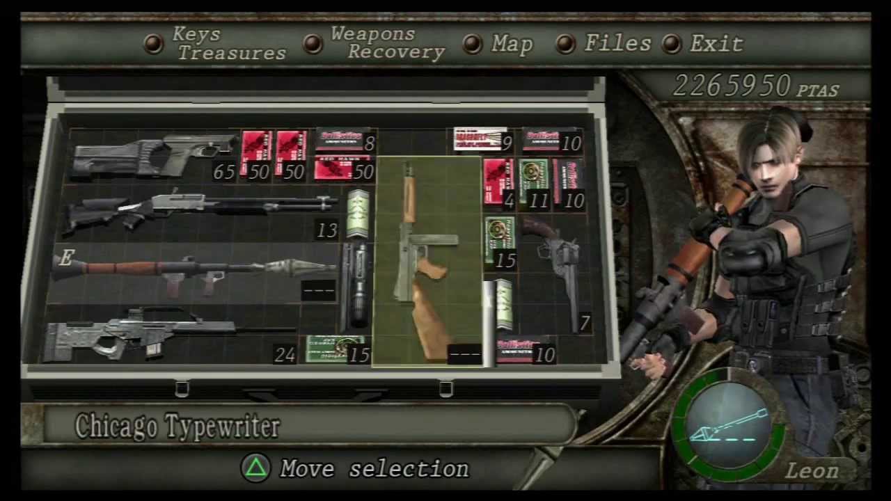
Resident Evil 4:

Note how Resident Evil 1 had no HUD whatsoever, and all information was conveyed through the inventory/PDA interface. This meant you had to: count your shots. Health was conveyed through limping. This also meant immersion was increased.
Why the fuck does the four assignable weapons you have equipped to the d-pad need to render on screen right in the middle every time you switch? Are the players meant to be completely retarded and forget what they assigned to those buttons via the inventory two seconds ago, and cannot simply check if they're returning from a break in play? It's only four fucking hotkeys. Jesus.
Note how the style of the Resident Evil 1 interface represents a PDA and an attache case of sorts. It's charming, attractive and helps maintain your suspension of disbelief.
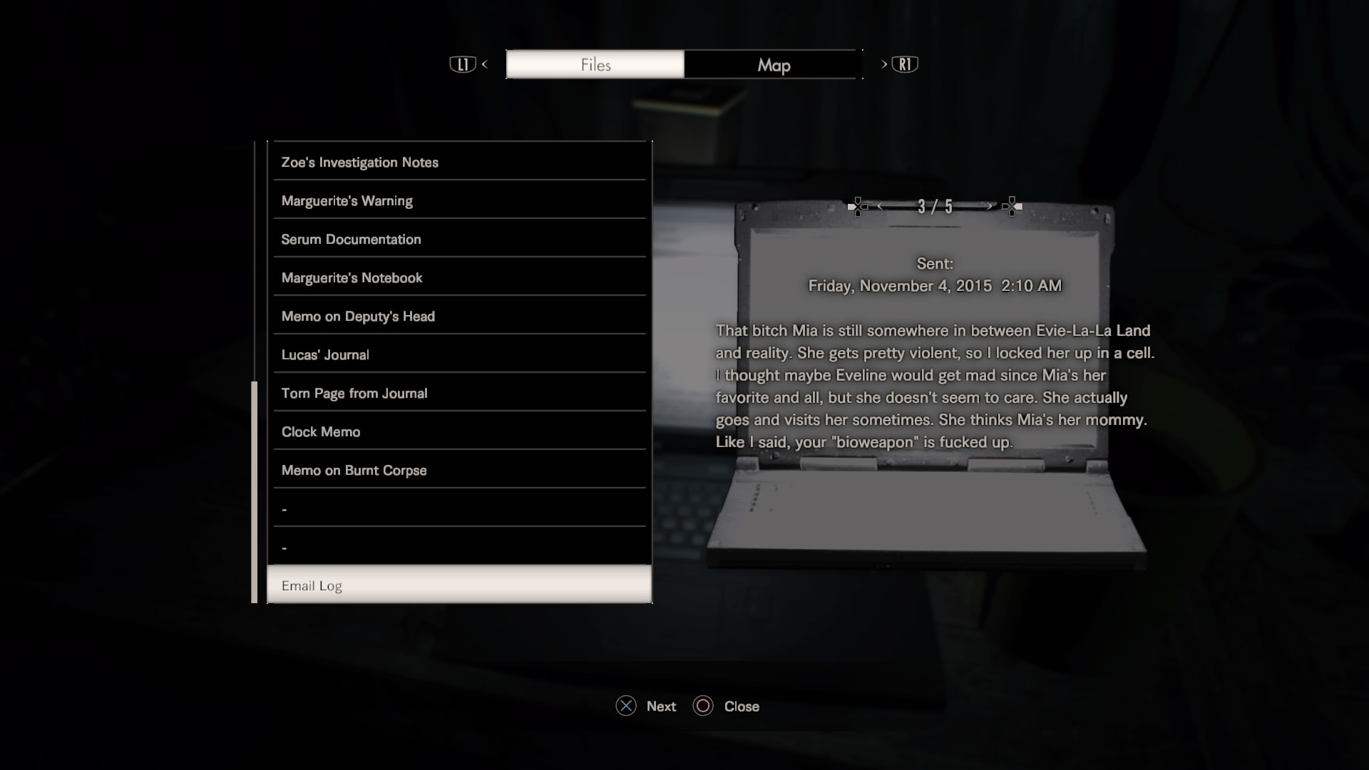
This REtardMake Part 2 is no doubt developed by the same soulless cucks that did Retard Evil 7, which also had a user interface that told a story about the shitty devs:

Who cares about GUI design? Just throw in chainsaw battles and they'll be none the wiser. Best Resident Evil since we sold our souls!
But lets be pointlessly optimistic and assume their GUI art and design is currently placeholder. Which it in all likelihood isn't even if it's subject to change.
Last edited:


