Putting the 'role' back in role-playing games since 2002.
Donate to Codex
Good Old Games
  • Welcome to rpgcodex.net, a site dedicated to discussing computer based role-playing games in a free and open fashion. We're less strict than other forums, but please refer to the rules.

    "This message is awaiting moderator approval": All new users must pass through our moderation queue before they will be able to post normally. Until your account has "passed" your posts will only be visible to yourself (and moderators) until they are approved. Give us a week to get around to approving / deleting / ignoring your mundane opinion on crap before hassling us about it. Once you have passed the moderation period (think of it as a test), you will be able to post normally, just like all the other retards.

Game News Wasteland 2 Kickstarter Update #31: OMG DISTRIBUTION DEAL, also new HUD screenshots

Joined
Apr 2, 2010
Messages
7,428
Location
Villainville
MCA
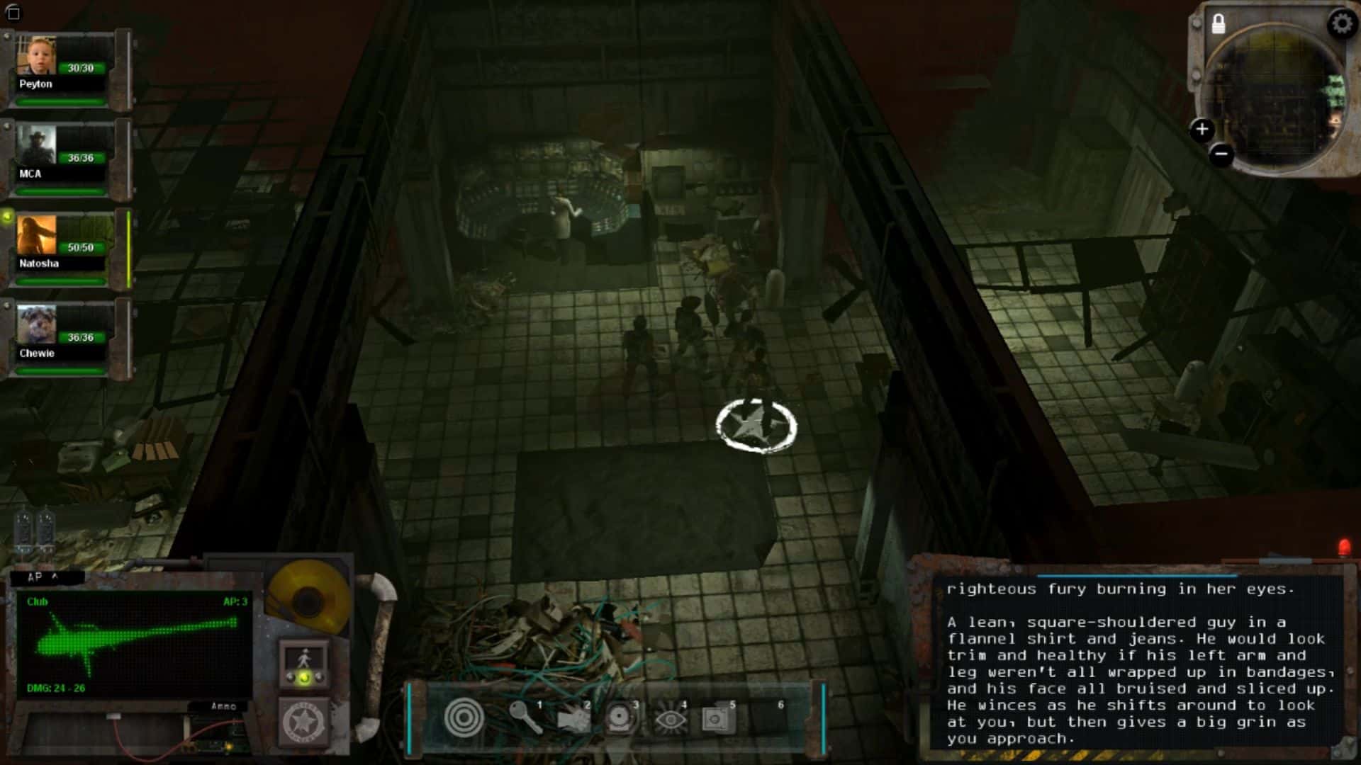
The thing that strikes me about the WL2 UI designs is that the artists seem to be complete consoltards with no sense of function and form and instead go about thinking "what would be cool". And we've seen the videos; most of the developers were rather young, relatively speaking. I think Fargo desperately needs some design veterans on the team.
 
Self-Ejected

Excidium

P. banal
Joined
Aug 14, 2009
Messages
13,696
Location
Third World
You don't need 20 years in the game industry to make something better looking and more functional than that.
 

Jaesun

Fabulous Ex-Moderator
Patron
Joined
May 14, 2004
Messages
37,432
Location
Seattle, WA USA
MCA Dead State Divinity: Original Sin Project: Eternity Torment: Tides of Numenera Shadorwun: Hong Kong Divinity: Original Sin 2 BattleTech
Roguey being a fucking retard again. and Brother None's example of the finished product proves it The in game footage shown so far looks really good, stop shitposting.


Click here to improve your Codex Experience™ by 100%.

Odd choice for them to used Deep Silver as a Distributor.. But at least it will solve the problem plagued by other Kickstarters that didn't have one lined up (and do not have a "gateway" into STEAM). But I don't care either way, they are just a Distributor. At least it's not fucking EA.
 

tuluse

Arcane
Joined
Jul 20, 2008
Messages
11,400
Serpent in the Staglands Divinity: Original Sin Project: Eternity Torment: Tides of Numenera Shadorwun: Hong Kong
InXile already has a self published game on Steam, The Bard's Tale.
 

Seerix

Arbiter
Joined
Mar 31, 2012
Messages
235
Paper descriptions look really off to me, another CRT screen for them would be fine. Icons look like they were taken from some 'generic icons for all your generic needs' library. All those cables and other details are unnecessary and do not match the actual hud elements. Ascetic HUD made from translucent ms paint boxes and rectangles with customization options would be much better than this.
 

Lancehead

Liturgist
Joined
Dec 6, 2012
Messages
1,550
Yes, but Deep Silver aren't going to do that for free, are they? They would be getting some money besides for making and distributing physical stuff.

This should be clear from even a high school (if even that) knowledge of economics: Scale and infrastructure. Deep Silver already has manufacturing facilities ect and can make a box and DVD (and maybe a manual or whatever feelies WL2 and ToN offered) much cheeper than InXile could ever hope.

That was always clear. The purpose of the question, which you seem to have failed to follow from the conversation, is to know whether any backer money was going to Deep Silver.
 

deuxhero

Arcane
Joined
Jul 30, 2007
Messages
11,973
Location
Flowery Land
Of course it is. No one expected InXile to print the physical rewards from thin air. If you asked any rational person donating how they think physical rewards would be produced, most would have guessed IX would pay a company with manufacturing facilities to do it. I highly doubt any rational person would see this as some great betrayal.
 

Lancehead

Liturgist
Joined
Dec 6, 2012
Messages
1,550
You should read my posts more carefully. Here's my first post in the thread:
@dropkickpickachu Deep Silver gets money for sales from copies they distribute. They do not get any money from the Kickstarter budget nor any money from digital sales.
What about the distribution of physical copies of the backers? Who's paying Deep Silver for those?
The two points you were eager to teach me - that it costs less for Deep Silver to manufacture, and that InXile would need to pay them - are not what I was seeking. Because BN said (in the quote I quoted) no backer money was going to Deep Silver, I asked for a clarification on which money was going to them (them being a publisher).

Of course it is. No one expected InXile to print the physical rewards from thin air. If you asked any rational person donating how they think physical rewards would be produced, most would have guessed IX would pay a company with manufacturing facilities to do it. I highly doubt any rational person would see this as some great betrayal.
Where do you read "betrayal" in my posts? Do you have a reading comprehension problem?
 

jewboy

Arbiter
Joined
Mar 13, 2012
Messages
657
Location
Oumuamua
DOF in games in general is a crime against humanity. What worries me even more than the DOF itself is that someone actually thought that this was a good idea. I hope it wasn't Mr. Fargo because he can't be fired. I am immensely relieved to hear that it will be optional.

I agree that the UI is ugly, but I don't mind the overal idea of minimalist modularity. I do prefer the UI of Fallout 2 and most of the IE games. I think the UI of FO:NV was decent as well. Why not throw together a few different styles and let the backers vote on them? Or even better ship the game with more than one style of UI if that isn't too much work.

As for the distribution deal I see nothing wrong with it. One of the reason that I back Mr. Fargo's projects is that I trust his business decisions and his ability to get things done in the real world. Outsourcing the distribution sounds like a good idea to me. Yes, it will cut into inXile's profits but that was always going to be the case. Manufacturing and shipping physical things like boxes and DVDs and cloth maps and all the other physical rewards costs money. And yes this does seem to imply that the part of the backer funding that was going to be put toward physical distribution of stuff can now be put toward game content and hopefully a UI that doesn't look like shit. Presumably T:ToN will be handled the same way.
 

boltrek

Literate
Joined
Jun 29, 2013
Messages
33
I dislike how InXile even ask for feedback from fans at all. I mean it has it's uses (no social feature, derp) but apart from that holy shit, they are the designers not the fans, so go design. It's awkward and stupid. Just go make the game and wake us up when you're done and give us a game code to go download it. Pointless shit which just provokes internet armchair experts to "mock up" and pretend they are now super RPG designers (ie half of this thread).
 

Infinitron

I post news
Patron
Staff Member
Joined
Jan 28, 2011
Messages
99,624
Codex Year of the Donut Serpent in the Staglands Dead State Divinity: Original Sin Project: Eternity Torment: Tides of Numenera Wasteland 2 Shadorwun: Hong Kong Divinity: Original Sin 2 A Beautifully Desolate Campaign Pillars of Eternity 2: Deadfire Pathfinder: Kingmaker Pathfinder: Wrath I'm very into cock and ball torture I helped put crap in Monomyth
I dislike how InXile even ask for feedback from fans at all. I mean it has it's uses (no social feature, derp) but apart from that holy shit, they are the designers not the fans, so go design. It's awkward and stupid. Just go make the game and wake us up when you're done and give us a game code to go download it. Pointless shit which just provokes internet armchair experts to "mock up" and pretend they are now super RPG designers (ie half of this thread).


It's going to happen anyway, man. All of this stuff would have popped up in the beta test.
 
Joined
Jun 6, 2010
Messages
2,386
Location
Milan, Italy
Hey, I'm going to have to contrast all the "readability" and "modability" feedback you guys seem to have received to design the interface the way you did, and emphasize that some of us just want the interface to pull us into the game. I like heavy interfaces that feel like they have real weight, and belong in the game world they inhabit. Fallout & Baldur's Gate both have great UI's (first BG more than the second) by this measure.
You are an evil person and part of the problem.
 

Hellraiser

Arcane
Joined
Apr 22, 2007
Messages
11,773
Location
Danzig, Potato-Hitman Commonwealth
The UI tries to look like a gadget made from old salvaged 80s electronics, that's nice and all but some ideas just don't make sense. The LED number display and buttons branching out look just wrong. At the very least they should be attached to some sort of crude surface, they really need some background, just having them hanging there in the air looks awkward. Even just a green circuit board behind them would make it look better.

Button placement is a mess, there's no logic behind it, it doesn't fit neatly with the rest. I would rather see it in the form of a small keyboard or a keypad with all the buttons close together and spaced evenly in an overall sensible pattern. Indeed I would personally put both the AP LED display and the buttons as part of a single device supposedly operated using that keypad. It's logical to have the action buttons related to a combat turn and the AP counter on the same damn "device" with the display at the top and the buttons at the bottom and on the sides of the display. You'll need them at roughly the same point during a turn. The end turn button can be elsewhere however, more on why in a moment.

Fuck GUI modification by the user, just give him interchangeable quickslots tied to number keys for whatever skills/items he drags&drops on them. There's no sane reason why he should want to move the AP/weapon/combat turn order part of the GUI unless you put it in the middle of the damn screen by default.

Here's one thing I noticed, why do games always have the end turn button in the lower-right corner? MOO2, Civ, SMAC, Fallout, Jagged Alliance 2 the list goes on. Why do you have it in the lower-left one? Indeed notice another thing, most bottom centric GUI's for games go left to right with buttons/information in order more or less depending on what information or mechanics the player needs first and what last. Because most people in the "west" read left to right.

Fallout: text display (telling you what just happened)>inventory (use stimpak/arm yourself if shit hit the fan)>weapons+AP>HP+AC>stuff of zero importance during combat (pipboy/character sheet/skilldex)>end turn

Starcraft: minimap (what is going on)>selected units and their health>portrait/menu>unit orders

Alpha Centauri: Selected unit info+menu button>tile the unit is on info>other units/cities on tile info>central "strategic" overview info panel (which shows combat info when attempting an attack)>minimap and end turn.

You have the text printout display giving the most vital information on the right side (BTW change the font and dump the transparency, transparent paper is moronic, the frame could also use a redisign), the combat widgets on the other end of the screen and skills in the middle. As a player I would jump around from right to left to the right again after I do an attack with one of my rangers, assuming the damage done is displayed on the printout (which it should so the player can review the situation to make tactical decisions). That's tedious and indeed counterintuitive in a way. Don't reinvent the wheel here, go with Fallout's left-side printout with the combat actions right next to it. Quickslots should be in a row above or below the combat buttons, same goes for ranger portraits with HP and AP bars. Possibly place the portraits above the printout.

EDIT: Oh and yes, put all the stuff that's nearly totally unimportant during combat and not that important outside of it on the right side. Character sheet button, main menu button etc.
 

Rake

Arcane
Joined
Oct 11, 2012
Messages
2,969
inXile realy made a bad decision with the whole "modable, floating pieces of shit parts for the UI" that they promished. At least make the parts to have a common theme and look like parts of a single UI instead of 8 different ones.
 

Smejki

Larian Studios, ex-Warhorse
Developer
Joined
Oct 22, 2012
Messages
710
Location
Belgistan
Yes, but Deep Silver aren't going to do that for free, are they? They would be getting some money besides for making and distributing physical stuff.

This should be clear from even a high school (if even that) knowledge of economics: Scale and infrastructure. Deep Silver already has manufacturing facilities ect and can make a box and DVD (and maybe a manual or whatever feelies WL2 and ToN offered) much cheeper than InXile could ever hope.

That was always clear. The purpose of the question, which you seem to have failed to follow from the conversation, is to know whether any backer money was going to Deep Silver.
Of course not. The get cut from physical sales
 

Infinitron

I post news
Patron
Staff Member
Joined
Jan 28, 2011
Messages
99,624
Codex Year of the Donut Serpent in the Staglands Dead State Divinity: Original Sin Project: Eternity Torment: Tides of Numenera Wasteland 2 Shadorwun: Hong Kong Divinity: Original Sin 2 A Beautifully Desolate Campaign Pillars of Eternity 2: Deadfire Pathfinder: Kingmaker Pathfinder: Wrath I'm very into cock and ball torture I helped put crap in Monomyth

Rake

Arcane
Joined
Oct 11, 2012
Messages
2,969
inXile realy made a bad decision with the whole "modable, floating pieces of shit parts for the UI" that they promished. At least make the parts to have a common theme and look like parts of a single UI instead of 8 different ones.


It was part of the game's pitch, and nobody complained about it then.

http://www.youtube.com/watch?feature=player_detailpage&v=YHEgVIMS9pQ#t=355s 5:55
I know, and i don't excpect them to change it. But so far what we have seen from inXile is underwhelming as far as UI is conserned. I haven't see much praise for their UI design.

And they seem to go that road with Torment as well.:mad:
 

Kem0sabe

Arcane
Joined
Mar 7, 2011
Messages
13,210
Location
Azores Islands
And they seem to go that road with Torment as well.:mad:


I suspect that's not going to be the case after this.
I don't know. Even NWN2 UI had a ton of fans. Some people realy have perverted taste.

I enjoyed the quick-spell menu in NWN2, also the character leveling UI was ok, the problem with the whole thing was how cumbersome and ugly the inventory and front end were.
 

Logic_error

Self-Ejected
Joined
Jul 2, 2013
Messages
137
To be frank, our production process was geared towards maximum efficiency, not press-readiness. That means our screenshots looked very heavily WIP, and you can still see some of that now. Polishing and finishing up art assets really doesn't make much sense while you're still blocking away, just from a pure production efficiency viewpoint. Now that things are blocked in, we're doing polish passes, fully propping out levels, etc and the game looks significantly better pretty much every time I boot it up. I don't know if people fully realized how distant a lot of the stuff we've put out there is from the final product.

That said, I thought this shot was great, if a bit blurry. We know about the objections people have against DoF and do intend to make it optional.

PS: the Damonta screenshot from a few updates back is a good example. Textures looked like shit so we kept it at a glimpse, yet a few weeks later we could put out this shot with its snazzy lighting work. Big steps now.
The textures could look way better. I assume this is still work in progress?

EDIT: Is that.. perspective projection?????

You are kidding me.. right?
 

ghostdog

Arcane
Patron
Joined
Dec 31, 2007
Messages
11,158
What the fuck did they do to the UI ??

:rpgcodex:

the old one was immensely better :

Wasteland2.jpg
 

As an Amazon Associate, rpgcodex.net earns from qualifying purchases.
Back
Top Bottom