Putting the 'role' back in role-playing games since 2002.
Donate to Codex
Good Old Games
  • Welcome to rpgcodex.net, a site dedicated to discussing computer based role-playing games in a free and open fashion. We're less strict than other forums, but please refer to the rules.

    "This message is awaiting moderator approval": All new users must pass through our moderation queue before they will be able to post normally. Until your account has "passed" your posts will only be visible to yourself (and moderators) until they are approved. Give us a week to get around to approving / deleting / ignoring your mundane opinion on crap before hassling us about it. Once you have passed the moderation period (think of it as a test), you will be able to post normally, just like all the other retards.

Capcom Resident Evil 4 Remake - out now for PC/Playstation/Xbox

Machocruz

Arcane
Joined
Jul 7, 2011
Messages
4,519
Location
Hyperborea
Original Krauser looked more brutal and menacing. Pure killer. Scary guy.

As much as I'd like to shit on this game for being an unneeded remake and a AAA game made in current year, that trailer makes it look like there is some solid action entertainment in there.
 

Ash

Arcane
Joined
Oct 16, 2015
Messages
7,055
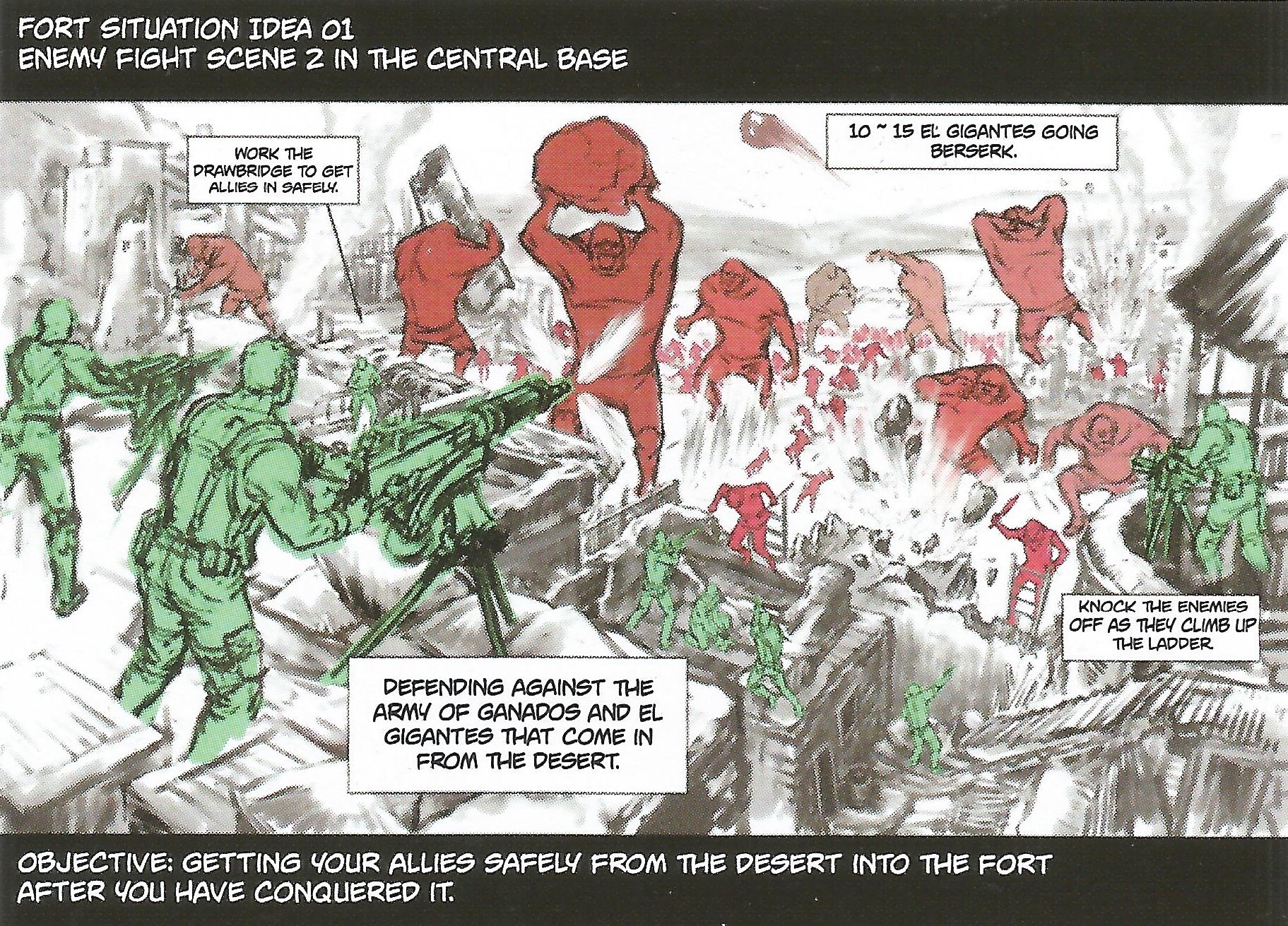
Luis seems to be in the game so much more now, it has me wondering if there’s going to be an optional co-op mode. In the original game I’m pretty sure Luis dies before you get to that boss fight with the two El Gigante they showed in this newest trailer.
he's a test version of Sheva's AI for the inevitable RE5 remake
:troll:

I was thinking about a RE5 remake. That could potentially be there most interesting remake. There’s a whole lot of stuff they had planned for Resident Evil 5 that they ended up dropping during development.

The original version sounded much bigger. Stages were originally going to be designed with underground areas to get around shit. There were huge war zones sections. There was this whole system (a light survival system) where you’d need to find shelter from the intense heat and stay hydrated or else you might start having hallucinations...Chris would tan when in the sun too long. I’m pretty sure the first trailer opening with Chris being blinded by the sun, and how it played up light and shadows was a hint at the cut system.

There were also way more enemies. Even in the extended version of the second trailer you can see they wanted more enemies than the final version had. That second trailer also showed off Chris doing stuff that’s similar looking to moves they’d give you in RE6, but he seems to be able to do even more in that second trailer for RE5. Some of the stuff they had planned for RE5 almost sounds like a cross between what they did make, and Metal Gear Solid V, 5 years later. Some smaller version of what they had planned seemed to make it into RE6.

5article9.jpg
This all sounds like total garbage. No wonder why it was scrapped.
 

Ash

Arcane
Joined
Oct 16, 2015
Messages
7,055
Similarly, the term "outdated". Sure, some old conventions have been rightfully superseded, the most inarguably, objectively bad of all like cumbersome UIs, but for the most part old is better and does not decline with age. RE4 had cumbersome tank controls intentionally, because survival horror base. About the only control issue RE4 has was having to go to the inventory to switch weapons every time, but this was weird even in 2005.

Adding in full freedom of movement as they have is not a modernization, it's a homogenization and genre shift to full-blown standardized action (which, ironically, IS modernization - the rush to make every game the same because we know this formula sells).

The modern era has brought about very few gameplay advancements, more devolution than improvement, so I hear modernization and I associate that with total shit.
 
Last edited:

Ezekiel

Arcane
Joined
May 3, 2017
Messages
6,704
Similarly, the term "outdated". Sure, some old conventions have been rightfully superseded, the most inarguably, objectively bad of all like cumbersome UIs, but for the most part old is better and does not decline with age. RE4 had cumbersome tank controls intentionally, because survival horror base. About the only control issue RE4 has was having to go to the inventory to switch weapons every time, but this was weird even in 2005.

Adding in full freedom of movement as they have is not a modernization, it's a homogenization and genre shift (which, ironically, IS modernization - the rush to make every game the same).

The modern era has brought about very few gameplay advancements, more devolution than improvement, so I hear modernization and I associate that with total shit.
I would say the power of the melee was a control issue in RE4. Being able to melee most enemies away whenever they were stunned by a bullet. Mostly agree with you both, though.
 

Ash

Arcane
Joined
Oct 16, 2015
Messages
7,055
Oh, that. Could perhaps be very easily solved by either making Leon vulnerable during melee, or reducing frequency that enemies go into the head/knee stun states, perhaps sometimes doing the other non-meleeable stun states instead (knocked back, knocked to floor, grabs knee in pain, head pops but they still grab and throw you etc).
Also more head stun states where they stumble backwards instead of forwards (backwards out of melee reach).
Perhaps also reduce the AoE on the kick just a little bit. shit takes down whole groups lol.
That said, in Mercenaries mode where the combat stakes are peak, you need those melees. so if introduced Mercs may need a slight difficulty nerf too.
 
Last edited:
Joined
Jan 31, 2023
Messages
57
Similarly, the term "outdated". Sure, some old conventions have been rightfully superseded, the most inarguably, objectively bad of all like cumbersome UIs, but for the most part old is better and does not decline with age.
Do you mean UI functionality, or visual design? Many people started to appreciate older more robust and say, 'artistic' designs, recently - like, compare Witcher 1 to 3. Tbh I'm not a part of that crusade against rectangular minimalism, but I can see the point.
 

Tyranicon

A Memory of Eternity
Developer
Joined
Oct 7, 2019
Messages
7,840
Sounds like they're upgrading the knife a lot.

I remember using the knife a lot in the original just to trigger melee moves. Will have to see how this works out.
 

Machocruz

Arcane
Joined
Jul 7, 2011
Messages
4,519
Location
Hyperborea
I think the ideas are generally solid, but none of what they mentioned is something that came about in the "modern" age of video games, unless that goes back 20 something years, undermining the notion of modernizing here.

On the other hand, you could look at it as them following the kitchen sink approach that games take these days, regardless of genre. But they need to add some roguelite elements, deck building, skill trees, and crafting to get that sweet modern game dev Bingo!
 

Ezekiel

Arcane
Joined
May 3, 2017
Messages
6,704
Watched the video. That was a long way to say very little, nothing that wasn't already known.

7:22: "Our goal was to implement evolutions that have occurred since the original was released."

In other words, "We are not paid to think outside the box. We imitate what's popular." He didn't even make a good case for adding stealth, explain how they are going to implement it in a way that will be exciting. Will we be able to knock on walls or place dirty magazines? Will enemies track our wet foot prints or our tracks in the mud? Merely showed Leon crouching very low at 3:28 (with an icon in the bottom right as if the player won't figure out they are in the crouching position otherwise) and then rise up and stab someone in the throat. Same thing we've been doing in so many games for a lifetime. If he was going to stab him in the throat, why wasn't he upright in the first place? You only think that's an odd question because we've been doing it the same way for twenty years. God damn, I'm so sick of crouching. Look up "man sneaking" and tell me how many of those first photos show the men crouching low. You and I, almost anyone, would bend our knees slightly and lean forward a bit as we moved slowly forward. We would try to make our steps quiet as we moved behind people, not reduce our visibility when there is no one looking anyway. It's gotten so out of hand that I think if I made a game with optional sneaking I would troll the player by having the character stab or punch the enemy in the midsection/crotch when attacking from a crouching position. Force them to stand up before performing an effective stealth kill. I would make the crouch that is available for reducing visibility, accessing low spaces and covering behind objects slower than the standard more upright sneaking position, to encourage being in the cooler position. Let them enter the slow (more upright) sneaking position by tapping the button and enter the slower crouch position by holding the button briefly, like in Metal Gear Solid, except with no prone position. But still let them run around if the enemy is at least a few yards away and not looking. If the game had a ton of sneaking and prone was necessary because of that, then I would simply make the default stance of the character a sneaking position, as fast as a regular walk (or maybe even a little faster), allowing them to crouch and go prone with the button, rather than sneak or crouch with it.

6:22 shows the merchant. His voice isn't funny anymore.

Found it funny when shooting at a lantern above the cow, it instantly set the whole cow ablaze. Why is a lantern in there anyway? Then again, old game had that too, only not with animals.
 
Last edited:

Ash

Arcane
Joined
Oct 16, 2015
Messages
7,055
Similarly, the term "outdated". Sure, some old conventions have been rightfully superseded, the most inarguably, objectively bad of all like cumbersome UIs, but for the most part old is better and does not decline with age.
Do you mean UI functionality, or visual design? Many people started to appreciate older more robust and say, 'artistic' designs, recently - like, compare Witcher 1 to 3. Tbh I'm not a part of that crusade against rectangular minimalism, but I can see the point.

I definitely appreciate older UIs. System Shock 2's is probably my gold standard. I am talking about purely functionality. while many older UIs were perfectly fine, quite a few were not. E.g Fallout 1 inventory. Or a lack of tool tips for many. Or just absolutely everything being driven by UI/mouse which while a noble goal adds unnecessary convolution, making a game a chore to learn as there is a way to do everything with the UI and keybinds both, doubling the amount of inputs crammed in player headspace.

Modern UIs often are boring/lacking deeper functionality old games offered, definitely homogenized, and often ugly, but one thing we can say is they're never going to be a pain in the ass to figure out, or result in wrong inputs.

On the console side of things, it was pretty common to see similar flaws as Fallout 1's inventory, such as Castlevania SOTN's two-column list inventory. It's OK but...just adding filters/categorization would greatly improve the experience.

Basically I'm saying modern UIs are NOT overall better, but they never fall into the unnecessary trap of being cumbersome that many older games fell into. UX design is always a priority for modern UI designers. One of few things I respect in modern game design.
 
Last edited:
Joined
Jan 31, 2023
Messages
57
I definitely appreciate older UIs. System Shock 2's is probably my gold standard. I am talking about purely functionality. while many older UIs were perfectly fine, quite a few were not. E.g Fallout 1 inventory. Or a lack of tool tips for many. Or just absolutely everything being driven by UI/mouse which while a noble goal adds unnecessary convolution, making a game a chore to learn as there is a way to do everything with the UI and keybinds both, doubling the amount of inputs crammed in player headspace.
To be fair I rarely encounter such problems, likely due to the fact I mostly play stuff from 2000s onwards. But for example, I think F1's UI is fine for what it is. Maybe the inventory tab is suboptimal and too small regarding the things you carry.
Modern UIs often are boring/lacking deeper functionality old games offered, definitely homogenized, and often ugly, but one thing we can say is they're never going to be a pain in the ass to figure out, or result in wrong inputs.
Oh, I definitely find them painful. The UI in newer Assassins Creeds is hard to navigate, and ironically its poorly suited for both a controller and M+KB. For a controller because you're supposed to use a pointer, and for mouse because the icons are too big, so that you can sort of aim at them them while using a controller. Also there's the bad habit of putting every single thing in a separate UI tab, whenever possible. As well as the fact that many of those UIs still dont use a grid for displaying items, they use a list instead. I have no idea why, nothing is gained this way. Its overall less clear and natural, because in real life you'd probably have a bit more spatial concept of what you carry, rather than a list.
 

Ash

Arcane
Joined
Oct 16, 2015
Messages
7,055
Oh, I definitely find them painful. The UI in newer Assassins Creeds is hard to navigate, and ironically its poorly suited for both a controller and M+KB. For a controller because you're supposed to use a pointer, and for mouse because the icons are too big, so that you can sort of aim at them them while using a controller. Also there's the bad habit of putting every single thing in a separate UI tab, whenever possible. As well as the fact that many of those UIs still dont use a grid for displaying items, they use a list instead. I have no idea why, nothing is gained this way. Its overall less clear and natural, because in real life you'd probably have a bit more spatial concept of what you carry, rather than a list.
Why the fuck are you playing Assassin's Creed? Hand in the monocle, and leave this place.
 

Thorakitai

Learned
Joined
Feb 26, 2020
Messages
303
It's a sad fate how throughly westernized Capcom is looking how this remake is throughly different from the original and not in a good way.

>Bad Character designs given how Capcom is obssessed with photorealistic facescans, given how Ashley and Krauser are nerfed.

>Story and feel is now overly grimdark and serious, unlike how the original balances classic Resident Evil cheese and seriousness.
 

DJOGamer PT

Arcane
Joined
Apr 8, 2015
Messages
8,108
Location
Lusitânia
Knife parrying seems overly op
Also the enemies do so little damage - despite giving the player both a parry and evade mechanic, critical attacks not only don't kill in 1 hit but they also don't do that much damage (see garrador clip), or perhaps only damage Leon to a certain HP state
 

Ash

Arcane
Joined
Oct 16, 2015
Messages
7,055
I hate the term 'modernizing', for it implies improvement when it actually means standardization.
Call it whatever you want, getting rid of QTEs is nothing but incline.
Well, you reap what you sow I guess. Judging by everything else capcom has done over the past decade or so, this is gonna be bland as fuck. Piss easy. Lacking content. And trying to be cool like 90s/early 00s Capcom was while failing miserably. Y'all will be begging for QTEs when modern Capcom is done with you :lol:

Oh, I forgot that RE2 remake was...partially acceptable. That must be why some maintain futile hope.
 

TheHeroOfTime

Arcane
Joined
Nov 3, 2014
Messages
2,966
Location
S-pain
The way they seem to be improving the game it's fine to me. They gave Leon more mobility than in the original game, but they also have expanded the way the Ganados react (Also, it seems they have more variety in their designs and their weapons). But ultimately I want to play it first. The original RE4 has a very particular balance between it's game mechanics (The tank controls, the enemies located damage, the contextual attack buttons,etc). I have to see how this balance is in the remake.
 
Joined
Nov 23, 2017
Messages
4,635
Knife parrying seems overly op
Also the enemies do so little damage - despite giving the player both a parry and evade mechanic, critical attacks not only don't kill in 1 hit but they also don't do that much damage (see garrador clip), or perhaps only damage Leon to a certain HP state

Knife parry looks like it lowers your knife’s durability. Seems they’ve taken the counter system from RE6, (and the knife counter from the Resident Evil Remake) put it’s usage on a knife meter instead of a universal stamina meter, and maybe removed the crowd control function the RE6 counter gives you with some enemies.

The knife seems like it’s functionally the stuff that RE6 added: The counter attack, and a melee combat system (the little they’ve shown of knife combat doesn’t look like the one knife swing of RE4) outside of the contextual attacks you trigger with location damage on enemies. Only instead of the stamina meter using the knife lowers its durability. The knife also seems to function as the gasoline from RERemake, being able to kill downed enemies without triggering Plaga.

The Krauser knife fight seems to really be a drain of the knife durability.
 

d1r

Single handedly funding SMTVI
Patron
Joined
Nov 6, 2011
Messages
4,331
Location
Germany
It's a sad fate how throughly westernized Capcom is looking how this remake is throughly different from the original and not in a good way.

>Bad Character designs given how Capcom is obssessed with photorealistic facescans, given how Ashley and Krauser are nerfed.

>Story and feel is now overly grimdark and serious, unlike how the original balances classic Resident Evil cheese and seriousness.
Yeah, the game is a classic case of American/Canadian woke realism. The amount of "censorship" that is going on here just puts me off completely.
 

As an Amazon Associate, rpgcodex.net earns from qualifying purchases.
Back
Top Bottom