Putting the 'role' back in role-playing games since 2002.
Donate to Codex
Good Old Games
  • Welcome to rpgcodex.net, a site dedicated to discussing computer based role-playing games in a free and open fashion. We're less strict than other forums, but please refer to the rules.

    "This message is awaiting moderator approval": All new users must pass through our moderation queue before they will be able to post normally. Until your account has "passed" your posts will only be visible to yourself (and moderators) until they are approved. Give us a week to get around to approving / deleting / ignoring your mundane opinion on crap before hassling us about it. Once you have passed the moderation period (think of it as a test), you will be able to post normally, just like all the other retards.

Pretti! Interface-graphics

Vault Dweller

Commissar, Red Star Studio
Developer
Joined
Jan 7, 2003
Messages
28,044
Elhoim said:
Anyway, I was playing around with PS and did a little something with the walls. Check the RED RECTANGLE, and tell me if you like it.
I like it. Very neat.

I like the beige marble (the hand slots). Here is an idea (which probably sucks), can you make the entire interface out of one stone block and kinda carve the interface details in it? Something like:
http://static.flickr.com/42/104243508_49a55e783a_m.jpg
http://www.cjasper.com/images/Slides/JP ... arving.jpg
 

Grandpa Gamer

Scholar
Joined
Oct 27, 2006
Messages
190
Vault Dweller said:
Here is an idea (which probably sucks), can you make the entire interface out of one stone block and kinda carve the interface details in it?

Does anything but suck! :D
It is exactly the thing. Spot on.
And I'm sure Mantra can make it. Marble shouldn't be any harder than steel.
 

Kraszu

Prophet
Joined
May 27, 2005
Messages
3,253
Location
Poland
Last Elhoim interface is also very good, icons/numbers are visible better then on mantra_n interface.
 

Elhoim

Iron Tower Studio
Developer
Joined
Oct 27, 2006
Messages
2,880
Location
San Isidro, Argentina
Vault Dweller said:
Elhoim said:
Anyway, I was playing around with PS and did a little something with the walls. Check the RED RECTANGLE, and tell me if you like it.
I like it. Very neat.

Great! Can you send me the wall textures for a test? I can make this "fake bump map" so you can test it in-game.

Vault Dweller said:
I like the beige marble (the hand slots). Here is an idea (which probably sucks), can you make the entire interface out of one stone block and kinda carve the interface details in it? Something like:
http://static.flickr.com/42/104243508_49a55e783a_m.jpg
http://www.cjasper.com/images/Slides/JP ... arving.jpg

Cool! I think I can do it or, as Grandpa Gamer said, Mantra could pull it off too.
 

callehe

Liturgist
Joined
Dec 5, 2004
Messages
459
Location
Gothic Castle
ooh, bump mapping, nice. this is getting better and better. last interface very nice Elhoim, very clear and functional and good looking.
 

Twinfalls

Erudite
Joined
Jan 4, 2005
Messages
3,903
Great thread, well done Hyperboy and the designers! I'd just like to put a vote in for Elhoim's last one, it has that warm, fuzzy old-school flava.

Here's my contribution, in the 'Esprit du Codex':

aodmainll7.png
 

Fresh

Erudite
Joined
Dec 2, 2004
Messages
1,057
Location
Vault boy's secret hideout
Twinfalls said:
Great thread, well done Hyperboy and the designers! I'd just like to put a vote in for Elhoim's last one, it has that warm, fuzzy old-school flava.

Here's my contribution, in the 'Esprit du Codex':

aodmainyv5.png

OMGROFL! :D

This is pure awesome-ness. Well done.
 

denizsi

Arcane
Joined
Nov 24, 2005
Messages
9,927
Location
bosphorus
What is the width for the widest weapon slot image? The sword is 152x63. Is it the widest?

I take it that the slot images for weapons are screen graps from the 3d models. So, you could take new grabs with weapons put into perspective for narrower fixed image width (and not necessarily a box. The 99x63 crossbow is nice for example, but the sword occupies an unnecessary horizontal space in my opinion ), kind of like how it was in FO. Have you considered that?

edit: 12 icons, I can't figure some of them.

From left to right, they are: attack, disguise, sneak, steal, lockpick, trap/disarm, craft, alchemy, map, inventory, the yellow thing which looks like spiral blades and options / save?

Or is it journal, inventory, map and save, the last four icons?
 

Durwyn

Prophet
Joined
Oct 29, 2006
Messages
1,132
Location
Erewhon
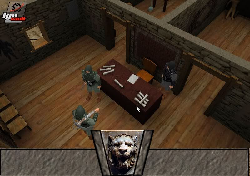
This gui is being made only for fun, and to show more talented fellows than me some other styles of interface. It's early WIP. The bars on the left, and right from lions head will contain Icons.

untitled.jpg


I know that lions head color is diffrent from panels color but i will do something whit this.
 

Fresh

Erudite
Joined
Dec 2, 2004
Messages
1,057
Location
Vault boy's secret hideout
Durwyn said:
This gui is being made only for fun, and to show more talented fellows than me some other styles of interface. It's early WIP. The bars on the left, and right from lions head will contain Icons.

pic

I know that lions head color is diffrent from panels color but i will do something whit this.

Sweet lion's head Durwyn. I'd like to see you continue with your concept. Alternatively shrink the head and add it to Mantra_n's interface.
 

fraunclein

Novice
Joined
Jan 25, 2006
Messages
67
Argh, don't go over the top with the details(as pretty as they are). If there's something to be changed in the original concept, it's to make it more easier on the eyes. That being said, Elhoim's latest piece gets my vote. Very smooth stuff, while nice little details like the red ribbons prevent it from looking overly generic.
 

Durwyn

Prophet
Joined
Oct 29, 2006
Messages
1,132
Location
Erewhon
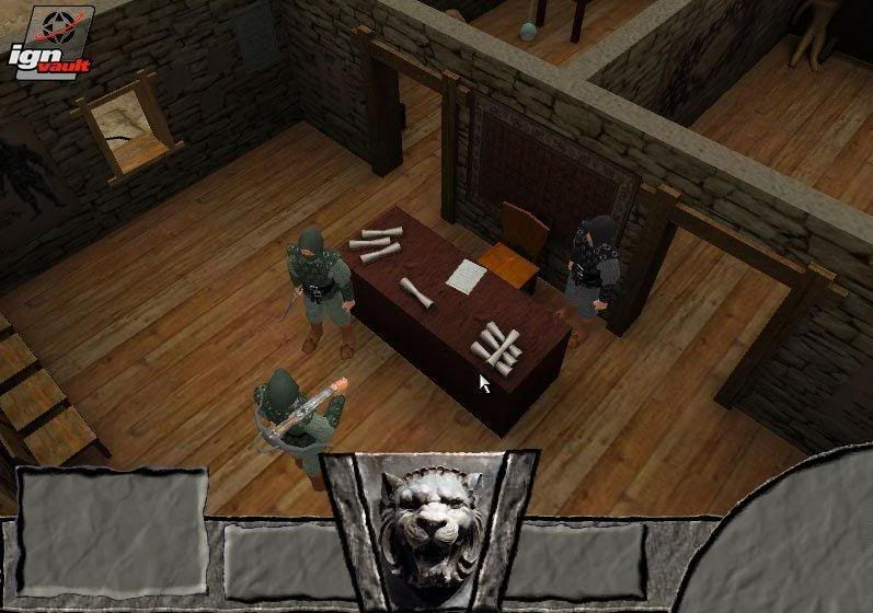
Small update to my funwork. My design have flaws that i know of. Currently i am trying to catch a style, such things as funcionality (icons, their size, fonts) will come next.

V4.jpg
 

Vault Dweller

Commissar, Red Star Studio
Developer
Joined
Jan 7, 2003
Messages
28,044
denizsi said:
What is the width for the widest weapon slot image? The sword is 152x63. Is it the widest?
Don't recall, whatever fits into the slot.

So, you could take new grabs with weapons put into perspective for narrower fixed image width
Sure, we can change everything.

edit: 12 icons, I can't figure some of them.

From left to right, they are: attack, disguise, sneak, steal, lockpick, trap/disarm, craft, alchemy, map, inventory, the yellow thing which looks like spiral blades and options / save?

Or is it journal, inventory, map and save, the last four icons?
Combat, search, sneak, steal, lockpick, trap, crafting, alchemy, journal, inventory, map, save/load.
 

Vault Dweller

Commissar, Red Star Studio
Developer
Joined
Jan 7, 2003
Messages
28,044
!HyPeRbOy! said:
Durwyn said:
This gui is being made only for fun, and to show more talented fellows than me some other styles of interface. It's early WIP. The bars on the left, and right from lions head will contain Icons.

pic

I know that lions head color is diffrent from panels color but i will do something whit this.

Sweet lion's head Durwyn. I'd like to see you continue with your concept. Alternatively shrink the head and add it to Mantra_n's interface.
Indeed.
 

Durwyn

Prophet
Joined
Oct 29, 2006
Messages
1,132
Location
Erewhon
Little changed version. I have very booring day so i have plenty of time to play with psp. Added upper bar, made lions head smaller, so it don't fuck eyes so much. Changed a little right corner bar. I'm now thinking how to add some life to it, becouse now it looks pretty dull.
Anyways, comments highly appreciated.

nextshit.jpg
 

MountainWest

Scholar
Joined
May 29, 2006
Messages
630
Location
Over there
Durwyn said:
Anyways, comments highly appreciated.

I'm personally not to found of having parts sticking up into the world screen. It's like having someones head blocking your view at the cinema. The lion head does look good, though.
 

Durwyn

Prophet
Joined
Oct 29, 2006
Messages
1,132
Location
Erewhon
MountainWest said:
Durwyn said:
Anyways, comments highly appreciated.

I'm personally not to found of having parts sticking up into the world screen. It's like having someones head blocking your view at the cinema. The lion head does look good, though.

Funny thing is that my GUI HUD or how do you call it, is smaller than original VD's. I just had to put it higher on screen to hide old one. Then i cuted lower part of screen. So it's just optical bigger.

Edit: I read your post once more , and i understood your problem.
 

golgotha

Liturgist
Joined
Oct 3, 2005
Messages
187
The problem I see with your HUD Durwyn, is that its rather distracting. Its the first thing I notice when looking at the screenshot instead of the action on screen.
 

Elhoim

Iron Tower Studio
Developer
Joined
Oct 27, 2006
Messages
2,880
Location
San Isidro, Argentina
VD, do you want the icons to be carved into the interface, or do you want me to preserve their colors and carve some buttons for them?

EDIT: Personally I would choose the buttons as the carving can be confusing.
 

Vault Dweller

Commissar, Red Star Studio
Developer
Joined
Jan 7, 2003
Messages
28,044
It's up to you, really. What we are trying to do here is to make a better interface so everything goes and nothing is "must have". If someone can make better icons, go for it. If someone feels that the interface should have horisontal and vertical bars a-la BG, give it a try. If someone can replace everything with 3 buttons Civ 4 style - I'd like to see that. And so on, and so on...
 

As an Amazon Associate, rpgcodex.net earns from qualifying purchases.
Back
Top Bottom