Putting the 'role' back in role-playing games since 2002.
Donate to Codex
Good Old Games
  • Welcome to rpgcodex.net, a site dedicated to discussing computer based role-playing games in a free and open fashion. We're less strict than other forums, but please refer to the rules.

    "This message is awaiting moderator approval": All new users must pass through our moderation queue before they will be able to post normally. Until your account has "passed" your posts will only be visible to yourself (and moderators) until they are approved. Give us a week to get around to approving / deleting / ignoring your mundane opinion on crap before hassling us about it. Once you have passed the moderation period (think of it as a test), you will be able to post normally, just like all the other retards.

Jeff Vogel Soapbox Thread

Max Heap

Arcane
Joined
Jul 21, 2011
Messages
617
I would honestly be fine with the art if it was consistently shitty.
It can look like Ultima 5 for all I care.

I just don't like the odd mix of handpainted sprites, with pre-rendered sprites and the weird unaligned angles of objects and characters.
If he fixed that it would be totally fine with me. Even the strange switch from isometric to straight top view wouldn't bother me much. If that's what takes it to push it to a new platform, oh well... that ain't a tragedy, really.
But this strange inconsistency is off-putting.
 

Kruno

Arcane
Patron
Village Idiot Zionist Agent Shitposter
Joined
Jan 2, 2012
Messages
11,478
I think where Jeff Vogel really missed out in his career is in failing to leverage his celebrity.

He talks about how as a humble indie he couldn't afford to hire an employee. Okay dude, but you're not just any indie dev, you're Jeff Vogel, a guy whose name still rang out loudly enough in 2018 that he could raise $100,000 for a game that looks like Queen's Wish. You don't need an employee, you need a partner. Join forces with another indie developer who's better at art than you are, and create something that's bigger than either of you could have done alone.

His ex-wife did do the original Exile 1 graphics and they still look decent. Not noisy, and uncluttered.
 

Julyan Morley

Novice
Joined
Apr 20, 2019
Messages
6
I think there were times in Jeff's career when most anyone else in his shoes would have taken some risk, or given up some control, to grow his business. I believe him that it doesn't make much sense to do that now.

Ultimately it's on him for not personally developing skills that were very obviously high leverage skills for him to develop. The obstinance displayed in this blog post seems to illustrate why that never happened.
 

JarlFrank

I like Thief THIS much
Patron
Joined
Jan 4, 2007
Messages
34,367
Location
KA.DINGIR.RA.KI
Steve gets a Kidney but I don't even get a tag.
Can he expand into a small 30 people studio like Obsidian and make a game with PoE quality level ?

He could also theoretically make a game that looks like Underrail, also a mostly one-man indie project with a shoestring budget.

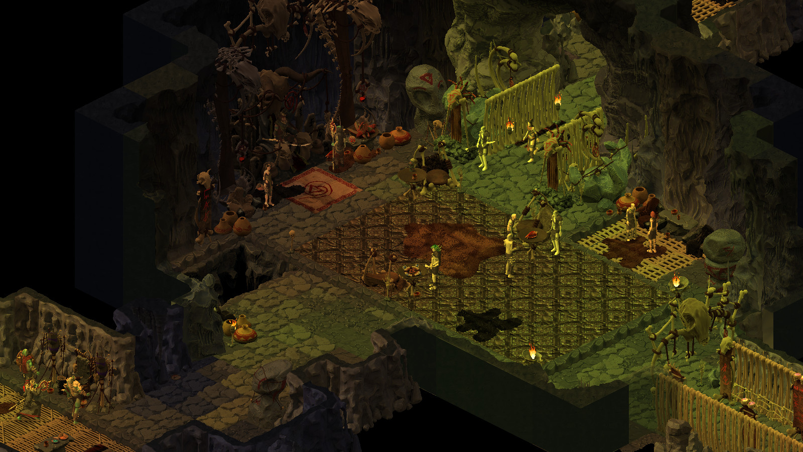
Or Age of Decadence, which despite the low poly 3D graphics looks decent because it has a sense of art direction to it.

Or ATOM RPG.

Or something like Bastard Bonds, a decent indie RPG that has a pretty cool artstyle.

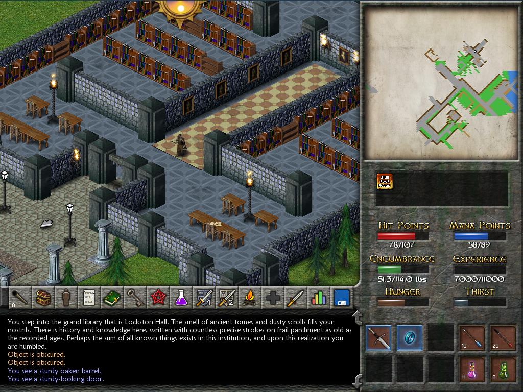
Or the Eschalon games, which have a similarly low budget and simple artstyle, yet look much more pleasing to the eye than 90% of Spiderweb games.

It's not like there aren't other indie RPGs made by either small teams or one-man teams that manage to have a decent art direction. And none of these blew millions of dollars into their art assets. So that should be proof that decent art is affordable enough for indies. Heck, there are plenty of good artists who work for cheap, usually located in Eastern Europe or Asia. And some of them even have experience with tilesets. Queen's Wish looks like Vogel just hired 5 different artists, told them to give him different things, and the result is a disjointed mess that doesn't look like it has a unified style at all.
 

Tacgnol

Shitlord
Patron
Joined
Oct 12, 2010
Messages
1,871,883
Codex 2016 - The Age of Grimoire Grab the Codex by the pussy RPG Wokedex Strap Yourselves In Codex Year of the Donut Shadorwun: Hong Kong Divinity: Original Sin 2 Steve gets a Kidney but I don't even get a tag. Pathfinder: Wrath I helped put crap in Monomyth
I think where Jeff Vogel really missed out in his career is in failing to leverage his celebrity.

He talks about how as a humble indie he couldn't afford to hire an employee. Okay dude, but you're not just any indie dev, you're Jeff Vogel, a guy whose name still rang out loudly enough in 2018 that he could raise $100,000 for a game that looks like Queen's Wish. You don't need an employee, you need a partner. Join forces with another indie developer who's better at art than you are, and create something that's bigger than either of you could have done alone.

His ex-wife did do the original Exile 1 graphics and they still look decent. Not noisy, and uncluttered.

I actually preferred the original Exile 1 graphics to the updated set he had done (with Exile 3?).

They had a bit more "soul" to them.
 

Mortmal

Arcane
Joined
Jun 15, 2009
Messages
9,498
He's lurking here for sure. He's delusional and surrounded by sycophants. He pretend we want AAA quality graphics and wont ever be satisfied ,so he wont even try to improve them. We dont want AAA graphics we want better presentation. On some of the screenshots of queen wish some of the token aren't even scaled with the adventurers size, the wolves for exemple . That's the minimum to do , at least when you care.Well if wants to feel better he can look at KOTC 2 the one guy in the world doing worse than him...
AOD , underail, ridiculously low budget games do better with more care, heck look at serpent in the staglands , just one young couple working on it and it looks gorgeous with unique style.
 

JarlFrank

I like Thief THIS much
Patron
Joined
Jan 4, 2007
Messages
34,367
Location
KA.DINGIR.RA.KI
Steve gets a Kidney but I don't even get a tag.
Examples of games on the same or lower budget than Jeff Vogel's which manage to look better:

aodscreenshot3.jpg

Made by a small team of indie devs who self-funded it with their own savings, essentially. Went through a long cycle of development, and changed artstyle at some point (I remember some very old AoD screenshots where it was 2D isometric). Still ended up profitable enough for the devs to go into full time development.

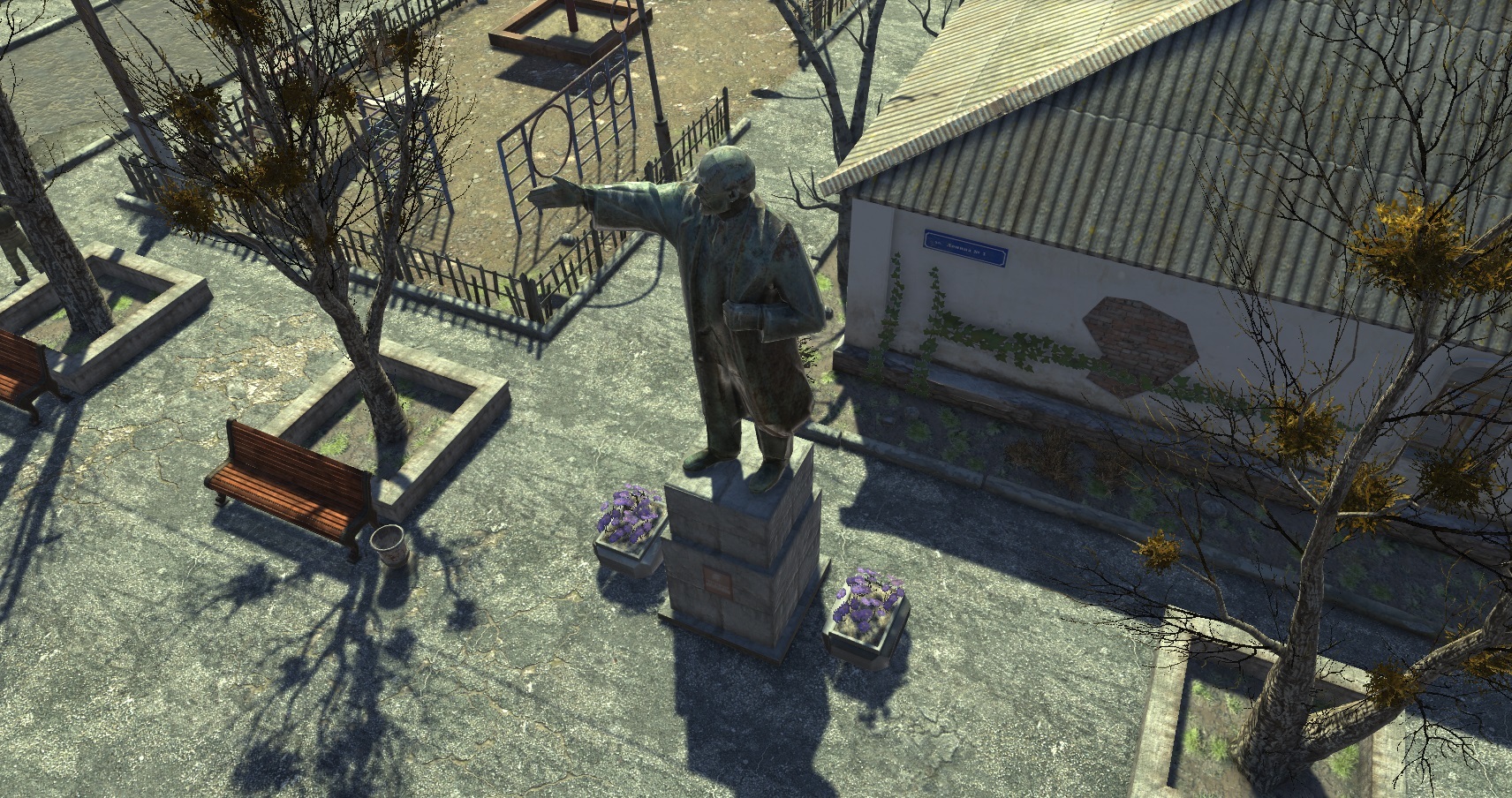
07ab92cb8682b8eac8363a894455a00393ca5219.jpg

Russian-made Fallout clone that raised 33k on Kickstarter, a fraction of what Queen's Wish raised. Decent quality 3D graphics with a distinct post-soviet style to them.

ss_cb22ebe32f210cad8d2c252a47e800bb9d05a958.1920x1080.jpg

Cheap indie RPG made by a one-man team. Doesn't look great, but doesn't look terrible either. The visuals are decent enough, and most importantly, the choices of colors are harmonious enough to not be hard on the eyes. The proportions of objects look right and the perspective is fine, too. This is what low budget indie should look like.

ss_8876e369f482723c980b86dd54b6f42d175f9c5e.1920x1080.jpg

Game made by a single Serbian madman. Characters and environments blend in well with each other. Again, colors are tasteful enough that they don't hurt your eyes. The tilesets themselves aren't that high quality either but it still looks atmospheric due to a good use of lighting. Whoever was responsible for the art direction knew what he was doing and used the limited resources to good effect.

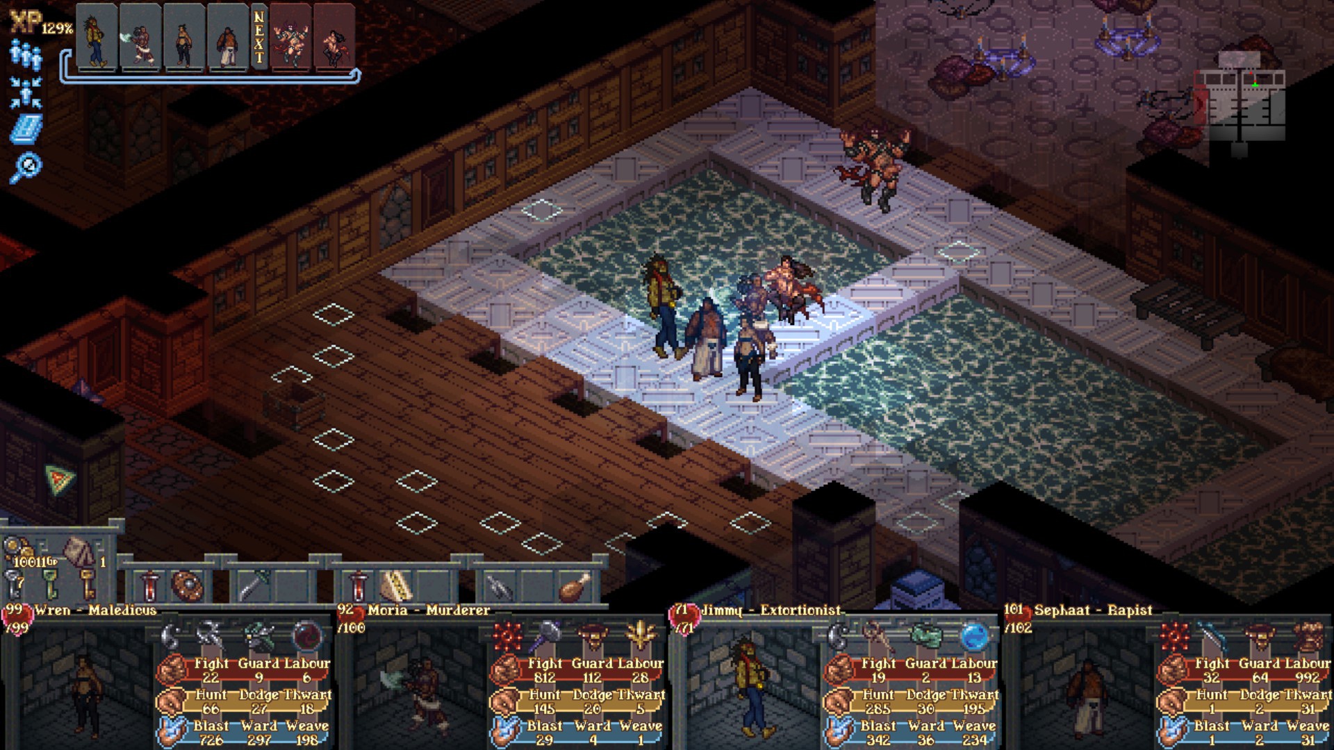
armand_bastardbonds-combat01.jpg

A lite RPG with a story that feels like it was first written as an erotic fanfic. Yet the visual style of it is pretty damn decent. Characters and environments fit well to each other, the tileset has a tasteful choice of colors, and just like with Underrail, skillful use of lighting lends it a nice atmosphere.
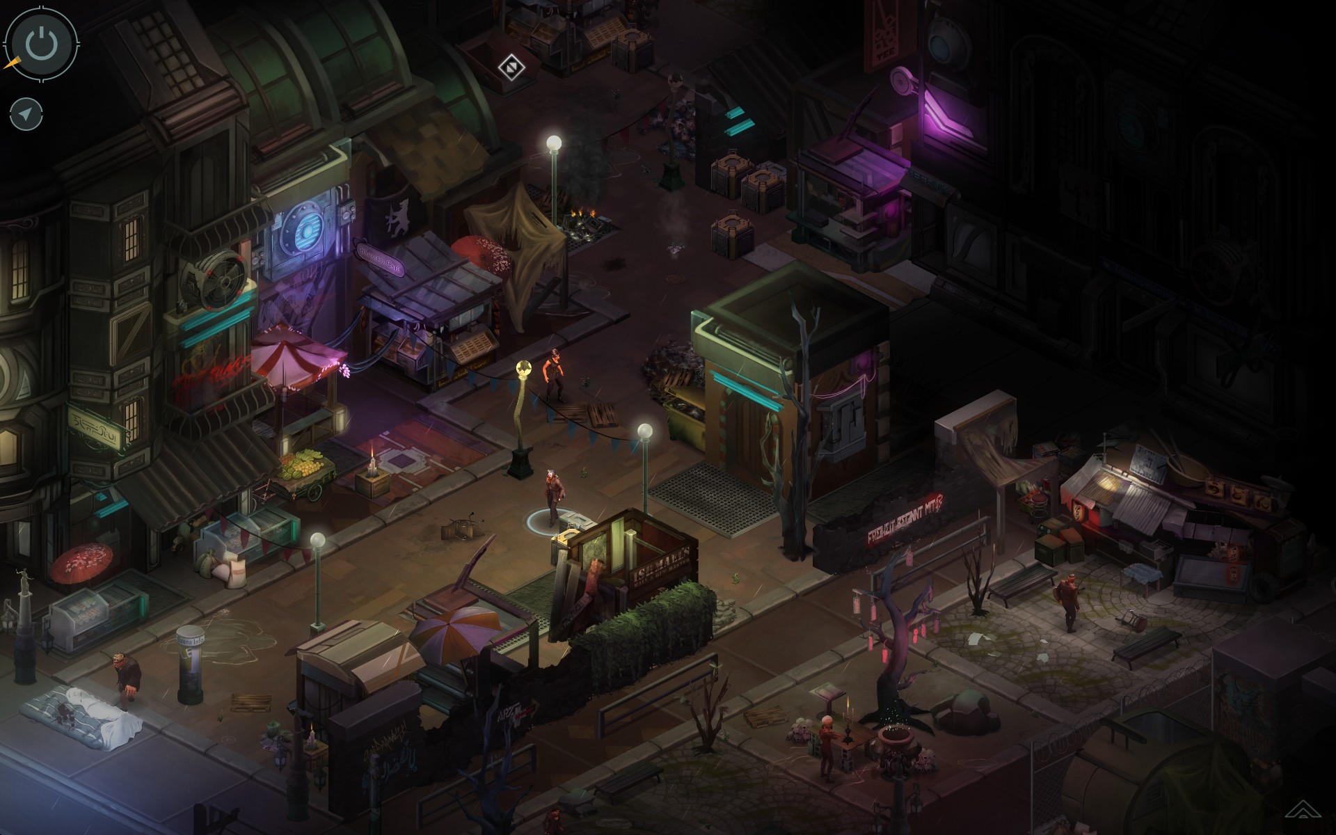
shadowrun_general_shot.jpg

Bit of an unfair comparison because Shadowrun Returns had a much larger budget than any of Vogel's games, but the same principle applies. The devs made 3 games on that engine, re-using their high quality assets in each one. Nobody ever complained about asset re-use there, because the visuals just look fucking great. High quality tileset combined with low poly 3D characters for a greater variety of equipment displayed on the characters. High quality 2D + 3D characters is truly the best choice. Yes, those high quality assets weren't cheap, but if you re-use them for future games it's an investment that pays off. Also, since Vogel somehow made the choice of shitty perspective for Queen's Wish because he wants to port the game to tablets and phones: this game was also officially released on Android platforms.

ss_54b9d2071efa8c012a1ae5d70f55dded88acadba.1920x1080.jpg

Zombie survival RPG. Like in Shadowrun, it uses 2D environments with 3D characters for greater flexibility. Again, it doesn't have super top AAA quality tilesets, but the tilesets are tastefully colored and give off a nice vibe fitting to the zombie apocalypse setting. It looks simple, but it looks beautiful. It also looks very clean and not messy at all. One glance at the screen lets you easily spot everything that is of interest: buildings, objects, NPCs, etc.

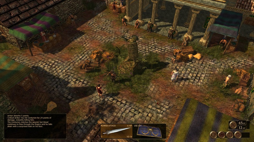
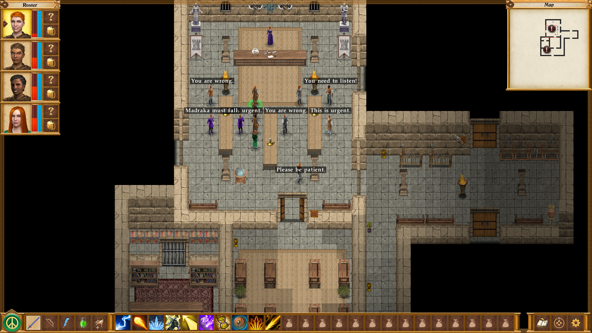
Meanwhile, Queen's Wish:
ss_753b959306aaf1178e4b4f14286027235cbe6866.1920x1080.jpg

Really, Jeff? Really? A messy perspective that's hard to read, character models that don't blend well with the environment (in fact, they don't blend at all - they look like they're drawn from a wholly different perspective), assets that look like they could be sold as an RPG Maker asset package, character portraits that look like Poser 3D models people on DeviantArt use for cheap fetish art. People have said for years that they'd like you to use a better artstyle, and this is what you're going for? This is the kind of visual style a Kickstarter that makes almost 100k gets you? Which is more than twice the amount of money ATOM RPG's Kickstarter brought in, mind you.

How is this in any way justifiable?

In comparison to those other games which also had budget limits, this looks like a cheap RPG Maker game with assets that don't fit together. These other games look like someone sat down, said "I want my game to look like this", and then gave his artists precise instructions; these artists then worked together to make their assets all blend in well with the overall art direction. This looks like a bunch of random, disjointed elements slapped together willy-nilly with no regard to the overall impression they're supposed to have on the player. Some elements of it, like the samey Poser 3D looking character portraits, even look cheap, like someone just went with the cheapest option that required the least amount of effort.

Look at all the other games I posted screenshots of above, Jeff.

Can you still justify your artstyle in face of those?
 

Lord_Potato

Arcane
Glory to Ukraine
Joined
Nov 24, 2017
Messages
10,913
Location
Free City of Warsaw
Examples of games on the same or lower budget than Jeff Vogel's which manage to look better:

armand_bastardbonds-combat01.jpg

A lite RPG with a story that feels like it was first written as an erotic fanfic. Yet the visual style of it is pretty damn decent. Characters and environments fit well to each other, the tileset has a tasteful choice of colors, and just like with Underrail, skillful use of lighting lends it a nice atmosphere.

ss_54b9d2071efa8c012a1ae5d70f55dded88acadba.1920x1080.jpg

Zombie survival RPG. Like in Shadowrun, it uses 2D environments with 3D characters for greater flexibility. Again, it doesn't have super top AAA quality tilesets, but the tilesets are tastefully colored and give off a nice vibe fitting to the zombie apocalypse setting. It looks simple, but it looks beautiful. It also looks very clean and not messy at all. One glance at the screen lets you easily spot everything that is of interest: buildings, objects, NPCs, etc.

Hey, JarlFrank, what are those two games? They look nice, might try them out!
 

Bad Sector

Arcane
Patron
Joined
Mar 25, 2012
Messages
2,334
Insert Title Here RPG Wokedex Codex Year of the Donut Codex+ Now Streaming! Steve gets a Kidney but I don't even get a tag.
Perhaps Vogel doesn't have the skill and ability for that art? I mean, he wrote in that article that Queen's Wish artstyle is a meant to evoke the style of Exile but Exile's art style is very different from Queen's Wish. Maybe he just cannot distinguish between the two?
 

biggestboss

Liturgist
Joined
Feb 16, 2017
Messages
528
Examples of games on the same or lower budget than Jeff Vogel's which manage to look better:

armand_bastardbonds-combat01.jpg

A lite RPG with a story that feels like it was first written as an erotic fanfic. Yet the visual style of it is pretty damn decent. Characters and environments fit well to each other, the tileset has a tasteful choice of colors, and just like with Underrail, skillful use of lighting lends it a nice atmosphere.

ss_54b9d2071efa8c012a1ae5d70f55dded88acadba.1920x1080.jpg

Zombie survival RPG. Like in Shadowrun, it uses 2D environments with 3D characters for greater flexibility. Again, it doesn't have super top AAA quality tilesets, but the tilesets are tastefully colored and give off a nice vibe fitting to the zombie apocalypse setting. It looks simple, but it looks beautiful. It also looks very clean and not messy at all. One glance at the screen lets you easily spot everything that is of interest: buildings, objects, NPCs, etc.

Hey, JarlFrank, what are those two games? They look nice, might try them out!
Bastard Bonds is the first one. IIRC it is a NSFW game.

Second one I think is Project Zomboid but not 100% because I've never played it.
 

Dayyālu

Arcane
Joined
Jul 1, 2012
Messages
4,633
Location
Shaper Crypt
But then he decided that rather than improving what he achieved, he wants to bring it all down and make a game with aesthetics of a jrpg.

I'm hard pressed to find even RPGmaker games with such poor art direction.

Hasn't Jeff said that at one point he made quite a bit of cash ("life-changing money") off one of his games?

Infinitron got it: Vogel after crapping on Steam for years managed to get in, and in that era of higher-level curation his games got a shitton of sales by being essentially the best of his catalogue. After indiepocalypse got in and his quality steadily declined, he probably never made the same amount of money (thus the endless blogposting crying about the "indiepocalypse" but HE IS TOTALLY FINE GUYS INDUSTRY VETERAN IT IS THOSE YOUNGSTERS THAT HAVE TO WORRY). I'd have to dig out the posts, but the 180 after he got on Steam and realized fuck this is going to get me a load of cash was amusing. Nowadays his games don't have a niche anymore (we got the RPG Kickstarter craze, Steam is flooded with cheapo games that are better than his last titles) and he probably trucks on brand loyalty.

Vogel's history is full of hating to take risks. Nethergate was risky: it didn't sold as much as he wanted and he complained for years that all that work has gone to waste and that he would never try something so "audacious" again (I mean, Nethergate with the two campaigns and the fake historical set-up is probably his second best work lorefag wise after Geneforge). Blades of Avernum was another "misstep" he sometimes talked about and never tried again after realizing that giving his players the development tools to make essentially the same games he was doing was nuking his endless remakes business plans.


Considering the sycophantic response to his post on Twitter, I don't think him reading feedback would change anything.

Something happened though. Remember, Vogel PROUDLY does not reply to fans. Does not read fan criticisms or forums. Fans are bad. Opinions are bad. They should be ignored. He's a professional. Feedback is bad.

qVsnct5.jpg
Yet I need to say GAMES IN MY YOUTH LOOKED SHITTY. STOP JUDGING. STOP.

Can you still justify your artstyle in face of those?

Truthfully, we're all approaching the thing from the wrong angle. Consider that Vogel, and this time I am not memeing, considers himself old and tired. He wants to optimize. Thus, why he went for the shittiest art style possible and Kickstarter?

+ Steam sales are probably slowing down heavily. He needs a new way to get money for certain and in advance, and if he can milk the audience by cutting down heavily on expenses and taking the extra Kickstarter money it's even better.

+ Getting good artists and keeping them (or getting non-Anglo artists for cheaper prices) is hard. Vogel is nowadays lazy. He goes for the minimum because he doesn't want to plan for art direction. He doesn't want better art. He doesn't need it. He needs terrible art that can be recycled ad infinitum (like in his previous entries) and he needs it to be fungible. There's some truth in his post, literally through the teeth: he doesn't want to pay again for more art assets, he doesn't want to plan for more art assets.

+ He's bored of the genre. Avadon has been perfunctory, derivative, and probably the worst of his gaming series. But he's a 25+ years old veteran that knows only to make retro RPG. We're not talking Illwinter or IronTower studios, with people with "real jobs" (pardon the term) on the side or with a burning passion: he wants the minimum and he wants it to pay the bills.

If you consider that the art style, more than a "ARTISTIC CHOICE" is merely a low effort for the maximum gain attempt, it makes sense. "BUT HE COULD GET SO MUCH MORE": yes, but he doesn't care. That would require risks. Effort. He doesn't want to risk or to work too hard on something. Literal wageslave mentality, and I am a wageslave, for sure I know!
 

thesecret1

Arcane
Joined
Jun 30, 2019
Messages
6,683
It's quite sad to see the man behind Geneforge fall so low. One has to ask what happened, because Geneforge didn't have this mentality. It had plenty of quite innovative ideas and was a curious take on the genre in its own right. Then again, you'd think that after getting its concept proven, he'd go bigger with it - take a loan if needed and hire some guys to take it to the next step, make proper graphics so that even casuals would give it a try - he really could have created a pretty big IP out of it, but he chose to just make more of the same instead.
 

JarlFrank

I like Thief THIS much
Patron
Joined
Jan 4, 2007
Messages
34,367
Location
KA.DINGIR.RA.KI
Steve gets a Kidney but I don't even get a tag.
Truthfully, we're all approaching the thing from the wrong angle. Consider that Vogel, and this time I am not memeing, considers himself old and tired. He wants to optimize. Thus, why he went for the shittiest art style possible and Kickstarter?

+ Steam sales are probably slowing down heavily. He needs a new way to get money for certain and in advance, and if he can milk the audience by cutting down heavily on expenses and taking the extra Kickstarter money it's even better.

+ Getting good artists and keeping them (or getting non-Anglo artists for cheaper prices) is hard. Vogel is nowadays lazy. He goes for the minimum because he doesn't want to plan for art direction. He doesn't want better art. He doesn't need it. He needs terrible art that can be recycled ad infinitum (like in his previous entries) and he needs it to be fungible. There's some truth in his post, literally through the teeth: he doesn't want to pay again for more art assets, he doesn't want to plan for more art assets.

+ He's bored of the genre. Avadon has been perfunctory, derivative, and probably the worst of his gaming series. But he's a 25+ years old veteran that knows only to make retro RPG. We're not talking Illwinter or IronTower studios, with people with "real jobs" (pardon the term) on the side or with a burning passion: he wants the minimum and he wants it to pay the bills.

If you consider that the art style, more than a "ARTISTIC CHOICE" is merely a low effort for the maximum gain attempt, it makes sense. "BUT HE COULD GET SO MUCH MORE": yes, but he doesn't care. That would require risks. Effort. He doesn't want to risk or to work too hard on something. Literal wageslave mentality, and I am a wageslave, for sure I know!

Yeah, I haven't followed his blogposts much but I do get that impression, too.

I've had the entire Avadon trilogy on Steam for a while now. Still stuck in the first or second chapter or whatever, cause I played some more interesting things in between and haven't really been motivated to continue this one since. Last time I played it was almost a year ago. Don't feel the urge to get back into it because of how bland it feels. It's got absolutely nothing outstanding about it. It's similar to his previous games except with less soul. Like he'd just gone through the motions of making an RPG, following the formula without putting any passion into it.

The encounters are lame and boring. Higher level enemies are bascially just HP bloated versions of their lower level counterparts. It's painfully linear. The characters are generic fantasy tropes. Meh.

This is so much in contrast to, say, Geneforge and a few of the Avernums, which had actually imaginative settings and somewhat interesting plots, along with choices and consequences for the player.

It's truly the game of a man who just doesn't care anymore. Pure blandness, pure formula.
 

passerby

Arcane
Joined
Nov 16, 2016
Messages
2,788
Queen's Wish look is a result of him listening to a loud minority of autists arguing that the original Exiles were his best looking games.
 
Last edited:

Dayyālu

Arcane
Joined
Jul 1, 2012
Messages
4,633
Location
Shaper Crypt
It's quite sad to see the man behind Geneforge fall so low. One has to ask what happened, because Geneforge didn't have this mentality.

One just needs to hear the man to understand what happened: again, he got scared. He has to pay the bills (and honestly, everyone has to do that, and he's a married man with a family and not a twentysomething living with his parents - no offense intended - and no expenses but just dreams and grit) and what he perceived as his "most experimental" games failed badly. It's also easy to forget that the last Geneforge is now ten years old.

For ten years, he has done just remakes and Bioware-lite games and they paid the bills. Queen's Wish is probably the most experimental thing he has done in ten years, and he wants to be entirely sure that's going to pay him back. So, Kickstarter. So, cutting every possible corner. So, zero risks.

The art style blog entry is bizzarre, but let's do for once some Academia-like work and comment on why he planned it so instead of what he says. His points are rambling and meaningless: his logic, as said on his interviews and previous blogposts, isn't. It's also fairly noticeable that the nature of the comments that triggered him aren't "the art sucks" but are "I can't get anyone to buy this because the art sucks".

Serious talk, in the real world a man has to get money and plan for retirement. Vogel has probably no marketable skills whatsoever (25+ years veteran of making games that nowadays can be made in two months by a bunch of chinks) and he has to plan carefully. He was never going to get extra people or plan bigger things or else: he isn't an entrepreneur and he managed to stay afloat for the peculiar age when he threw out his best games (the great RPG drought of the 00s). If Vogel was making games just, I dunnow, ten years later, he'll have a nice Steam page with 29 reviews, a three-page long thread on the 'Dex and he would be forgotten in six weeks.
 

JarlFrank

I like Thief THIS much
Patron
Joined
Jan 4, 2007
Messages
34,367
Location
KA.DINGIR.RA.KI
Steve gets a Kidney but I don't even get a tag.
It's quite sad to see the man behind Geneforge fall so low. One has to ask what happened, because Geneforge didn't have this mentality.

One just needs to hear the man to understand what happened: again, he got scared. He has to pay the bills (and honestly, everyone has to do that, and he's a married man with a family and not a twentysomething living with his parents - no offense intended - and no expenses but just dreams and grit) and what he perceived as his "most experimental" games failed badly. It's also easy to forget that the last Geneforge is now ten years old.

For ten years, he has done just remakes and Bioware-lite games and they paid the bills. Queen's Wish is probably the most experimental thing he has done in ten years, and he wants to be entirely sure that's going to pay him back. So, Kickstarter. So, cutting every possible corner. So, zero risks.

The art style blog entry is bizzarre, but let's do for once some Academia-like work and comment on why he planned it so instead of what he says. His points are rambling and meaningless: his logic, as said on his interviews and previous blogposts, isn't. It's also fairly noticeable that the nature of the comments that triggered him aren't "the art sucks" but are "I can't get anyone to buy this because the art sucks".

Serious talk, in the real world a man has to get money and plan for retirement. Vogel has probably no marketable skills whatsoever (25+ years veteran of making games that nowadays can be made in two months by a bunch of chinks) and he has to plan carefully. He was never going to get extra people or plan bigger things or else: he isn't an entrepreneur and he managed to stay afloat for the peculiar age when he threw out his best games (the great RPG drought of the 00s). If Vogel was making games just, I dunnow, ten years later, he'll have a nice Steam page with 29 reviews, a three-page long thread on the 'Dex and he would be forgotten in six weeks.

But see, this is what's so baffling about it all. He could just take a look at some games that are successful right now, in the indie scene. Games like the ones I posted screenshots of above. Maybe he could read some forum discussions.

Thing is, if he recognized that a good artstyle (not expensive art, just good art) and a soundtrack - let's not forget that not a single one of his games has music, even though generally it is expected for games to have soundtracks, even 2 dollar games on Steam have soundtracks - goes a long way into attracting a broader audience, he could easily make bank and secure his retirement with little effort at all.

But he fails to recognize one of the most simple, most obvious things. It's like he's a brick wall resistant to learning anything at all. It's not rocket science that appealing presentation attracts more potential customers, who will then become loyalists if the actual content is good, too.
 

thesecret1

Arcane
Joined
Jun 30, 2019
Messages
6,683
It's quite sad to see the man behind Geneforge fall so low. One has to ask what happened, because Geneforge didn't have this mentality.

One just needs to hear the man to understand what happened: again, he got scared. He has to pay the bills (and honestly, everyone has to do that, and he's a married man with a family and not a twentysomething living with his parents - no offense intended - and no expenses but just dreams and grit) and what he perceived as his "most experimental" games failed badly. It's also easy to forget that the last Geneforge is now ten years old.

For ten years, he has done just remakes and Bioware-lite games and they paid the bills. Queen's Wish is probably the most experimental thing he has done in ten years, and he wants to be entirely sure that's going to pay him back. So, Kickstarter. So, cutting every possible corner. So, zero risks.

The art style blog entry is bizzarre, but let's do for once some Academia-like work and comment on why he planned it so instead of what he says. His points are rambling and meaningless: his logic, as said on his interviews and previous blogposts, isn't. It's also fairly noticeable that the nature of the comments that triggered him aren't "the art sucks" but are "I can't get anyone to buy this because the art sucks".

Serious talk, in the real world a man has to get money and plan for retirement. Vogel has probably no marketable skills whatsoever (25+ years veteran of making games that nowadays can be made in two months by a bunch of chinks) and he has to plan carefully. He was never going to get extra people or plan bigger things or else: he isn't an entrepreneur and he managed to stay afloat for the peculiar age when he threw out his best games (the great RPG drought of the 00s). If Vogel was making games just, I dunnow, ten years later, he'll have a nice Steam page with 29 reviews, a three-page long thread on the 'Dex and he would be forgotten in six weeks.
That's the thing, though. If you spend 25+ years doing something, and end up being no better than a bunch of chinks because you had your head stuffed up your ass for most of that time and decidedly refused to improve, then it's no wonder you don't have anything in your retirement fund. Had he taken the plunge and took the risk (and I don't think rebooting Geneforge with a new plot and ATOM-tier graphics would be too risky, as the concept of the game had been proven time and time again), we'd probably be having a subforum just for him and he'd make bank. Hell, he could kickstart the damn thing just to offset the risk even more – there are plenty of people who'd back such a thing. Instead he's choosing to be a low effort chickenshit. BTW I'm not some NEET staying in my parent's basement, I have my share of bills to pay as well.
 

Drowed

Arcane
Joined
Dec 28, 2011
Messages
1,744
Location
Core City
But he fails to recognize one of the most simple, most obvious things. It's like he's a brick wall resistant to learning anything at all. It's not rocket science that appealing presentation attracts more potential customers, who will then become loyalists if the actual content is good, too.

Exactly, that's what surprises me the most. If his point is that he has an already captive audience that will buy his games "no matter how the graphics look," then fine, I agree. But isn't that exactly the point? His audience will buy the game regardless of the presentation, which means that if he wants to expand (even if by just a little) this audience, he has to attract those outside of it. The most logical option for this would be to make then a more attractive game for those who don't know his work, not a game uglier than his last.

He could literally pick up Avadon's look, stretch out / double the resolution and pay someone to touch up everything to look presentable, and that's it. He would have a tileset for the next 3-4 of his games without any big problem, and better yet, a "compatible" tileset with a good part of his catalog that he could use for the remakes he likes so much. In every way possible, his choice for the look of the new game seems stupid, I don't get him.
 

As an Amazon Associate, rpgcodex.net earns from qualifying purchases.
Back
Top Bottom