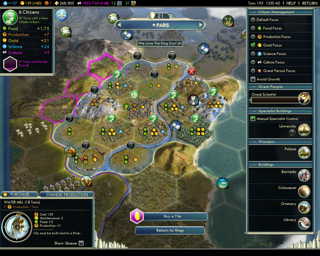
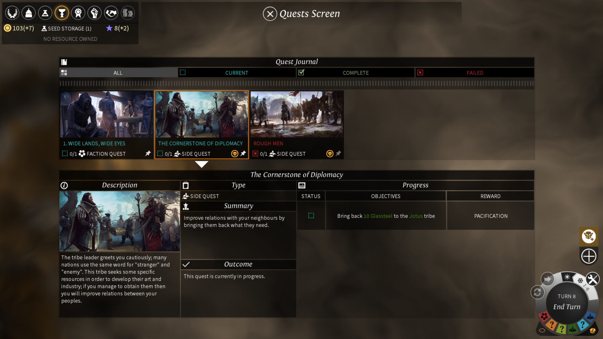
It's not.It really turns me on when fantasy elements are mixed with a distinctly modern touch, like the UI and the tilt shift. It's a cool design choice that gives it an entirely different feel than a regular fantasy UI would, and sets it apart from a lot of other 4X, in my opinion, simply because it is so cool.Interesting decision to go with a futuristic UI in a fantasy 4x.
And by interesting i mean stupid, since it probably won't sit well with a lot of people.
It's a really good UI. Very clean, very slick, easy to understand what is what. Functionality above all else.
Sure, usability is king, but a slight styling would have done wonders imo. It doesn't mesh well with the rest of the game.
Anyway, it wouldn't be a deal-breaker for me if i was interested, but i can imagine it would to some.
Fair enough. It seems i'm wrong in speculating that people don't like the UI. Maybe it's just me.
Out of curiousity, because I quite liked ES, I checked the gameplay on YT and this thing made me
 ten seconds in.
It's like Endless Space's UI was full of wood, gilding, green leaves and Schwabach font. It's like a mayo icecream or chocolate chicken. Otherwise the gameplay looked excellent.


