I promise, I will try to remedy that!The one thing I have to criticize at this point, and a very major criticism at at that, is the lack of cleavage and unacceptable size of tavern wench booba.

I promise, I will try to remedy that!The one thing I have to criticize at this point, and a very major criticism at at that, is the lack of cleavage and unacceptable size of tavern wench booba.
I disagree, no, and yes.

It’s more like that I have finally found that sweet spot I was searching for all these years. I may yet tweak things here and there, but I am mostly working on missing systems, refining existing ones and working on content now. The art direction is close to where I want it to end up.I won't judge an author's vision but the more you deviate from your original direction the more things clash together
Unless there's a new direction
just thoughts
It’s more like that I have finally found that sweet spot I was searching for all these years. I may yet tweak things here and there, but I am mostly working on missing systems, refining existing ones and working on content now. The art direction is close to where I want it to end up.

Well, if the end result is not the game I wanted to make, it doesn't matter if billboards speed up development or not. I might even argue that fewer 3D objects are needed to achieve the same variety I'd get with billboards. Rotate, scale, switch texture, combine. 3D assets are great for that.It's just that with advent of AI texture generation leaving billboard object pipeline behind seems strange when you can save so much time creating content now
3d pipeline also quadruples time spent on creating assets
Can't argue with thatWell, if the end result is not the game I wanted to make, it doesn't matter if billboards speed up development or not. I might even argue that fewer 3D objects are needed to achieve the same variety I'd get with billboards. Rotate, scale, switch texture, combine. 3D assets are great for that.
Also, AI is not touching this game's assets in any way. Ever.


Would it be possible to offer a "retro" mode to play without the more modern lighting effects? I guess not but I still like to ask.With billboard actors I can only push the gfx so farThank you for your reply. I see your point and understand the decision from a creative perspetive but alas I do miss the
stronger retro look very much. Yet I do hope this wonderful game isn't going the same road as Skald, losing piece of piece of it's retro look.
Btw, I don’t mind SKALD’s art direction at all. It’s still a properly old-school looking game.

Everything is possible with enough time spent tweaking things. I have already implemented various settings for the gfx, but I am keeping them locked out until I figure what the game needs.Would it be possible to offer a "retro" mode to play without the more modern lighting effects? I guess not but I still like to ask.With billboard actors I can only push the gfx so farThank you for your reply. I see your point and understand the decision from a creative perspetive but alas I do miss the
stronger retro look very much. Yet I do hope this wonderful game isn't going the same road as Skald, losing piece of piece of it's retro look.
Btw, I don’t mind SKALD’s art direction at all. It’s still a properly old-school looking game.

I know what you mean. I will probably have it off by default. There is a bak-like local map too. Basically a larger version of a mini map.Yes, I too feel like the game lost some of the retro aspect graphics wise when looking at the new screenshots, it's less BaK-like now. Still, the 3D looks ok too and allows for more graphical variety, just please don't take it too far.
Also I see there's a minimap now, I really hope that can be turned off. I competes with the player's attention and makes traveling into more of a "follow the minimap" game instead of actually navigating around the world. You could make a point that BaK also had a map, but you had to open it separately to glance at it to get a better idea of your surroundings. I feel like minimaps are a bit of a detriment as the minimap is always there so you end of following it rather than looking around yourself more.

You did give me foot for thought


JarlFrankYou did give me foot for thought


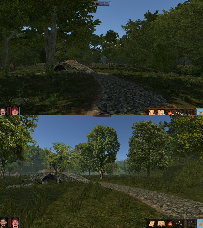
I like the terrain. But I don't like the portraits. The gentlemen in it do not have distinguished enough features. It's like they forgot how to draw a properly sized nose and full beard. And whats that? A Pirate hat? Do you even get to sail the high seas in this game?I've been pondering more about the new graphics. I can live with the 3D-elements (I actually think I understand your design decision about 3D) but I think I now know what's bothering me: It's the colors. The earlier version was generally brighter, but also there were more different nuances in the colors of the trees and between trees and landscape. In the latest version everything looks of a very similar green which makes the discernation more difficult and is less easy on the eye imho.


