Putting the 'role' back in role-playing games since 2002.
Donate to Codex
Good Old Games
  • Welcome to rpgcodex.net, a site dedicated to discussing computer based role-playing games in a free and open fashion. We're less strict than other forums, but please refer to the rules.

    "This message is awaiting moderator approval": All new users must pass through our moderation queue before they will be able to post normally. Until your account has "passed" your posts will only be visible to yourself (and moderators) until they are approved. Give us a week to get around to approving / deleting / ignoring your mundane opinion on crap before hassling us about it. Once you have passed the moderation period (think of it as a test), you will be able to post normally, just like all the other retards.

PompiPompi

Man with forever hair
Patron
Developer
Joined
Jul 22, 2019
Messages
4,224
RPG Wokedex
I am developing a Steam game called Golden Fall 2. It's an RPG game, with a rogue like battle mechanics.

I am adding more and more content, I am thinking of having 20 levels.
The question is... what should I expose in the trailer and screenshots.

The best parts are also the parts you want to be a surprise to the player.
So how do I choose what to expose the potential player to in the trailer and screenshots?

Do you mind if the important parts are revealed? As you won't remember most of it when reaching that place in the game?
What is a good store page/trailer/screnshots for a game as a player?

I know that as a developer, it might be better to make a sale rather than always 100% pleasing the player, but what do you think an RPG developer should do?

The game I am working on's Steam Page:
https://store.steampowered.com/app/1292410/Golden_Fall_2/
 

DalekFlay

Arcane
Patron
Joined
Oct 5, 2010
Messages
14,118
Location
New Vegas
I actually care more about spoiling how all the levels look than the story. Annoys me when reviews or tech examinations show later levels, because I want them to be a surprise visually. For story though... Hollywood probably put a ton of money into market research for trailers and they seem to spoil any story moment from the first half of the movie or so. I'd guess following a similar track wouldn't be the worst decision in the world.
 
Joined
Dec 5, 2010
Messages
1,620
Boobs.

6294-the-elder-scrolls-arena-deluxe-edition-dos-front-cover.jpg
 
Last edited:

Bony Hands

Literate
Joined
Aug 20, 2020
Messages
36
You both want to get players interested in your game and tell them how it plays without showing your whole hand. Your trailers left questions that haven't been answered, so maybe try addressing them and seeing how it works. You mentioned a skill system that likes you build your character the way you want, but you didn't show it off. This would be a good chance to show off any flashy abilities you have. You said the world is engaging, so show this. Are there certain types of traps or terrain, or can the NPCs do something neat? Show them off.
 

Morpheus Kitami

Liturgist
Joined
May 14, 2020
Messages
2,697
Anything around 15% of the way into it is fair game, excepting major story developments or gameplay twists. Hollywood may do that shit, but its fucked over more than one movie and you probably won't have the benefit of people reexamining it decades later. For the later stuff, anything that wouldn't be a massive spoiler, like a temple or a dragon or something that's very obvious to expect. Since your game is a generic chunk of rock, you might want to showcase any environmental diversity you have instead of just dumping a bunch of screenshots that, to the noob, might as well be the same screenshot.
 

Butter

Arcane
Patron
Joined
Oct 1, 2018
Messages
8,615
You should think of your trailer like a greatest hits of the game's first 2 hours. The early part of your game has to draw people in whether they've seen the trailer or not, so just pull from there. Plus you won't be spoiling any of the late game that way.
 

Falksi

Arcane
Joined
Feb 14, 2017
Messages
11,028
Location
Nottingham
Just show enough for people to get a feel for it.

Personally I'd avoid showing anything which you deem as a "surprise"
 
Joined
Oct 5, 2014
Messages
4,748
Location
New Zealand - Pronouns: HE/HIM
think of the greatest surprises in recent gaming memory and study how those games were marketed.

the one game that immediately comes to mind is Bioshock

the whole 'twist' was never revealed until the game was released

instead they focussed on the setting and gameplay in the marketing

food for thought?
 

Norfleet

Moderator
Joined
Jun 3, 2005
Messages
12,250
I'd say "everything", but in separated doses. Different potential target audiences look for different things, so figure out what your given target audience would like to see in your press release and make that press release push their buttons. As far as I know, people don't decide not to get a game because they heard too much about it, unless they heard something they didn't like, but, frankly, if you're hiding that information from them, it's going to come and bite you in the refund period anyway.
 

Doktor Best

Arcane
Joined
Feb 2, 2015
Messages
2,876
I actually care more about spoiling how all the levels look than the story. Annoys me when reviews or tech examinations show later levels, because I want them to be a surprise visually. For story though... Hollywood probably put a ton of money into market research for trailers and they seem to spoil any story moment from the first half of the movie or so. I'd guess following a similar track wouldn't be the worst decision in the world.

Thats like saying you should implement quest compass and level scaling because the suits of AAA productions know it works best.

They don't. They google Skyrim gross revenue, get a massive boner and tell their devmonkeys to replicate it.
 

orcinator

Liturgist
Joined
Jan 23, 2016
Messages
1,774
Location
Republic of Kongou
It should show enough to let the buyer know that this isn't just another RPG maker game.
ss_49f19b2d1ee2363318cdc55090706943950bd652.1920x1080.jpg

I don't think you're going to be able to pull this off.
 

PompiPompi

Man with forever hair
Patron
Developer
Joined
Jul 22, 2019
Messages
4,224
RPG Wokedex
It should show enough to let the buyer know that this isn't just another RPG maker game.
ss_49f19b2d1ee2363318cdc55090706943950bd652.1920x1080.jpg

I don't think you're going to be able to pull this off.

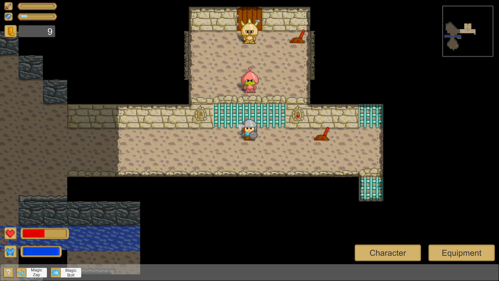
Visuals were improved since this screenshot.
Also there is nice animations that make it look nicer than what the screenshot can show.
I don't think it looks like an RPG make game, because it doesn't use all the assets most RPG Maker developers use.

Here is a newer screenshot of the same place:

DemoNewGraphics.jpg

Actually it's not that different, I see the previous picutre already had the per character shadows.
The main difference here is the fog of war.

But yea, things can yet be improved.
GUI can have more work, as it's not very well made right now.

But what else you think make this look bad?

Yea, but there are other things that can be improved.
Like levers don't have shadows, and some wall to gate transition is abuprt.
But the game gameplay wise is quite nice.
Visuals, there is room for improvement.
 
Last edited:

PompiPompi

Man with forever hair
Patron
Developer
Joined
Jul 22, 2019
Messages
4,224
RPG Wokedex
I might hire an artist eventually to replace the assets.
But I really don't want to buy assets that all look like the clones of the same Zelda game.
No matter how clean and well produced they are, they are extremely boring looking.

There are several aspects of assets.
One is production value.
But there is also a matter of creativity and "atmosphere design".

It's kind of like all those mobile games that have nice visuals but are all boring looking because of the art direction.

But perhaps, you are caught in the issues in the visuals.
Some issues are subconciously making the screenshot seem bad even if you don't notice them.

For instance, near almost all the gates, the walls have kind of a "wall corner" pixels that show that the wall is ending there.
The big gate doesn't have it, because I put the candles near it. It's an issue that I need to fix.
If the big gates had those corner walls with the candles, you might not have noticed, and it will look better to you.

Another issue is the ceiling "Stripes" I put next to walls, some of them are still not put very well, they have issues as well.

If I think all those things, you might not notice but the screenshot might look intuitively better.

Can you tell me how to improve the current visuals?
For instance, if I hire an artist and I want him to make new visuals based on my design?

Would you want a richer pallete?
Can you point out what the actual issues are?
 

J1M

Arcane
Joined
May 14, 2008
Messages
14,739
This is a tricky topic because basically all of the conventional wisdom is wrong. Also, you need to think about the entire store page. Not just the trailer.

Perfect example: conventional marketing says to hide your UI in your store screenshots. Players want to see the UI.

Personally, I skip any part of a trailer that is story related. So I end up skipping 100% of a lot of trailers.

Here is a video you will find helpful:


DraQ

Arcane
Joined
Oct 24, 2007
Messages
32,828
Location
Chrząszczyżewoszyce, powiat Łękołody
PompiPompi
Anyway, unless you are a big studio developing a sequel to a well established series that gets the players so pumped they might not even notice the game now sucks until about three installments in,
you need to think in an elevator pitch terms.

Potential player may spend about a minute on your store page if you're lucky. If you are extremely lucky, they might click the trailer. If you are humongously, unreasonably lucky, they won't quit watching about 10s in. Then depending on what you've said on the store page AND shown in the trailer/screenshots player may actually entertain buying your game, but only if you have managed to successfully convince them that they want it *specifically*.

Your task is to maximize that luck by telling prospective player as fast as possible why the fuck are they wasting their time on your store page.

For me it was maybe 15s and went like this:
  • I swiped the screenshot scrollbar
  • glanced at the description
  • closed the tab thinking "wtf another pointless generic indie turd".
 

As an Amazon Associate, rpgcodex.net earns from qualifying purchases.
Back
Top Bottom