Putting the 'role' back in role-playing games since 2002.
Donate to Codex
Good Old Games
  • Welcome to rpgcodex.net, a site dedicated to discussing computer based role-playing games in a free and open fashion. We're less strict than other forums, but please refer to the rules.

    "This message is awaiting moderator approval": All new users must pass through our moderation queue before they will be able to post normally. Until your account has "passed" your posts will only be visible to yourself (and moderators) until they are approved. Give us a week to get around to approving / deleting / ignoring your mundane opinion on crap before hassling us about it. Once you have passed the moderation period (think of it as a test), you will be able to post normally, just like all the other retards.

Game News Wasteland 2 Kickstarter Update #31: OMG DISTRIBUTION DEAL, also new HUD screenshots

Lancehead

Liturgist
Joined
Dec 6, 2012
Messages
1,550
You might not "care" about it, but that is a large part of what makes it look better to a lot of people or what makes websites look good instead of clusterfucky and all over the place, you'd know if you took a few design courses. xD

Arguing that a UI is a clusterfuck because it's not symmetrical comes across as arguing that a poem is no good because it doesn't rhyme.

It's more like using a monospaced font for codes because it increases the readability of various symbols.
 

Infinitron

I post news
Patron
Staff Member
Joined
Jan 28, 2011
Messages
99,628
Codex Year of the Donut Serpent in the Staglands Dead State Divinity: Original Sin Project: Eternity Torment: Tides of Numenera Wasteland 2 Shadorwun: Hong Kong Divinity: Original Sin 2 A Beautifully Desolate Campaign Pillars of Eternity 2: Deadfire Pathfinder: Kingmaker Pathfinder: Wrath I'm very into cock and ball torture I helped put crap in Monomyth
Underworld's UI was like that because computers of the time had trouble displaying the world in a larger window
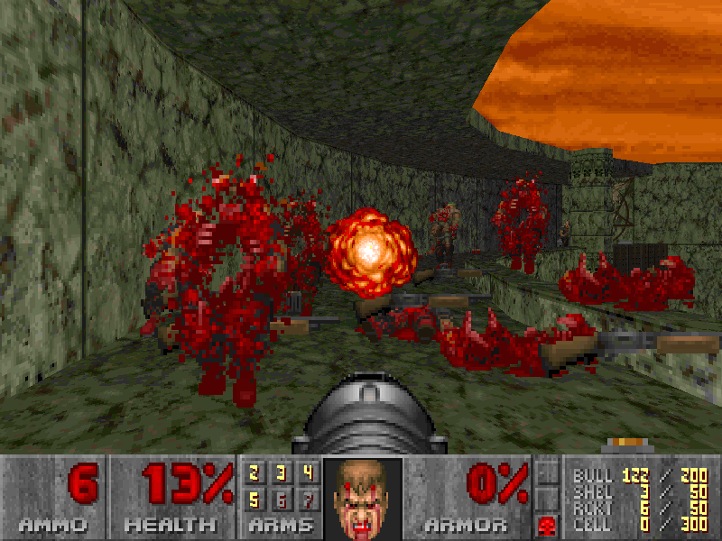
It came out the same year as Doom:
doom-via-wikia.png


First of all, no it didn't. It came out before Wolfenstein 3D.

Second, both Wolfenstein 3D and Doom were 2.5D games, created by Carmack who wanted to prove he could make a faster, more efficient first person game engine. The Underworlds were true 3D games.

Third, plenty of computers had trouble running Doom in full screen back in the day.
 

boltrek

Literate
Joined
Jun 29, 2013
Messages
33
Afaik Doom and Ultima Underworld used the same type of tech, 3D environments with 2D sprites for enemies/objects.
 

Curious_Tongue

Larpfest
Patron
Joined
Mar 2, 2012
Messages
11,905
Location
Australia
Codex 2012 Codex 2013 Serpent in the Staglands Codex USB, 2014
You might not "care" about it, but that is a large part of what makes it look better to a lot of people or what makes websites look good instead of clusterfucky and all over the place, you'd know if you took a few design courses. xD

Arguing that a UI is a clusterfuck because it's not symmetrical comes across as arguing that a poem is no good because it doesn't rhyme.

It's more like using a monospaced font for codes because it increases the readability of various symbols.

I don't know what you're talking about.
 

Infinitron

I post news
Patron
Staff Member
Joined
Jan 28, 2011
Messages
99,628
Codex Year of the Donut Serpent in the Staglands Dead State Divinity: Original Sin Project: Eternity Torment: Tides of Numenera Wasteland 2 Shadorwun: Hong Kong Divinity: Original Sin 2 A Beautifully Desolate Campaign Pillars of Eternity 2: Deadfire Pathfinder: Kingmaker Pathfinder: Wrath I'm very into cock and ball torture I helped put crap in Monomyth
Afaik Doom and Ultima Underworld used the same type of tech, 3D environments with 2D sprites for enemies/objects.


Doom was "2.5D", not 3D. You couldn't have a room over a room, for instance.
 

Dexter

Arcane
Joined
Mar 31, 2011
Messages
15,655
You might not "care" about it, but that is a large part of what makes it look better to a lot of people or what makes websites look good instead of clusterfucky and all over the place, you'd know if you took a few design courses. xD

Arguing that a UI is a clusterfuck because it's not symmetrical comes across as arguing that a poem is no good because it doesn't rhyme.
Bro there are several "design laws" as to how to make something look better to the human eye, the "law of symmetry" is one of them:
http://facweb.cs.depaul.edu/sgrais/gestalt_principles.htm
http://blog.usabilla.com/gestalt-laws-simplicity-symmetry-experience/

Look at the visual design of the Codex and notice how every post has three major vertical lines going down left from the avatar, then as a separation from the post and at the end.
There's also various horizontal lines ordering certain information and design elements.
Now imagine how it would look if every "page" or site button was a different size and not on the same line or how it would look if the size of every avatar would make the content of a post have a different width than any other poster.
 

Curious_Tongue

Larpfest
Patron
Joined
Mar 2, 2012
Messages
11,905
Location
Australia
Codex 2012 Codex 2013 Serpent in the Staglands Codex USB, 2014
You might not "care" about it, but that is a large part of what makes it look better to a lot of people or what makes websites look good instead of clusterfucky and all over the place, you'd know if you took a few design courses. xD

Arguing that a UI is a clusterfuck because it's not symmetrical comes across as arguing that a poem is no good because it doesn't rhyme.

It's more like using a monospaced font for codes because it increases the readability of various symbols.

I don't know what you're talking about.

I looked up monospaced font. I understand what you mean now.

Not the same thing. MF would be an industry standard that'd be impractical to break from.
 

Curious_Tongue

Larpfest
Patron
Joined
Mar 2, 2012
Messages
11,905
Location
Australia
Codex 2012 Codex 2013 Serpent in the Staglands Codex USB, 2014
You might not "care" about it, but that is a large part of what makes it look better to a lot of people or what makes websites look good instead of clusterfucky and all over the place, you'd know if you took a few design courses. xD

Arguing that a UI is a clusterfuck because it's not symmetrical comes across as arguing that a poem is no good because it doesn't rhyme.
Bro there are several "design laws" as to how to make something look better to the human eye, the "law of symmetry" is one of them:
http://facweb.cs.depaul.edu/sgrais/gestalt_principles.htm
http://blog.usabilla.com/gestalt-laws-simplicity-symmetry-experience/

Look at the visual design of the Codex and notice how every post has three major vertical lines going down left from the avatar, then as a separation from the post and at the end.
There's also various horizontal lines ordering certain information and design elements.
Now imagine how it would look if every "page" or site button was a different size and not on the same line or how it would look if the size of every avatar would make the content of a post have a different width than any other poster.

If I were asked to design a UI for some military tech, I'd play it safe and follow the general rules.

However, this is a game, a creative piece of work, and symmetry don't mean dick for either aesthetics or functionality.
 

Aeschylus

Swindler
Patron
Joined
Mar 13, 2012
Messages
2,543
Location
Phleebhut
Divinity: Original Sin Project: Eternity Wasteland 2 Divinity: Original Sin 2
However, this is a game, a creative piece of work, and symmetry don't mean dick for either aesthetics or functionality.
o_O

Symmetry means *everything* for aesthetics (well, in combination with line, pattern, and contrast). Functionality is another matter.
Just because something is a creative work doesn't give it license to be technically incompetent -- just the opposite, in fact.
 

MasPingon

Arcane
Joined
May 13, 2007
Messages
1,919
Location
Castle Rock
Wasteland forums and other places that just gobble up everything don't count.
So basically...no place except for the Codex? Only on the Codex and NMA have the negative voices dominated. Anywhere else (our forums, Kickstarter comments, Facebook, NeoGAF, SA, GOG, RPGWatch, Canard PC, GameStar.de, it has been positive-to-mixed).


You want to know what is wrong with your game - you come to Codex or NMA. News at 11.

Or did you just said that positive feedback from retards on facebook implicate Codex ignorance?
 

Curious_Tongue

Larpfest
Patron
Joined
Mar 2, 2012
Messages
11,905
Location
Australia
Codex 2012 Codex 2013 Serpent in the Staglands Codex USB, 2014
What do you call it when someone is called out for their ridiculously narrow minded interpretation of what's right, and they respond by using a ridiculous example of the opposite of their interpretation?
 

FeelTheRads

Arcane
Joined
Apr 18, 2008
Messages
13,716
Is Dexter just an autistic fuck? Or is there something wrong with me for not caring about the symmetry of Fallout's UI?

Oh, well, if you don't care then I guess it must not be important. After all you're the ultimate authority in the matter. Or just a dumb fuck. Who knows.

P.S. Ultima Underworld's UI is awesome.
 

Curious_Tongue

Larpfest
Patron
Joined
Mar 2, 2012
Messages
11,905
Location
Australia
Codex 2012 Codex 2013 Serpent in the Staglands Codex USB, 2014
Is Dexter just an autistic fuck? Or is there something wrong with me for not caring about the symmetry of Fallout's UI?

Oh, well, if you don't care then I guess it must not be important. After all you're the ultimate authority in the matter. Or just a dumb fuck. Who knows.

I like the apparently non-symmetrical clusterfuck that is Fallout's UI. The very fact that I find it pleasing negates the ridiculously rigid rules of aesthetics being lectured to me.


P.S. Ultima Underworld's UI is awesome.

Looks like shit.
 

Dexter

Arcane
Joined
Mar 31, 2011
Messages
15,655
I like the apparently non-symmetrical clusterfuck that is Fallout's UI. The very fact that I find it pleasing negates the ridiculously rigid rules of aesthetics being lectured to me.
I'm not sure what you are talking about, I took it as an example of how a development team did this well (see all the green lines with UI elements being on the same line that your eye will follow as opposed to red ones) aside of a bit of incongruity at the right side.
 

boltrek

Literate
Joined
Jun 29, 2013
Messages
33
I liked Fallout's UI, every single part of it reeked of atmosphere and worked toward enforcing the feel of the world, especially the fact that all of it was like a device the Vault Dweller carried around. It was a work of pure world-building genius, not just a user interface.

Screw all the faggots criticizing it, I found it easy to use, I never once found myself thinking "Wow this UI sucks", there was maybe a few times of trial and error on some of the buttons, but nothing major. The way is reinforced the lore of the game made up for whatever perceived faults it had. It find it odd seeing spergs on the Codex sperging out as usual like it was the worst since the Holocaust.
 

FeelTheRads

Arcane
Joined
Apr 18, 2008
Messages
13,716
I like the apparently non-symmetrical clusterfuck that is Fallout's UI. The very fact that I find it pleasing negates the ridiculously rigid rules of aesthetics being lectured to me.

:retarded: So you just went ahead and slammed your head in the keyboard without even actually reading Dexter's post to see his comment about Fallout's interface.
And no, by symmetrical he didn't mean perfectly identical on both sides. And what you find "pleasing" has no fucking relevance.

Because you're a goddamn ignorant newfag pleb.


Looks like shit.

Of course it does. It should be made from cut-up googled photos like the W2 UI instead.
 

Curious_Tongue

Larpfest
Patron
Joined
Mar 2, 2012
Messages
11,905
Location
Australia
Codex 2012 Codex 2013 Serpent in the Staglands Codex USB, 2014
What do you call it when someone is called out for their ridiculously narrow minded interpretation of what's right, and they respond by using a ridiculous example of the opposite of their interpretation?

Reductio ad absurdem.

Thank you.

However, this is a game, a creative piece of work, and symmetry don't mean dick for either aesthetics or functionality.
o_O

Symmetry means *everything* for aesthetics (well, in combination with line, pattern, and contrast). Functionality is another matter.
Just because something is a creative work doesn't give it license to be technically incompetent -- just the opposite, in fact.

Can you elaborate a little more please?
 

As an Amazon Associate, rpgcodex.net earns from qualifying purchases.
Back
Top Bottom