Putting the 'role' back in role-playing games since 2002.
Donate to Codex
Good Old Games
  • Welcome to rpgcodex.net, a site dedicated to discussing computer based role-playing games in a free and open fashion. We're less strict than other forums, but please refer to the rules.

    "This message is awaiting moderator approval": All new users must pass through our moderation queue before they will be able to post normally. Until your account has "passed" your posts will only be visible to yourself (and moderators) until they are approved. Give us a week to get around to approving / deleting / ignoring your mundane opinion on crap before hassling us about it. Once you have passed the moderation period (think of it as a test), you will be able to post normally, just like all the other retards.

Tower of Nibiru - Turn-based Dungeon Crawler

Strange Fellow

Peculiar
Patron
Joined
Jun 21, 2018
Messages
4,241
Steve gets a Kidney but I don't even get a tag.
I like this game because whenever I see the thread title I pronounce it like this in my head
 

MalcolmR

Literate
Joined
Jul 16, 2023
Messages
48
I like the environment art style, as others have said I would most definately change the monsters to be more in keeping with the environment style.
I have a feeling the enemies will go through several iterations before looking right. And by the time I finish making all 100+ enemies, my standards will probably be so much higher that I'll want to redo them all!
 

MalcolmR

Literate
Joined
Jul 16, 2023
Messages
48
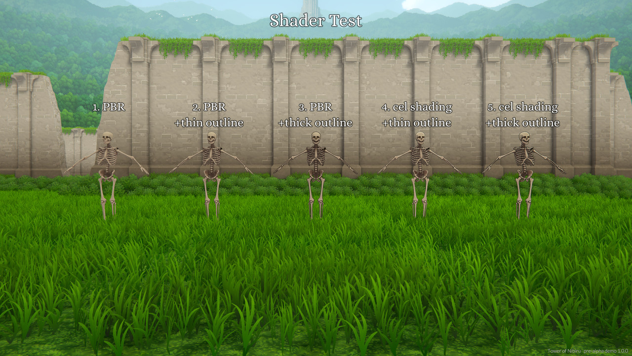
I've been messing around with my shaders to see if I can come up with a style that matches the environment. I want the enemies to be readable against any background, and since it's a stylized game, they should look fun and video-gamey rather than realistic. Feel free to chime in if you have any thoughts on 1-5.

To-N-Shader-Test.jpg
 

Modron

Arcane
Joined
May 5, 2012
Messages
11,141
The thin outline ones look best, I think I give the edge to 2 but would probably have to see them in motion to make a definitive statement that is if you're going to have idle animation of course.
 
Developer
Joined
Oct 26, 2016
Messages
2,288
I would have to see them all facing forwards same angle, but probably 2. Or 4. I don't see huge differences between those.
 
Joined
May 6, 2009
Messages
1,876,740
Location
Glass Fields, Ruins of Old Iran
1 can be hard to see
2 looks nice
3 is okay too but could stand out a bit too much depending on the surroundings
4 looks nice but cel shading could change the look of the game quite a bit, so more examples are needed
5 is a combo of 3 and 4
 

MalcolmR

Literate
Joined
Jul 16, 2023
Messages
48
The thin outline ones look best, I think I give the edge to 2 but would probably have to see them in motion to make a definitive statement that is if you're going to have idle animation of course.
I would have to see them all facing forwards same angle, but probably 2. Or 4. I don't see huge differences between those.
Yeah, 2 looks best and 4 seems similar.
1 can be hard to see
2 looks nice
3 is okay too but could stand out a bit too much depending on the surroundings
4 looks nice but cel shading could change the look of the game quite a bit, so more examples are needed
5 is a combo of 3 and 4

Thanks for the input guys! I'll focus on #2 for now, but I'll also keep experimenting with #4. My own impression is that #2 is a safer choice, but #4 is "cooler." In my next post, I'll use a different monster and I'll have them all facing the camera in an idle animation/pose.
 

MalcolmR

Literate
Joined
Jul 16, 2023
Messages
48
I have a few updates on the state of the game.

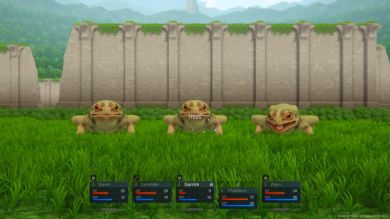
To-N-3-Toads.png


1. I've finished the Giant Toad. This one was a significant challenge because it inflicts two rare and fairly complicated status effects: grappled and engulfed.

The Grapple ability pulls you to the front row, prevents you from taking the row change or escape actions and makes every attack against you automatically hit. The grapple itself can be avoided with a reflex saving throw and it is broken if the grappler loses consciousness or if the grappled target is removed from the battlefield.

The Engulf ability allows a monster to swallow you, preventing you from targeting any creature except the engulfer and preventing you from being targeted by anyone. It also inflicts blindness, causing 50% of your attacks to miss (though I haven't indicated that yet in the UI). In addition, at the end of each round, you take "digestion" poison damage for a fixed amount and the engulfer is healed by the same amount. If the engulfer is killed, the engulfed target is immediately freed. If the engulfed target is killed while engulfed, its corpse remains inside the monster and cannot be revived until freed. Monsters with the Engulf ability have a set number of living players that they can hold at any given time. The Giant Toad can hold only one, but bigger monsters like bosses or mini-bosses can hold more. The Engulf ability can be resisted with a fortitude saving throw.

The giant toad has three abilities: Bite (basic attack, piercing damage), Tongue Grab (grapple, bludgeoning damage) and Swallow (engulf). It will only do Tongue Grab if it isn't currently grappling a target and it will only do Swallow on its currently grappled target.

So far, I've implemented 6 of the 14 status effects that I have planned. These were the hardest, but I expect Petrify and Confuse will also be pretty tough to implement.

2. I've implemented a "wounded" animation state for when an enemy is at low HP (less than 25%) or has a certain debilitating status effect. This was actually pretty easy to do in Unity. All I had to do was convert the "idle" state in the animator to a blend tree and add both idle and wounded to it. I could in theory interpolate between the sub-states based on HP, but I think it looks better to abruptly switch from one to the other.


To-N-Stones.png


3. The exploration/interaction system is now finished. There might still be some bugs, but I don't plan to introduce any new features, except maybe adding visible tiles to the minimap. Interactable objects are divided into containers, switches, signs and dialog trees (which also allow custom behavior). The exploration UI is now fully functional. You can equip items, spend skill points, use items and skills, etc., but I want to make it look a little better before showing it.

4. There is no town at the moment and there probably won't be one until after the release of the first demo. Instead, I have a healing spring by the entrance that restores HP/MP and revives fallen party members.
 

Shinji

Savant
Joined
Jan 10, 2017
Messages
377
Like the others have already mentioned, the environment looks really good. I like how the vegetation and stone structures blend together.
The lighting is really good too.

I also like what you did with the UI. It looks pretty clean and sharp.

By the way, in one of the screenshots I can spot a tower in the distance. I believe that is the end-goal of the game right? (i.e. "Tower of Nibiru")
Are you planning on having the player start on a far away location and by the end of the game they reach this tower? Or does most of the game takes place *inside* the tower?
 

MalcolmR

Literate
Joined
Jul 16, 2023
Messages
48
Keep up the good work, looks great!
Much appreciated!

I also like what you did with the UI. It looks pretty clean and sharp.
Glad you like it. I've been spending a lot of time on the other UI elements lately and my next batch of screenshots will probably show some new UI stuff. Even though my particular style of UI is fairly simple, it's very time-consuming for some reason and it's currently the main thing holding me back from releasing a pre-alpha demo.

Are you planning on having the player start on a far away location and by the end of the game they reach this tower? Or does most of the game takes place *inside* the tower?
Most of the game will take place inside the tower. The starting point is a town and the first five levels (the forest ruins environment from the screenshots) are the area between the town and the tower. The remaining 20 levels are all inside the tower, which is supposed to be massive and capable of holding several vastly different environments. To keep the game feeling fresh as you progress, I'm trying to create a strong contrast between areas. For example, the second area is the sewers of the tower and it has a very different feel and thematically different enemies.

If I can find the time and motivation, I'm also open to creating optional areas to make the game feel less linear.
 

MalcolmR

Literate
Joined
Jul 16, 2023
Messages
48
I've made some decent progress on Tower of Nibiru over the past few months. I've mainly been focusing on the UI and the battle system. I feel they're both in a pretty good spot now, but there's still a lot of work to do. Maybe I'll do a more detailed post on each of them later.

What I wanted to show today is the new art direction for the enemies. After some thought, I've concluded that procedural PBR texturing is not the right style for the enemies in my game. I love using Substance Painter for environments, but for enemies, the results felt bland and unappealing. Of course, this says more about my limitations as an artist than it does about PBR texturing.

Anyway, I decided to rewrite my toon shader to support a new, more flexible workflow. The idea is that I handpaint several black and white masks/maps in 3DCoat (probably the best software for handpainting) and then set the colors directly in the engine. I also have maps for lines/details and areas that are always in shadow, as well as options for how to blend lines with shadows. For example, I have an optional "negative line map" which will show lines/details in lit areas but erase shadows in shaded areas. It's a technique I noticed when studying 2d reference. I'm currently experimenting with normal maps and displacement maps to see if they can give me more control over the shape of the border between lit and shaded areas. I'm happy with the results so far, but I still need to test it with a wider variety of models to see how it holds up.

Pros:

-It's easy to experiment with colors in-engine without having to edit the texture files. Previously, I had to open the albedo map in an image editing program and make adjustments to the entire thing.
-Making a presentable texture set is much faster than before. In some cases, I think I could finish texturing a model in under an hour. It'll get even faster as I get more experience. The main bottleneck is figuring out where to draw extra lines and shading to imply form.
-Since the masks are just black and white with no gradient data (except anti-aliasing between black and white regions), they can be heavily crunch compressed down to almost nothing with no visible difference in quality. One full texture set would take up around 500kb in-build.
-The overall look is cleaner and more readable.

Cons:

-Since the textures are all black and white, it's impossible to really know what the end result will look like while I'm painting it.
-3DCoat is very buggy and crashes constantly, especially with the lasso paint tool. The painting features of 3DCoat appear to have been abandoned by the developers years ago in favor of the sculpting features, so it's unlikely there will ever be bug fixes.
-Since it's a toon shader with a 2D look, it might not blend perfectly with the 3D environment. I would either have to just accept this, or make some changes to the environment.


As usual, feedback is welcome.


Screenshots:

1. Mushrooms (new model, same rig/animations)

To-N-New-Mushrooms.png


2. Three Giant Toads (same model as before, new shader/textures)

To-N-New-Giant-Toads.png


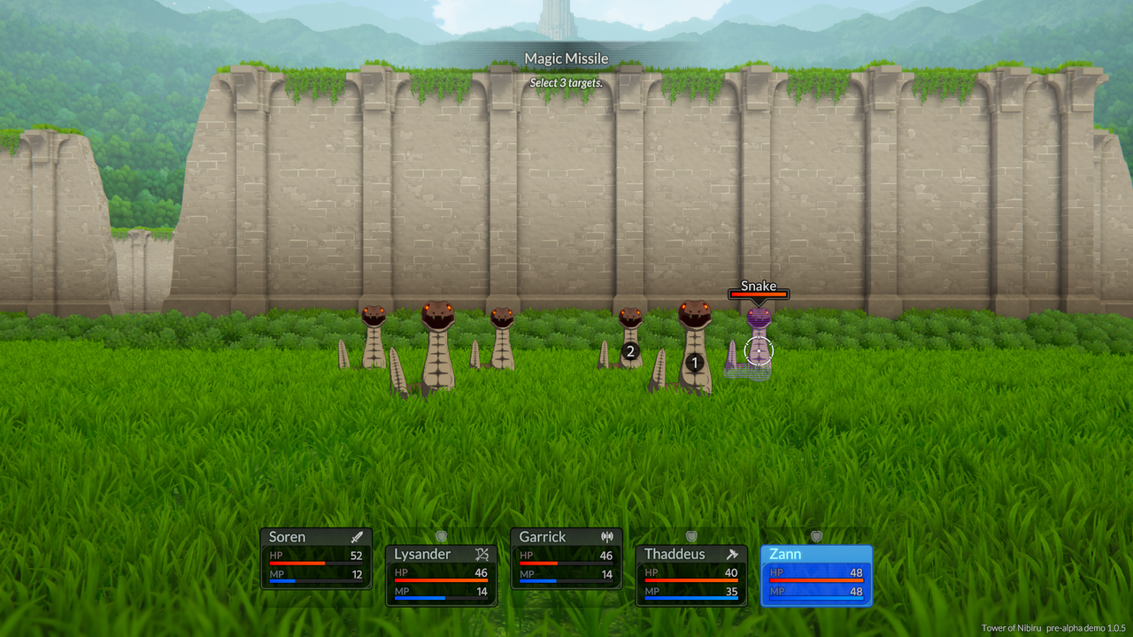
3. A group of Snakes using the new shader. I haven't posted this enemy before, so there's nothing to compare it to.

To-N-Snakes.png


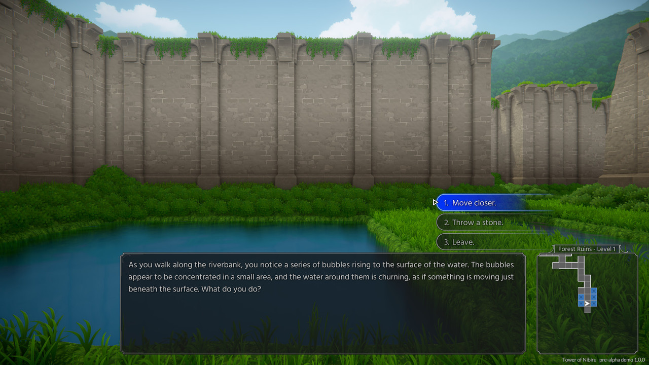
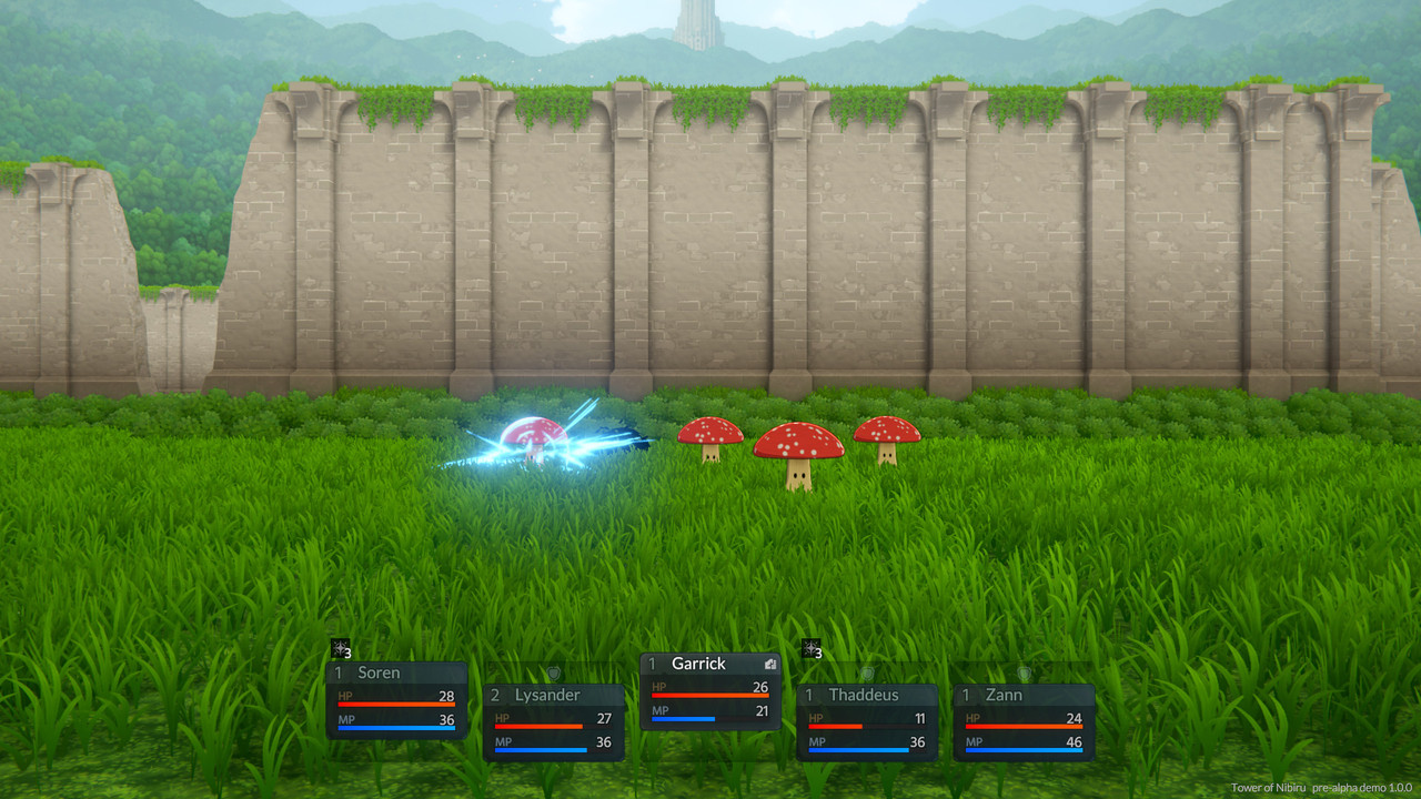
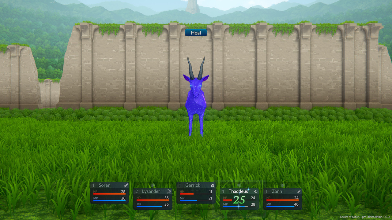
On a side note, the original five images I posted in this thread appear to have been removed. I definitely didn't delete them, so maybe there's a problem with PostImage's hosting. I can't edit my original post, so I'll include the images here for reference. Does anyone know what might have happened or have any advice on how to prevent this from happening again?

To-N-Exploration-1.jpg


To-N-Exploration-2.jpg


To-N-Dialog-Event.jpg


To-N-Battle-1.jpg


To-N-Battle-2.jpg
 

As an Amazon Associate, rpgcodex.net earns from qualifying purchases.
Back
Top Bottom