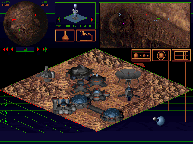
Putting the 'role' back in role-playing games since 2002.
Donate to Codex
Good Old Games
  • Welcome to rpgcodex.net, a site dedicated to discussing computer based role-playing games in a free and open fashion. We're less strict than other forums, but please refer to the rules.

    "This message is awaiting moderator approval": All new users must pass through our moderation queue before they will be able to post normally. Until your account has "passed" your posts will only be visible to yourself (and moderators) until they are approved. Give us a week to get around to approving / deleting / ignoring your mundane opinion on crap before hassling us about it. Once you have passed the moderation period (think of it as a test), you will be able to post normally, just like all the other retards.

Steam Banner

Which one would make you click on it in the store?

  • 1

    Votes: 8 15.7%
  • 2

    Votes: 9 17.6%
  • 3

    Votes: 10 19.6%
  • 4

    Votes: 0 0.0%
  • 5

    Votes: 1 2.0%
  • I like the old one better

    Votes: 25 49.0%
  • None of the above

    Votes: 6 11.8%

  • Total voters
    51
  • Poll closed .

MF

The Boar Studio
Patron
Developer
Joined
Dec 8, 2002
Messages
915
Location
Amsterdam
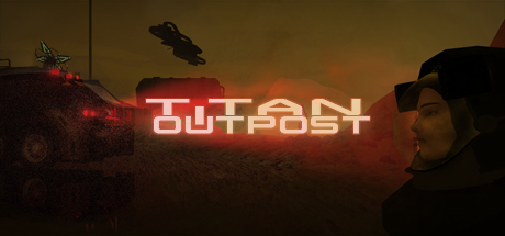
Steam Store information and screenshots updated and a new video with more gameplay is on its way.

I tried making a new capsule banner without the 'design language' constraints I had put upon myself and came up with this, with type based on the custom font that is used in-game..

1. I think this option looks best, but it feels a little generic.
CapsuleOption1.png


2. Same thing, but using the game's amber coloring scheme.
capsuleoption2.png


3. Brighter with reverse contrast so you can see what's going on at a glance. Looks worse but might be more eye-catching on Steam.
capsuleoption5.png


4. Alternatively agentorange's idea: A screenshot collage with a simplified take on the old logo. It should probably lose the background image altogether to be effective.
screenshotattempt.png


5. Another take on the collage. It's still very cluttered. The graphics don't scale down as well as Neo Scavenger's pixel art.
screenshotattempt2.png


Keep in mind that I'd much rather have a dedicated artist who specialises in paintings or book covers do the 'cover art', but that's not going to happen anytime soon.

Here's the old one for reference:
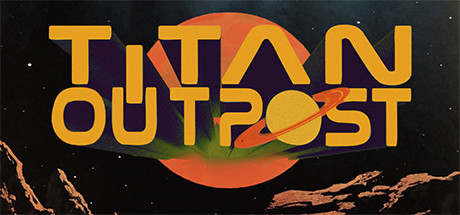
header.jpg


6. Elhoim's Edit.

index.php
 
Last edited:

Falksi

Arcane
Joined
Feb 14, 2017
Messages
11,033
Location
Nottingham
Just my opinion, but........

1. Too dark & lacklustre
2. Better, but the same issue as 1
3. Love it. Simple, stand out, dramatic, effective. WIN!
4. Too busy, can't be arsed to pick it apart.
5. Same as 4 but worse.

The old one is cool. I'd have that as a 2nd choice to Number 3
 

d1r

Single handedly funding SMTVI
Patron
Joined
Nov 6, 2011
Messages
4,328
Location
Germany
Change the background picture of the old one into something else than pixelated mess and you're fine.
 

V_K

Arcane
Joined
Nov 3, 2013
Messages
7,714
Location
at a Nowhere near you
1. Too dark & lacklustre
2. Better, but the same issue as 1
3. Love it. Simple, stand out, dramatic, effective. WIN!
4. Too busy, can't be arsed to pick it apart.
5. Same as 4 but worse.
Funny, I have the exact opposite impression. I absolutely hate nr. 3, all the bright colors jumping at you, looks very amateurish and actively annoying. Reminds me of an internet ad banner from the days of yore. And I find nr. 5 less cluttered than nr. 4. It is still cluttered, those screenshots should take less space and have clearer borders between them. But I'll also say that I like the background screenshot there more than in the other ones.
As for the first two, I don't think there's much difference between them - neither font color works very well for me.

So to sum it up:
3, 4 - definite no;
1, 2 - could work but change the font color, to something colder maybe. Alternatively, try using this composition with the background screenshot from nr. 5
5 - could work with additional screenshots made smaller.
 

Deleted Member 22431

Guest
It must be 1, 2 or 3. The title should be bigger though. I didn't like the font either.
 

Elhoim

Iron Tower Studio
Developer
Joined
Oct 27, 2006
Messages
2,880
Location
San Isidro, Argentina
upload_2020-1-9_12-52-27.png


Maybe like this? I added a small vignette effect on the edges, and highlighted the face and truck. I found the joined letter a bit confusing to read, so I separated them. Also fixed the line in the helmet so that she can breathe (probably the mesh not lining up). In any case, I'm not a proper 2D artist, but the main issue I've found was the very uniform lighting, making all of it samey.

Also a bit less saturated version:

upload_2020-1-9_12-54-51.png
 

Peachcurl

Arcane
Joined
Jan 3, 2020
Messages
10,701
Location
(╯°□°)╯︵ ┻━┻
I like the clear message of the old banner, hence I'd vote for that. The newer ones have too much stuff going on simultaneously.

My ideal vision of a banner would be:
*a shot on Titan, towards the horizon
*with Saturn in the Sky, and
*a single, small outpost building OR vehicle visible in the distance (no further human clutter, it's lonely up there!).

(PS: I'd like to note that I have no clue whether you can ever see Saturn from Titan.)
 

Plane Escapee

Your friend
Patron
Joined
Sep 11, 2015
Messages
221
Location
chair
Divinity: Original Sin 2 BattleTech Bubbles In Memoria A Beautifully Desolate Campaign Pillars of Eternity 2: Deadfire Pathfinder: Kingmaker Steve gets a Kidney but I don't even get a tag. Pathfinder: Wrath
I prefer the collage look overall. I agree with you that the background image should probably be changed.

Working from option 4, consider adding a thin, contrasting, stylized border separating each screenshot in the collage, replacing the 3D-model/face on the right with 2D concept art or stretching the collage screenshots and logo to take up the space where the background image with the face is at the moment, make the logo crisper by adding an outline to the letters.
 

Efe

Erudite
Joined
Dec 27, 2015
Messages
2,605
if 1-5 is you trying to do better than old one...
maybe dont try so hard?

i dont think 4-5 would be recognizable in a small banner either.
 

CappenVarra

phase-based phantasmist
Patron
Joined
Mar 14, 2011
Messages
2,912
Location
Ardamai
what's the image in the background (top-left) of option 5? it has punchy contrast but hard to say from the fragment

a single punchy screenshot like that + the original downsized (font+background works fine; coming from somebody who read the entire SF section of the small local library by the age of 15) is my gut feeling
 

MF

The Boar Studio
Patron
Developer
Joined
Dec 8, 2002
Messages
915
Location
Amsterdam
Great, it looks like there's consensus, the tyranny of choice is over! Oh, wait. Dang it.

Thanks for the input everyone.

Elhoim, good edits, thank you. Definitely an improvement highlighting the points of interest. The thin line in the helmet is a band of reflective material, but if you don't know it's there I suppose it does looks like a gap in the mesh. I'm leaning towards using your desaturated one right now and moving on, or relighting the scene based on your input.

However, I sat down with that person I met who does branding for Heineken. She dismissed the new stuff and thought my old logo hit all the marks. "Very crisp, 'consistent with the product's voice' and eye-catching". It needs proper framing, though, and she said that's really hard to do with a logo that is so tied to its own symbolism. The Saturn 'o' is obvious, but the other 'o' has to be orange because it represents Titan, which severely limits its versatility.

I'm also seeing a lot of support for the old logo here so I guess she has a point. Fact of the matter is, it looks cheap on Steam. Fuck me.

(PS: I'd like to note that I have no clue whether you can ever see Saturn from Titan.)

No, you can't.
There is a vista like that in the game, where you can just make out Saturn through the clouds from one of the highest mountain tops. It made it in through a bit of artistic license, because even in that situation it's unrealistic. 2077 is summer for the Titan North pole (a Saturnian orbit takes about 30 years), so the atmosphere would be slightly thinner at Doom Mons and Saturn could be visible. Barely. Maybe? Maybe. In any case, it's a bit of a stretch. The density of the atmosphere is one problem, but the biggest factor is sheer volume. Saturn would take up about a third of the sky, but you can't see it because the tholin haze on Titan extends about 300km from the surface.

If you can afford it, I'd always pay for someone to do a proper 2D banner. Something that stands out from the rest of the... well, shovelware.
I may have finally found someone who's confident in doing it, but he's not quoted me a price yet.

maybe dont try so hard?
All things considered, I spent more time on the old one. Maybe you're right.

what's the image in the background (top-left) of option 5? it has punchy contrast but hard to say from the fragment
It's a shot from when you visit the cryovolcano near the outpost. A recent water eruption (water is basically Titan's magma) instantly froze, creating an abstract ice scultpure. I'm proud of it, but I'm not sure if having just that is the most useful imagery. The shimmer and detail is also lost when scaled down. It would look something like this, although the composition doesn't lend itself well to placing a title.

newmockupcryo.jpg
 
Last edited:

Vault Dweller

Commissar, Red Star Studio
Developer
Joined
Jan 7, 2003
Messages
28,044
My 2 cents:

1) The first 3 banners don't tell me anything about the game. It could be a blocky indie shooter, an RTS, etc. I'm not suggesting that our banner is any clearer (or would impress any marketing agency) but it's easier to criticize someone else's stuff so...

2) The rest are way too busy and I don't think that anyone would understand what's going on there.

3) I'd agree with your Heineken friend that the old banner was charming, clear, and simple. So I'd leave it as is and focus on better screens that tell a story of how you play the game. And a video or two. And some articles about the game's concepts.

Bonus point: remember Sierra's Outpost? They butchered the mechanics but the marketing wasn't too bad.

Outpost%28sierra%29.jpg

^ the image makes it crystal clear that it's a space base-building game

outpost2.gif

^ makes it clear that managing this base is 'serious business'
 

AdolfSatan

Arcane
Joined
Dec 27, 2017
Messages
2,028
That looks like some weird creature. Had you not explained it, I would have never guessed what it is.

Don't like any of the banners so far.

Main culprit at having your original logo look cheap is the ungodly amount of photoshop layer filters you've applied. My suggestions, in case you care for them:

  • Get rid of whatever it is you put on the edges. You've already picked a soft and round typeface. They need to be sharp.
  • Get rid of the fades. Pick a solid, bold colour and stick to it. The O being orange makes sense to no one else but you. Without the explanation you posted before I would have assumed it was a designer's quirk.
  • You know what's prevalent in 70s sci-fi logos that's missing in yours? Dynamism. You might get way with it if it's a 5 letter word in pointy characters, but as it stands right now is outright boring. Tilt it, stretch it, warp it, do something.
  • That saturn O has nothing to do with 70s aesthetics. It looks too cutesy and rather reminds me of that time in the mid 2000's when everyone was doing 3d reflective buttons on ps.

Excuse me if I sound rough, I don't mean to be hurtful.
 

V_K

Arcane
Joined
Nov 3, 2013
Messages
7,714
Location
at a Nowhere near you
I'm proud of it, but I'm not sure if having just that is the most useful imagery. The shimmer and detail is also lost when scaled down. It would look something like this, although the composition doesn't lend itself well to placing a title.

index.php
I think this actually looks quite neat. You can use the space on the right to place two or three small screenshots (crop out the UI out of them to make them more readable in small versions).

Had you not explained it, I would have never guessed what it is.
And that's a good thing. It's intriguing.
 

KeighnMcDeath

RPG Codex Boomer
Joined
Nov 23, 2016
Messages
15,447
I'm proud of it, but I'm not sure if having just that is the most useful imagery. The shimmer and detail is also lost when scaled down. It would look something like this, although the composition doesn't lend itself well to placing a title.

index.php
I think this actually looks quite neat. You can use the space on the right to place two or three small screenshots (crop out the UI out of them to make them more readable in small versions).

Had you not explained it, I would have never guessed what it is.
And that's a good thing. It's intriguing.
Yeah not too bad.
 

Bigg Boss

Arcane
Joined
Sep 23, 2012
Messages
7,528
I like the clear message of the old banner, hence I'd vote for that. The newer ones have too much stuff going on simultaneously.

My ideal vision of a banner would be:
*a shot on Titan, towards the horizon
*with Saturn in the Sky, and
*a single, small outpost building OR vehicle visible in the distance (no further human clutter, it's lonely up there!).

(PS: I'd like to note that I have no clue whether you can ever see Saturn from Titan.)

iu


Probably not exactly like this but yes you can.
 

As an Amazon Associate, rpgcodex.net earns from qualifying purchases.
Back
Top Bottom