Devlog #8 Campaign map design goals

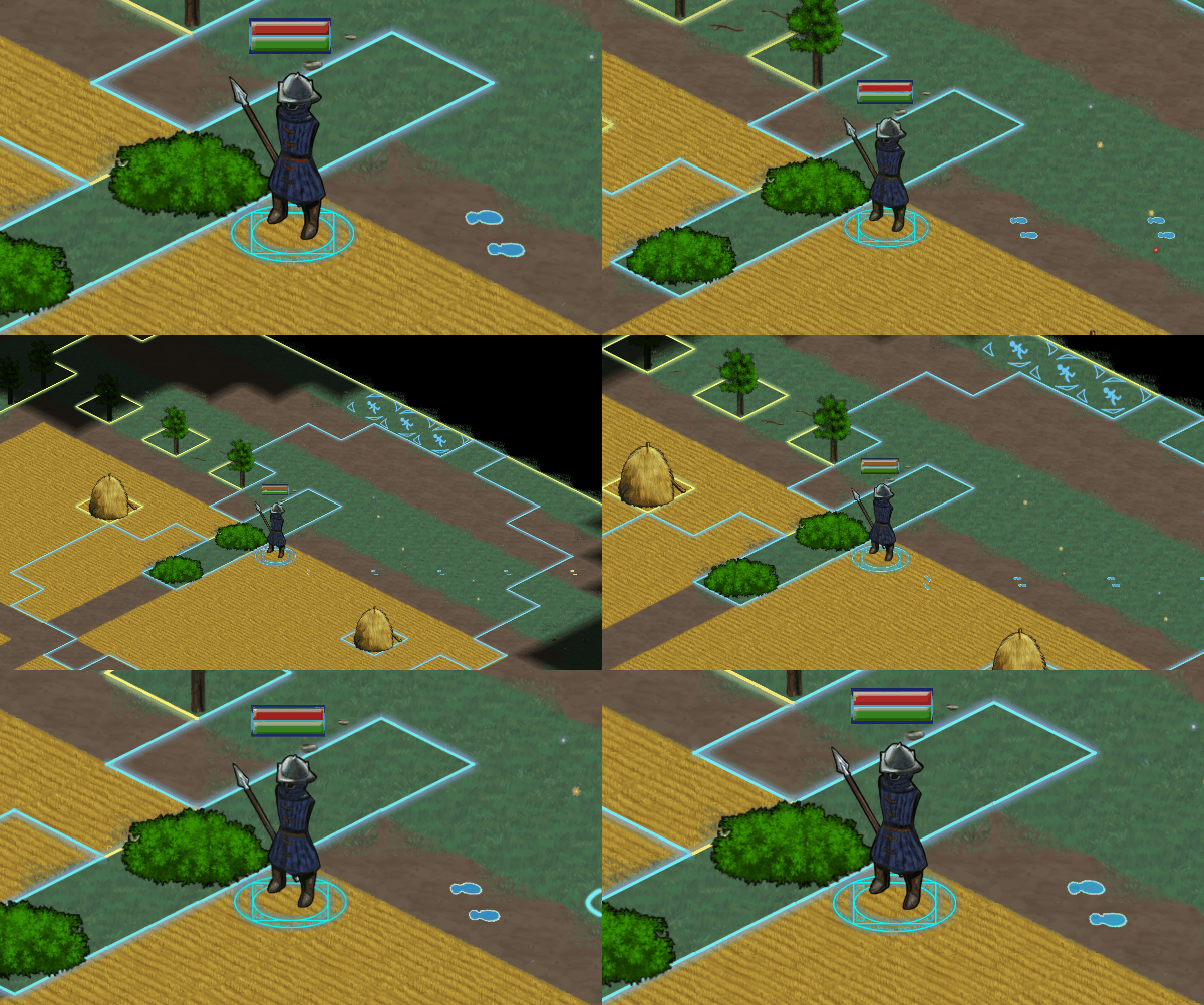
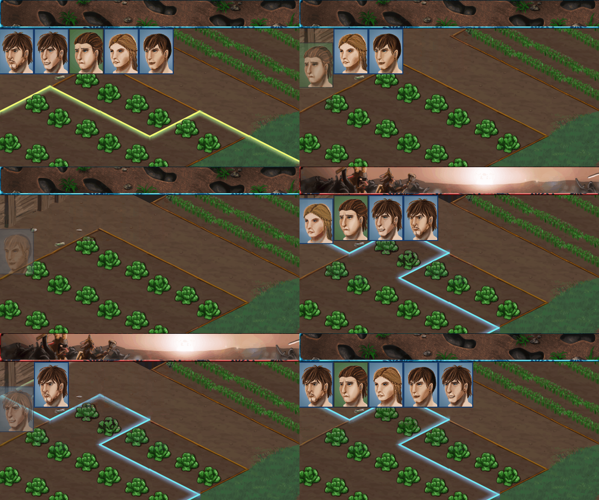
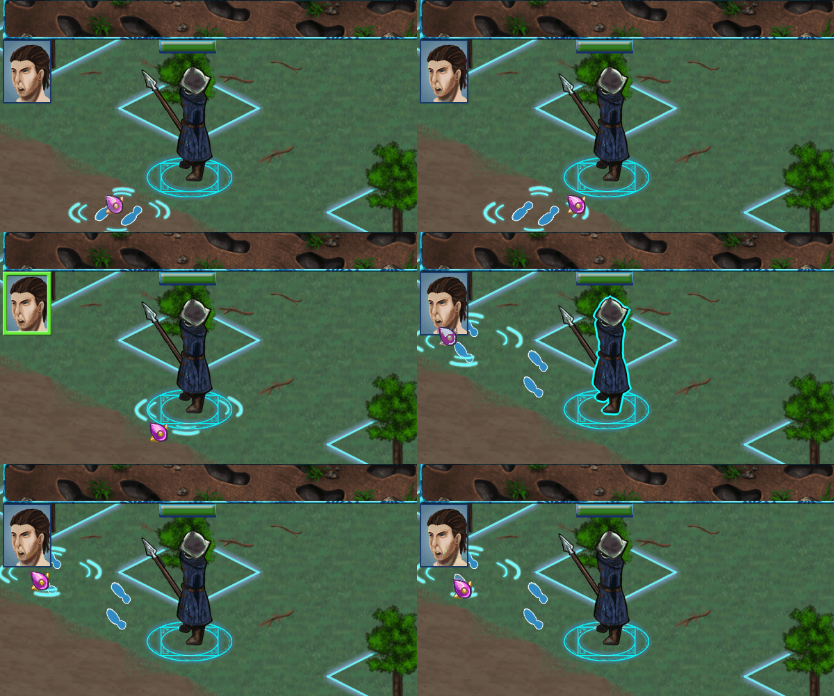
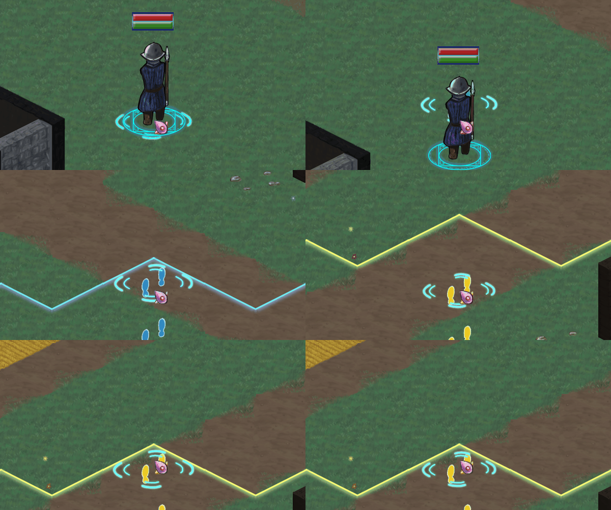
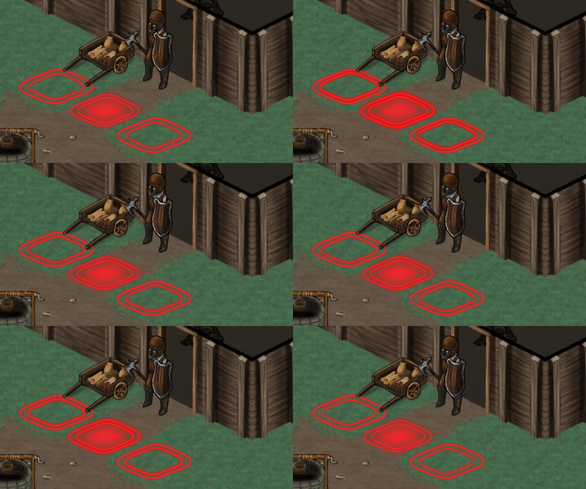
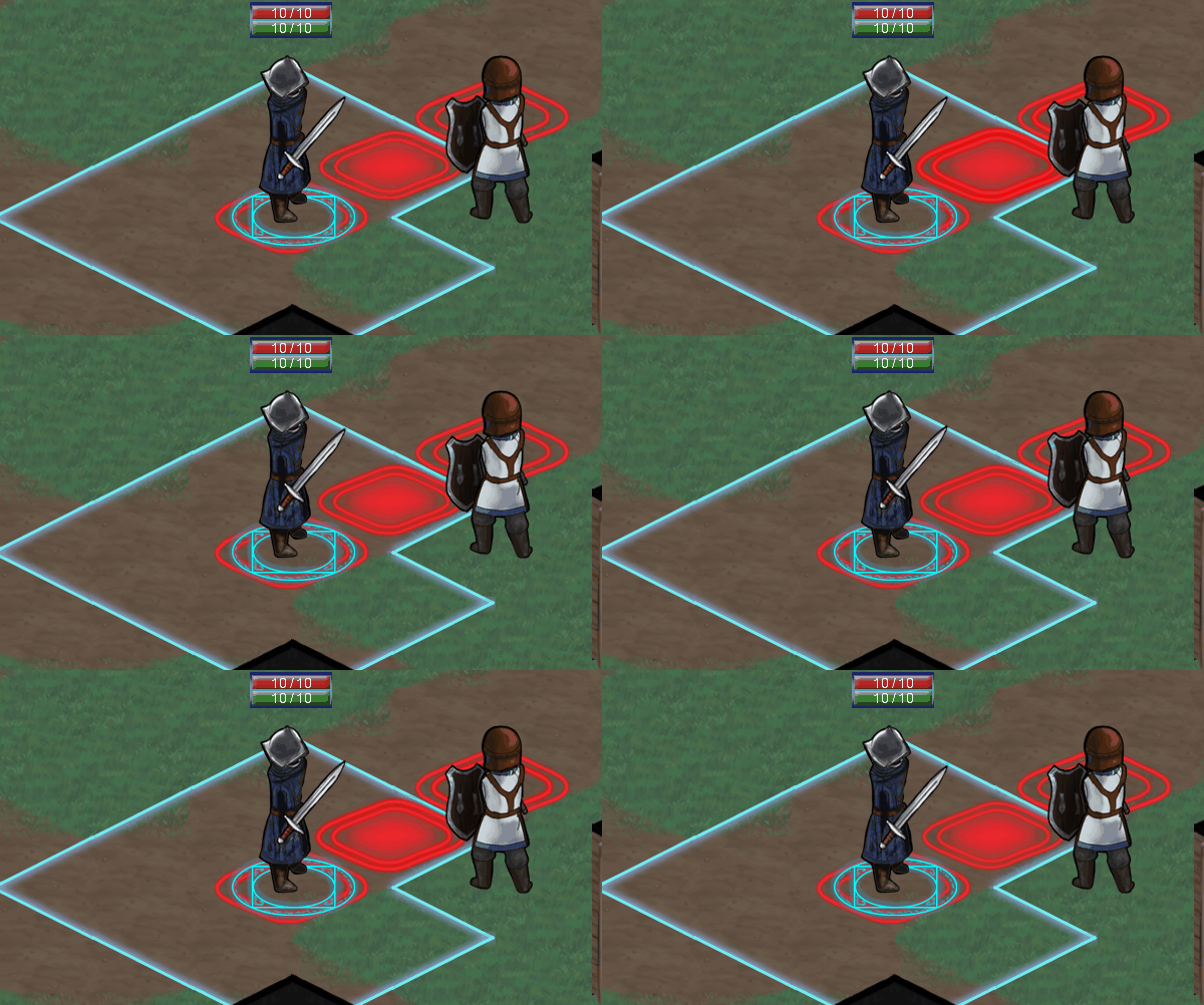
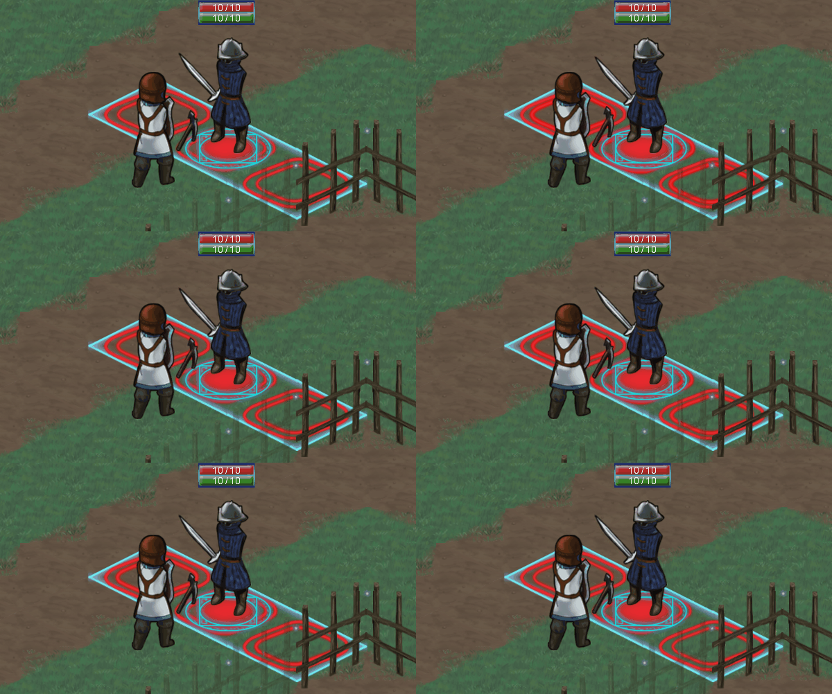
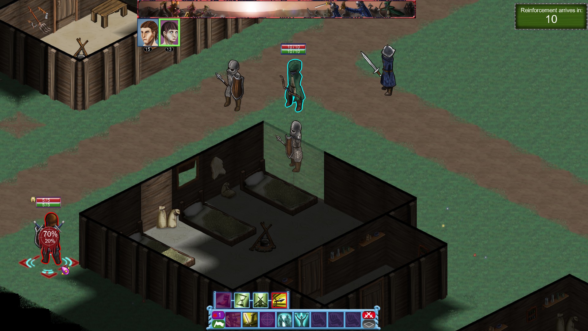
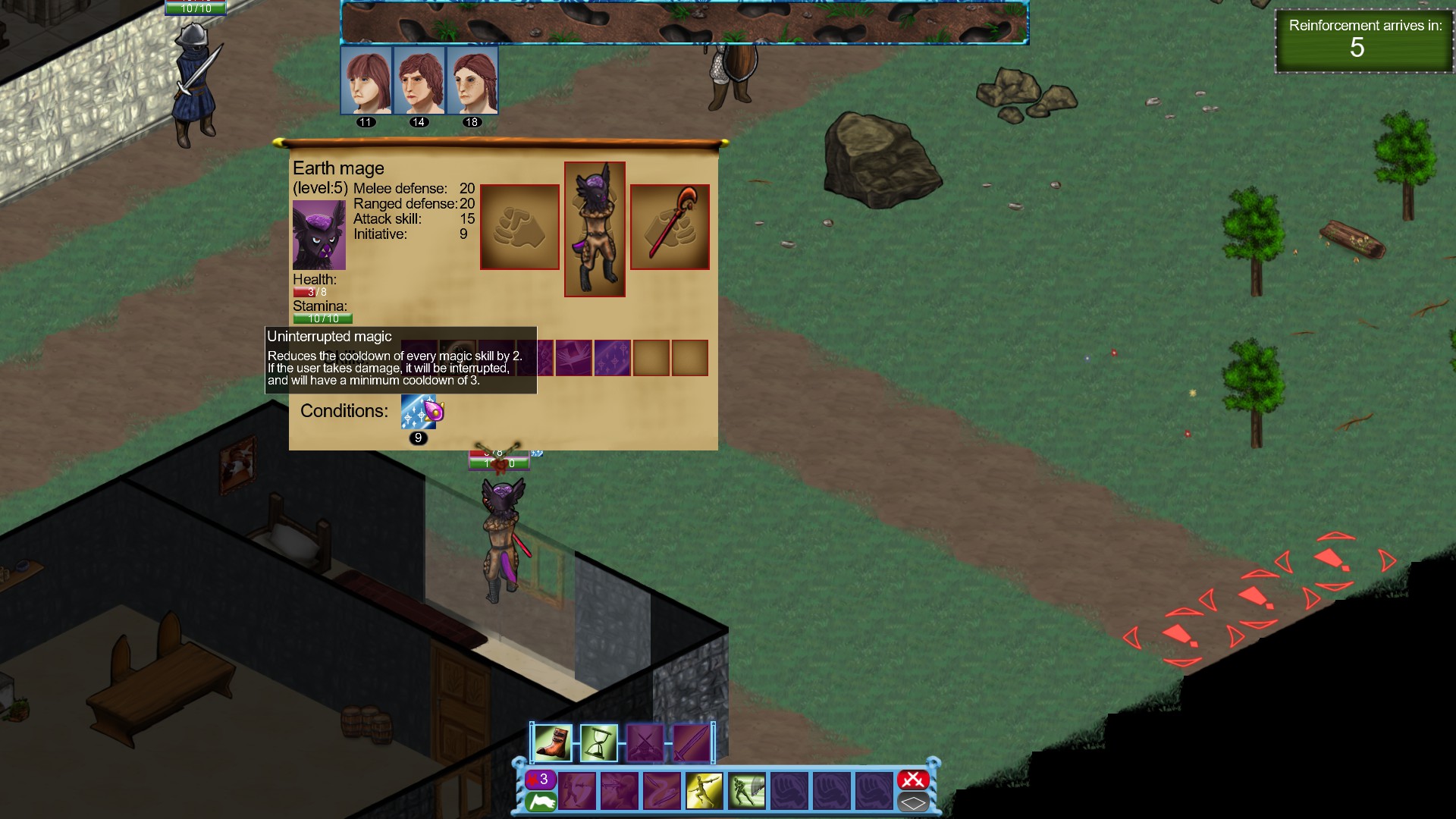
Hello everyone, I know I'm a "bit" late with this devlog, but I wanted to write this only when I have something to show for. Briefly about the combat demo before moving on to the campaign, while it has a lot of things it still needs in terms of polish, but we are satisfied with the core combat system in it. I think we finally reached a system we can build upon gameplay-wise so thanks to everyone who gave it a go and helped to reach this point!
So now that we are happy with the core combat system it is time to work on the campaign. In this devlog I want to share what will be the core design principles. Plus showing off the rudimentary 3D engine which we use for the campaign map because why not

.
Design goals:
After a lot of thinking (and binning countless ideas), I realized that I need to define what experience I want to give to the player and go from there. This is the feeling of building a deck for example in Magic the gathering or character in Guild Wars 1. In addition, I want players to have to adapt to the constantly changing enemies while they gather more and more ways to tweak their team as the game progresses. In addition, I have a secondary goal, which is that I want the player to feel they are fighting against something, and not just getting random missions from the game. I want my campaign design to emphasize these 2 points.
Starting point:
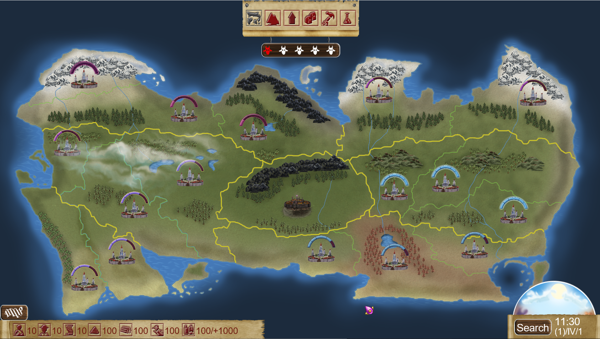
The basic structure of the map is very simple. There are 6 different sized regions, with 16 territories in total. Every territory belongs to a region and will have a loyalty rating (0-5) which represents how much the given territory supports the resistance. Your resistance income will depend on this value. The resistance will be able to build a spy network in a territory, which will improve the income of the region, plus will uncover any mission that the enemy is conducting in this region while it is up (more on this later). In addition, there will be a base-building component, research, smithy, barrack. So far very similar to the XCOM reboot.
The invaders:
One big difference is the way the invaders work. As I said in the beginning, I want the player to feel like they are fighting against somebody. So, what if not the players but the invaders have goals (called agendas) which they need to reach to win the game? These agendas will be things like building a base at a certain territory or have a whole region with 0 loyalty to the resistance, things like that. Semi-long goals, which the AI will be going to pursue, and the players have to realize what is the goal and stop it from happening in a given timeframe. The player loses the campaign if the AI manages to fulfill X amount of agendas (X can depend on the difficulty level for example).
Another idea that reinforces this feeling of playing against someone is the idea that the invaders themselves will have a type of income that depends on how successful they are in conducting their missions. This income can be used to create harder/more missions or upgrade their troops, or maybe fulfill an agenda of theirs. Successful players can slow down their income by sabotaging their missions in the tactical portion of the game.
There is a third point that will be important, namely how dangerous the AI thinks of the resistance. If the player fails a lot, they will not take the resistance seriously, and it might be more greedy, doing more missions with fewer troops defending them. Or if the player is playing well, then it would prioritize upgrading its units more, finding and destroying spy networks in territories, do fewer, but more heavily guarded missions, etc. My hope is that this mechanic while being immersive will help to smooth out the difficulty curve as well, giving a chance for a come back after a big loss and giving a bigger challenge if the player starts to snowball.
The visuals:
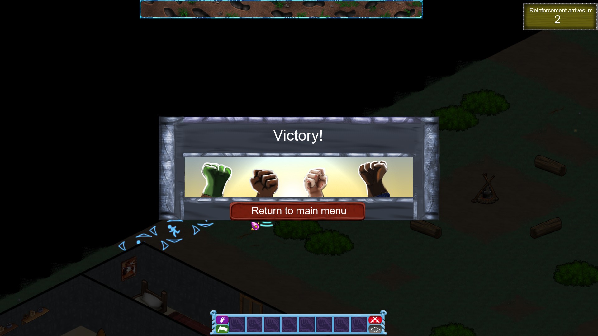
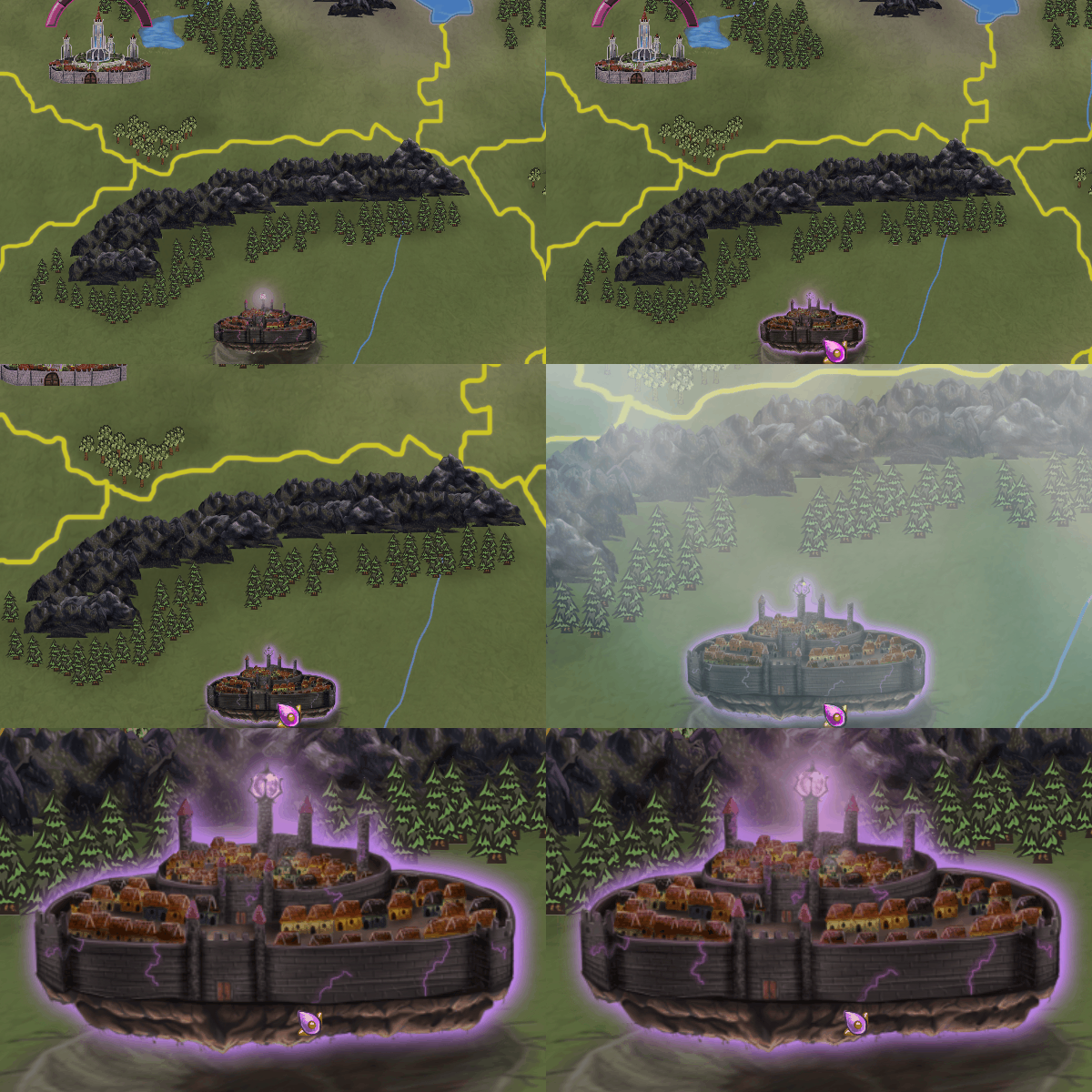
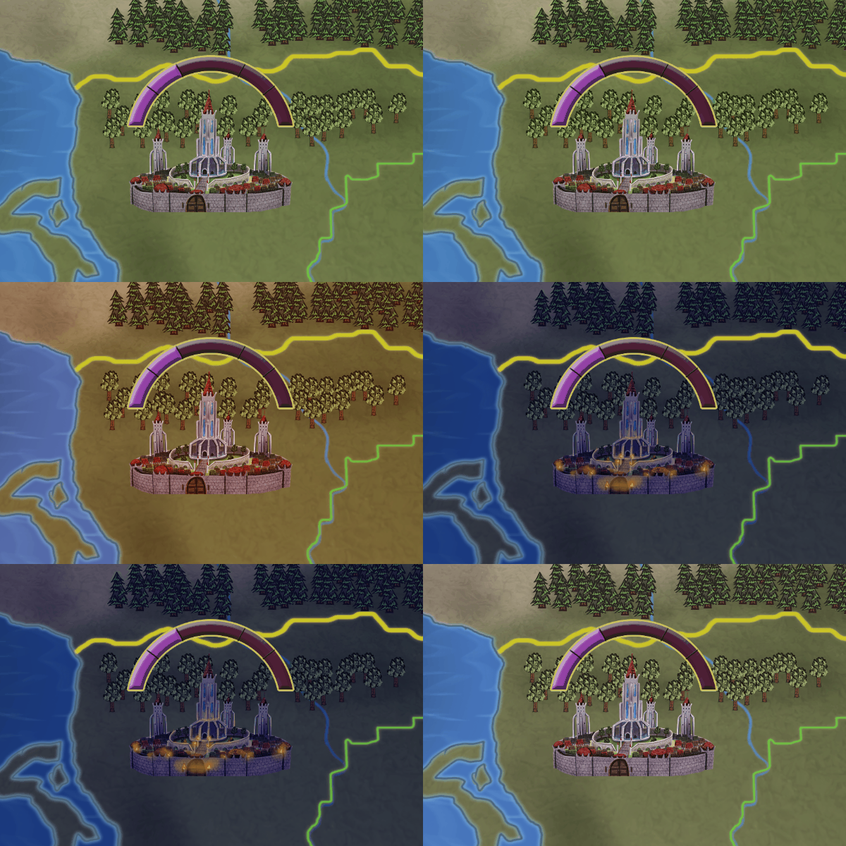
In addition to working on the design of the campaign map, we wanted to further improve the visual fidelity of the game. So we started to implement more and more shader effects on the video card to create a more dynamic visual experience and to make it feel a little bit more modern. Part of this is the rudimentary 3D engine that I created for the campaign map to create a bit of depth to the map.
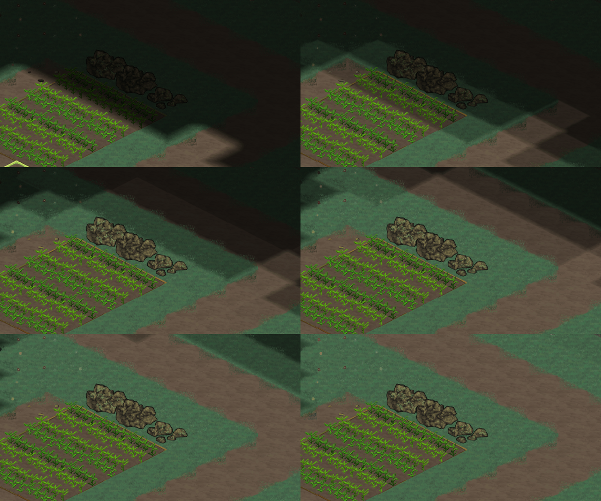
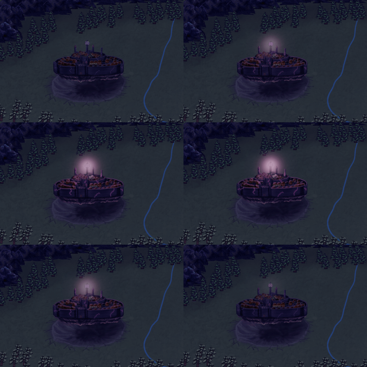
In addition to that, we have a day/night cycle with moving trees and lighting effects on cities.
These gif's are not perfect as it was hard to stay within the size limit. If you want to see these effects in better quality, check out our Twitter
here where I periodically show them off in video format.
So that's it for today's dev diary. Hopefully, now that we have a clear design philosophy and goal for the campaign map, I will be able to share our progress on it more frequently so stay tuned for more!


