Putting the 'role' back in role-playing games since 2002.
Donate to Codex
Good Old Games
  • Welcome to rpgcodex.net, a site dedicated to discussing computer based role-playing games in a free and open fashion. We're less strict than other forums, but please refer to the rules.

    "This message is awaiting moderator approval": All new users must pass through our moderation queue before they will be able to post normally. Until your account has "passed" your posts will only be visible to yourself (and moderators) until they are approved. Give us a week to get around to approving / deleting / ignoring your mundane opinion on crap before hassling us about it. Once you have passed the moderation period (think of it as a test), you will be able to post normally, just like all the other retards.

Might and Magic Might & Magic X Pre-Release Thread

Lonely Vazdru

Pimp my Title
Joined
Jan 10, 2007
Messages
6,702
Location
Agen
so why being upset so much?

Well, anger is what gives a codexer his power. It's an energy field created by all living things. It surrounds us and penetrates us, it binds the galaxy together.
 

Haba

Harbinger of Decline
Patron
Joined
Dec 24, 2008
Messages
1,872,098
Location
Land of Rape & Honey ❤️
Codex 2012 MCA Divinity: Original Sin Project: Eternity Torment: Tides of Numenera Wasteland 2
I just don't get the whole obsession with maps.

Old games used to come with those fancy maps, yet I don't think I've ever spent more than two minutes looking at one.

A really awesome manual? I'm in! A cloth map? Who cares?
 

Visbhume

Prophet
Joined
Jun 21, 2004
Messages
984
A really awesome manual? I'm in! A cloth map? Who cares?

Maps can be beautiful and intriguing in themselves. A couple of links:

http://www.imaginaryatlas.com/
http://www.imaginaryatlas.com/2013/05/16/iconic-town/

http://www.fantasticmaps.com/

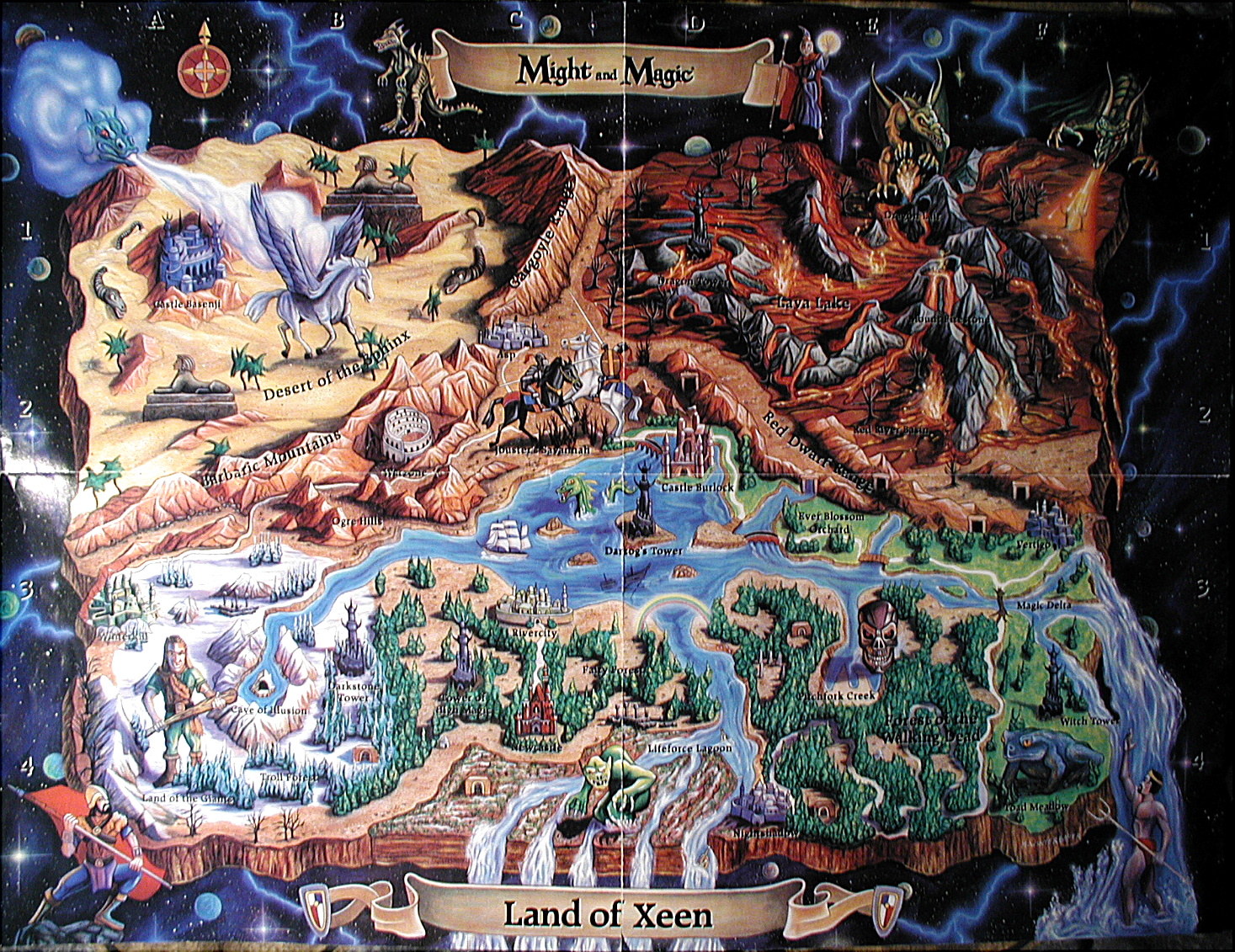
When I looked at a game map before starting to play, it wetted my appetite for adventure. "Oh, look at all these cool places! I wonder when I will reach that!"

I still remember my relish at the Might & Magic and Ultima VII maps. I agree cloth maps may be overkill, though.
 
Self-Ejected

HobGoblin42

Self-Ejected
Patron
Developer
Joined
Aug 25, 2012
Messages
2,417
Location
Munich
Codex 2013 Codex USB, 2014
wizardry1.gif
this...this is...this is beautiful !
 

LeStryfe79

President Spartacus
Joined
Nov 25, 2008
Messages
7,503
Location
Codex 2012 Serpent in the Staglands Divinity: Original Sin Project: Eternity Torment: Tides of Numenera Wasteland 2 Codex USB, 2014 Shadorwun: Hong Kong
That's one of the worst maps I've ever seen. There has to be at least one artist on that team that could do a better job in half a day's work. WTF is going on over there?
 

grdja

Augur
Joined
Mar 20, 2011
Messages
250

Well its so completely empty they will have to add stuff to that map. But yes style is terrible and it screams "tablet/Facebook game". As esteemed codexer couple posts below said, because of macfag "artists" pushing their style on everything. Sterility for the win.
 
Self-Ejected

theSavant

Self-Ejected
Joined
Oct 3, 2012
Messages
2,009
When I looked at a game map before starting to play, it wetted my appetite for adventure. "Oh, look at all these cool places! I wonder when I will reach that!"

I would agree, if it weren't like that:
After drooling over the awesome map for warm-up I enter the game and instantly need to puke. I feel cheated when looking at maps made with extensive love for detail, and then entering the ingame landscape with absolutely no love to detail and abstract ugly geometry. Might & Magic is a perfect example of that.
 

tindrli

Arcane
Joined
Jan 5, 2011
Messages
4,477
Location
Dragodol
Ye, even I can use CC3 alright and I can't draw for shit. That said, I don't think the map is that bad, it just looks kind of small.

wait....wait.. dont tell im its a whole map??? i thought that it was a part of the map ( 2 inch) of the whole named SHANTIRI’S RUINS :eek:
 

Visbhume

Prophet
Joined
Jun 21, 2004
Messages
984
I would agree, if it weren't like that:
After drooling over the awesome map for warm-up I enter the game and instantly need to puke. I feel cheated when looking at maps made with extensive love for detail, and then entering the ingame landscape with absolutely no love to detail and abstract ugly geometry.

Oh well, sometimes the anticipation is good enough by itself. A game world will seldom live up to one's imagination.

I like this map of William Hope Hogdson's Night Land:

http://fiction.eserver.org/novels/nightland/map.html

I kind of makes it look like an 8-bit console adventure! I would like to see game maps with similarly mysterious and evocative names.
 

warmonger3

Scholar
Patron
Joined
Apr 12, 2012
Messages
162
Location
The State of Decline
Divinity: Original Sin
I remember how I was looking forward to M&M 9, and how enraged I was that they insisted it was a M&M game it was a nightmare though I will admit I liked the dungeon design but that is it.
I have hope X will be more of a M&M game than 9 was but I have a feeling the old style of M&M games like Xeen are better left replayed.
They obviously can't make a better game than Xeen anyway.
If they could revisit that art style Xeen has then they might capture more of an old M&M feel, and for God's sake give us an updated Acromage in the Taverns! But it doesn't seem to be their intention so far....:(
 

Luzur

Good Sir
Joined
Feb 12, 2009
Messages
41,933
Location
Swedish Empire
When I looked at a game map before starting to play, it wetted my appetite for adventure. "Oh, look at all these cool places! I wonder when I will reach that!"

I would agree, if it weren't like that:
After drooling over the awesome map for warm-up I enter the game and instantly need to puke. I feel cheated when looking at maps made with extensive love for detail, and then entering the ingame landscape with absolutely no love to detail and abstract ugly geometry. Might & Magic is a perfect example of that.

well, you know you are welcome to go and play other RPG's, like Dragon Age I-II.
 

Mortmal

Arcane
Joined
Jun 15, 2009
Messages
9,498
I just don't get the whole obsession with maps.

Old games used to come with those fancy maps, yet I don't think I've ever spent more than two minutes looking at one.

A really awesome manual? I'm in! A cloth map? Who cares?

A real box , a map , an awesome manual and some moonstone with it, we had all of this. On a few floppies, very polished games with a real care to details, thats something all great rpgs have in common the care to details . I 've yet to see anything hinting at that about MMX , rather that they are putting the minimum effort possible into it.
Its a whole, if it was possible 20 years ago id like to see it happen again. No cloth map is the first(small ) step to the decline :) .
 

octavius

Arcane
Patron
Joined
Aug 4, 2007
Messages
19,685
Location
Bjørgvin


Well its so completely empty they will have to add stuff to that map. But yes style is terrible and it screams "tablet/Facebook game". As esteemed codexer couple posts below said, because of macfag "artists" pushing their style on everything. Sterility for the win.

Heh,"desaturated popamole hipster Facebook game graphics" was the first thing I thought when I saw that map.
 

FeelTheRads

Arcane
Joined
Apr 18, 2008
Messages
13,716
I just don't get the whole obsession with maps.

Old games used to come with those fancy maps, yet I don't think I've ever spent more than two minutes looking at one.

A really awesome manual? I'm in! A cloth map? Who cares?

So... you don't get why some people are interested in things you don't care about.

How do you live with these struggles? :eek:
 
Self-Ejected

theSavant

Self-Ejected
Joined
Oct 3, 2012
Messages
2,009
ad river issue: I see no problem here. Looks to me like a waterfall. High cliffs separating land from sea.
 

Luzur

Good Sir
Joined
Feb 12, 2009
Messages
41,933
Location
Swedish Empire


Well its so completely empty they will have to add stuff to that map. But yes style is terrible and it screams "tablet/Facebook game". As esteemed codexer couple posts below said, because of macfag "artists" pushing their style on everything. Sterility for the win.

Heh,"desaturated popamole hipster Facebook game graphics" was the first thing I thought when I saw that map.

mayhaps its one of those maps you have to fill in as you go, like in TES? but yeah they gotta work abit more on it.
 

As an Amazon Associate, rpgcodex.net earns from qualifying purchases.
Back
Top Bottom