-
Welcome to rpgcodex.net, a site dedicated to discussing computer based role-playing games in a free and open fashion. We're less strict than other forums, but please refer to the rules.
"This message is awaiting moderator approval": All new users must pass through our moderation queue before they will be able to post normally. Until your account has "passed" your posts will only be visible to yourself (and moderators) until they are approved. Give us a week to get around to approving / deleting / ignoring your mundane opinion on crap before hassling us about it. Once you have passed the moderation period (think of it as a test), you will be able to post normally, just like all the other retards.
You are using an out of date browser. It may not display this or other websites correctly.
You should upgrade or use an alternative browser.
You should upgrade or use an alternative browser.
KickStarter Mechajammer (formerly Copper Dreams) - cyberpunk RPG from Whalenought Studios
- Thread starter Infinitron
- Start date
vonAchdorf
Arcane
- Joined
- Sep 20, 2014
- Messages
- 13,465
Serpent in the Staglands KS. 1092 Backers $28,058.00
Copper Dreams KS. 634 Backers. $28,083.00
Well, it's gone over Serpent in money raised but where are all the backers?
I blame Bubbles and his beef with Serpents :D
grimace
Arcane
- Joined
- Jan 17, 2015
- Messages
- 2,084
Let's see if r/games mods let this stay up: https://www.reddit.com/r/Games/comments/4ld6s5/a_cyberpunk_rpg_that_dreams_of_rust_and_copper/
Promoting Kickstarters on Reddit and other boards can be a challenge.
Copper Dreams needs coverage on https://www.neondystopia.com/cyberpunk-games-database/
Last edited:
jagged-jimmy
Prophet
People are lazy. I will definitely back, but for the moment I'm like "um, there is still time...".Serpent in the Staglands KS. 1092 Backers $28,058.00
Copper Dreams KS. 634 Backers. $28,083.00
Well, it's gone over Serpent in money raised but where are all the backers?
grimace
Arcane
- Joined
- Jan 17, 2015
- Messages
- 2,084
664
backers
$29,128
pledged of $40,000 goal
12
days to go
Making progress!
Pledge $15 or more
370 backers
$5550 from the small fry
and
Pledge $250 or more
32 backers
and $8000 from the whales
vonAchdorf
Arcane
- Joined
- Sep 20, 2014
- Messages
- 13,465
The campaign has nearly come to a halt.
Hoping for a few shoutouts and a 48hr notification rush, 10k shouldn't be too hard, if Arcadian Atlas could make it on the last meters I am not giving up on Copper Dreams.
Still eagerly awaiting stealth mechanics update!
Still eagerly awaiting stealth mechanics update!
vonAchdorf
Arcane
- Joined
- Sep 20, 2014
- Messages
- 13,465
10k should be doable, it's 1/3 of what they got. But apparently they have problems tapping into a wider audience. Didn't think that this game is more niche than Serpent in the Staglands.
Excidium II
Self-Ejected
SitS had elves and swords.
Mustawd
Guest
Didn't think that this game is more niche than Serpent in the Staglands.
Well SiTS had actual good art, pixels or no pixels. While I don't care about grafix myself, Copper Dreams doesn't really have a very visually appealing art direction IMO. So I can see how this might be hampering it a bit.
an Administrator
Self-Ejected
Emmm... No.
Bubbles
I'm forever blowing
- Joined
- Aug 7, 2013
- Messages
- 7,817
Are they going to make the game if the Kickstarter fails?
That's what's they're saying, yes. The game has already been funded from the SitS proceeds, and the KS base goal is a "base game enhancement".
Excidium II
Self-Ejected
Yes it does.Emmm... No.
an Administrator
Self-Ejected
World is ok but character models are not very visually appealing.Yes it does.Emmm... No.
Mustawd
Guest
World is ok but character models are not very visually appealing.Yes it does.Emmm... No.
...it does have visually appealing art.
Yes it does.Emmm... No.
When you compare SiTS art it's a lot more visually appealing to me than Copper Dreams. Yes, Copper Dreams has a more gritty and down to earth feel, but people tend to fall into the trap that it must mean a bunch of browns and greys, and whatever. And that in of itself is not that bad. But if the rest of the art direction is equally bland, then it's hard for me to say it's "visually appealing".
For me it's inoffensive, which considering my very very low threshold for grafix, is not saying much. For comparison:
SiTS:
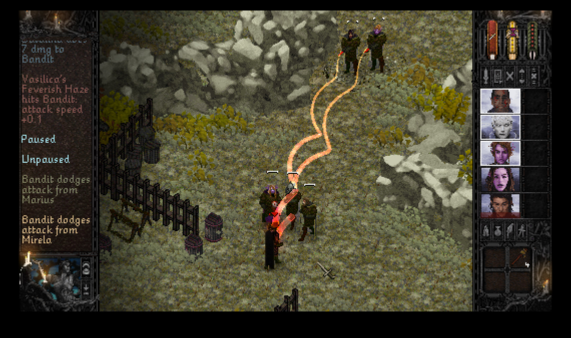
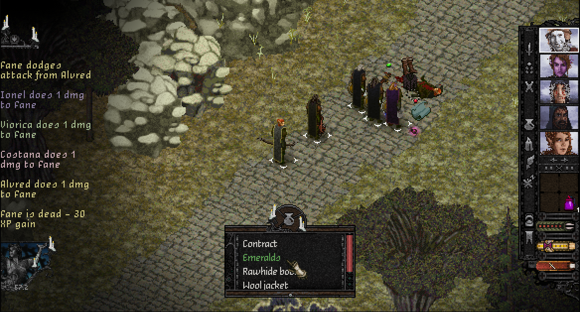
Compare that to some screenshots of Copper Dreams:
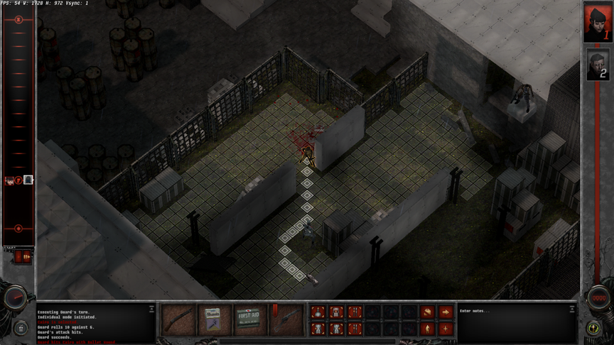
I know there is a splash of color here and there. And some other screenshots have a bit more color as well. But it's hard not to argue that gray and dark gray are the predominant colors here. Again, it's cool with me. But I wouldn't necessarily call it eye candy. And I'm not talking fidelity of graphics. I'm talking specifically in terms of art direction and the color palette.
And the argument that "it's gritty", doesn't hold water when you compare it to games with similar gritty feeling. For example, see Blade Runner below:
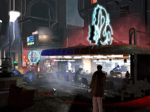
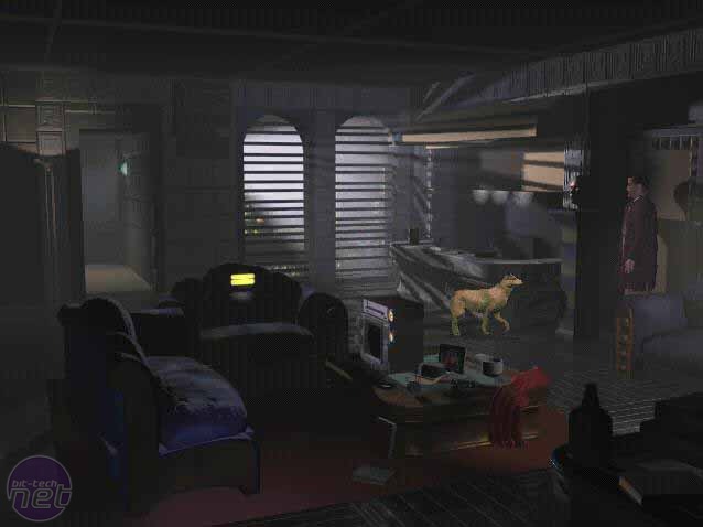
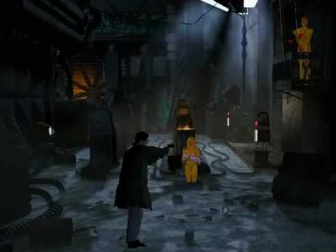

I'm not trying to be overly negative or pile on, nor am I implying they should just ape Blade Runner and call it a day. However, I'm trying to provide some valid and constructive criticism, regardless if they agree with me or not, because I really think it's hurting their campaign right now. You can get away with low fidelity grafix, but you need to make it up with an appealing visual milieu. And right now all I tend to remember is how damn gray the whole thing looks. If they decide to keep it that way, that's cool, but if we're talking about what is affecting the campaign, then I think it's something to consider.
God, Blade Runner was such a fucking great game, posting those screenshots is like posting images of a long lost love, you motherfucker, why do want to break my heart.
Excidium II
Self-Ejected
???I know there is a splash of color here and there. And some other screenshots have a bit more color as well. But it's hard not to argue that gray and dark gray are the predominant colors here. Again, it's cool with me. But I wouldn't necessarily call it eye candy. And I'm not talking fidelity of graphics. I'm talking specifically in terms of art direction and the color palette.
So? Do you count the colors to tell how good something looks or what?
Congrats on comparing the screenshots of some concrete warehouse to some street full of neon anyway.
Mustawd
Guest
So? Do you count the colors to tell how good something looks or what?
Let me clarify, as I don't think I was all that clear. I'm saying having a limited color palette is just fine. I mean look at Paper Sorcerer as an example.
But right now the areas tend to look like a muddy mess. Everything is the same washed out tone, and things just don't seem to "read" very well on a visual level. I mentioned adding more color because I think it'd be a bit more visually appealing. However, something as simple as playing with the contrast of the background and/or in-game objects would probably help.
Again, to me the art is completely functional and doesn't offend me in any way. However, it is not something I would call pretty at the moment. And in a kickstarter campaign, pretty matters. That's all I'm saying.
Bubbles
I'm forever blowing
- Joined
- Aug 7, 2013
- Messages
- 7,817
In terms of aesthetic appeal, I'd rate them: SitS KS footage > SitS, the actual game > Copper Dreams KS footage.
Maybe a fairer comparison is the first image on the SitS page vs. the first image on the CD page:


For marketing purposes, I think one is more effective than the other.
Congrats on comparing the screenshots of some warehouse to some street full of neon anyway.
Maybe a fairer comparison is the first image on the SitS page vs. the first image on the CD page:


For marketing purposes, I think one is more effective than the other.
Excidium II
Self-Ejected
Yeah, that left one is definitely better. It reminded me of Castlevania SotN.
I still think it looks better than SitS. The enviroment is specially hard on the eyes in that game. Too busy for the resolution, everything looks like a multicoloured spray of pixels.
I still think it looks better than SitS. The enviroment is specially hard on the eyes in that game. Too busy for the resolution, everything looks like a multicoloured spray of pixels.
- Joined
- Jan 28, 2011
- Messages
- 99,628


You guys might be overthinking it. SitS was a no-name indie Kickstarter RPG in 2014, Copper Dreams is a no-name indie Kickstarter RPG in 2016.
(Good job using my arguments about the reception of WL2's graphics, though )
)
(Good job using my arguments about the reception of WL2's graphics, though
 )
)Mustawd
Guest
You guys might be overthinking it. SitS was a no-name indie Kickstarter RPG in 2014, Copper Dreams is a no-name indie Kickstarter RPG in 2016.
No one is saying "Thing A" is hurting the campaign's momentum. There are a variety of reasons. And kickstarter fatigue, like you mentioned, is definitely one of them. As is the fact that nostalgia tends to drive a lot of these things, and Copper Dreams is kind of its own thing. There's no other game that's quite like it, and even some of its inspirations, MSG for example, are not necessarily readily apparent.
SiTS had the good 'ol fantasy, party-based, non-WoW graphics, and isometric view to appeal to a lot of older RPG fans.
Like I said, there are a variety of things. It's not just 2014 v 2016.
Excidium II
Self-Ejected
At least it's being made anyway. And that might be a factor too.


![Glory to Codexia! [2012] Codex 2012](/forums/smiles/campaign_tags/campaign_slushfund2012.png)


