Severian Silk
Guest
So what?

Eh, I'm not 100% convinced yet, because technically the UI is an overlay on the computer screen inside the mech.Green shade is not an option since I tried to keep the palette limited to orange and black with some small additions of red.
Check the help screen. Does it feel better now?

Yes, that looks better. I'd try even darker shades in later iterations, but that's for fine tuning at late development stages. And it's not just about eye irritation, but also how the GUI blends with the world.
It's one of the few leftovers from the time when the game was conceived as a faithful fan remake of Carmine, and when the concept changed into its own thing I got used to the control scheme so much I've decided to keep it.BTW: Is there a difference if you turn 180° to the left or 180° to the right? :D

You need to find balance between realism and usefulness. If it looks like shit, people won't play it even if it has the best gameplay. Anyway, I am not trying to force this on you, just giving constructive criticism. It's up to you if you agree or not.Eh, I'm not 100% convinced yet, because technically the UI is an overlay on the computer screen inside the mech.Green shade is not an option since I tried to keep the palette limited to orange and black with some small additions of red.
Check the help screen. Does it feel better now?

Yes, that looks better. I'd try even darker shades in later iterations, but that's for fine tuning at late development stages. And it's not just about eye irritation, but also how the GUI blends with the world.
For now, I'd rather keep the original look for the demo and then fine-tune it for the final game (or add an option to switch between them). I wish this kind of suggestion would come up earlier, because redoing some parts of the UI is going to be a daunting task because of a big number of objects.

I was talking about fine-tuning the color, but I guess I've gotten used to that look so I don't mind it. If it's that bad -- it can be tweaked and improved, and I'll gladly do it while fine-tuning stuff, because the frames and backgrounds are untextured panels, so iterating through them can take a while, and right now I'm focused on the content. However, I'll do a few tests and add stuff to speed things up later today (I think these color tweaks can be done using a material).You need to find balance between realism and usefulness. If it looks like shit, people won't play it even if it has the best gameplay. Anyway, I am not trying to force this on you, just giving constructive criticism. It's up to you if you agree or not.Eh, I'm not 100% convinced yet, because technically the UI is an overlay on the computer screen inside the mech.Green shade is not an option since I tried to keep the palette limited to orange and black with some small additions of red.
Check the help screen. Does it feel better now?

Yes, that looks better. I'd try even darker shades in later iterations, but that's for fine tuning at late development stages. And it's not just about eye irritation, but also how the GUI blends with the world.
For now, I'd rather keep the original look for the demo and then fine-tune it for the final game (or add an option to switch between them). I wish this kind of suggestion would come up earlier, because redoing some parts of the UI is going to be a daunting task because of a big number of objects.
The reason this kind of suggestion didn't come earlier is because I always saw one pic at a time for few seconds with huge delays in between. Now that you increased the rate of updates though...
I find it strange you need to change a lot of things. I assumed only the frames are textures and the background is just filled with color by code (technically texture as well).


Always a good idea to fix the stuff that break some version of your game.Also rewiring the UI to make it more flexible and less tied to the functions that break the Mac version.


Aaand I'm back.
Any suggestions?

Thanks bro!Aaand I'm back.
Any suggestions?
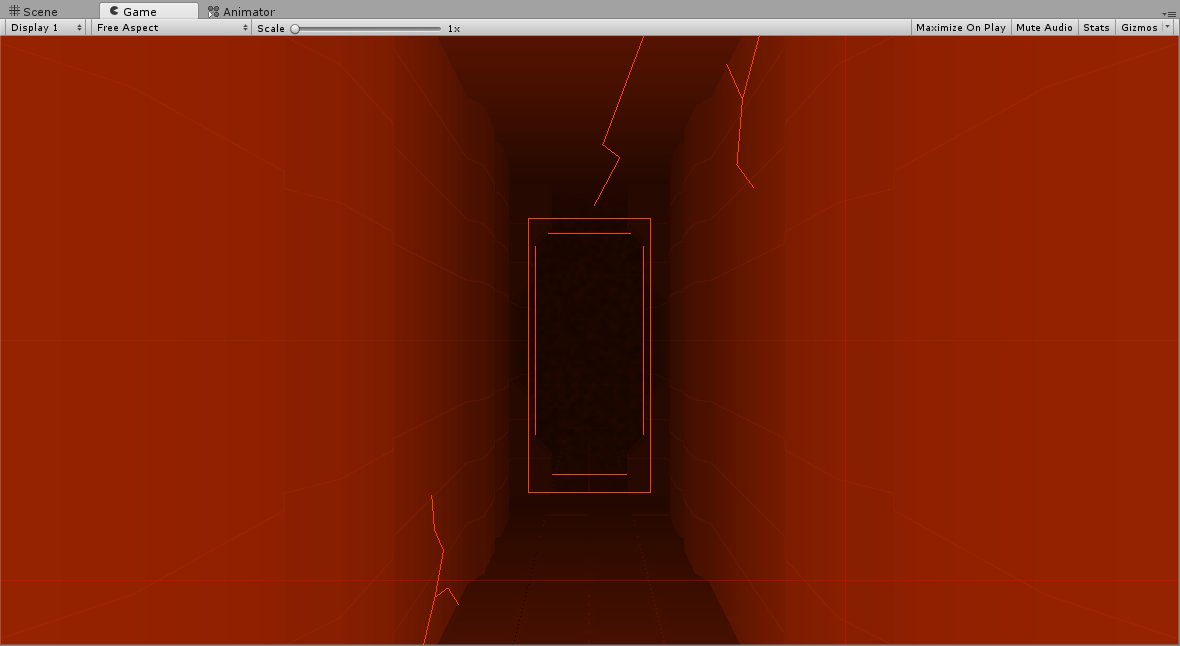
Welcome back. I would fade those cracks with lighting/distance... unless they indicate a crackable wall or something...?


