Putting the 'role' back in role-playing games since 2002.
Donate to Codex
Good Old Games
  • Welcome to rpgcodex.net, a site dedicated to discussing computer based role-playing games in a free and open fashion. We're less strict than other forums, but please refer to the rules.

    "This message is awaiting moderator approval": All new users must pass through our moderation queue before they will be able to post normally. Until your account has "passed" your posts will only be visible to yourself (and moderators) until they are approved. Give us a week to get around to approving / deleting / ignoring your mundane opinion on crap before hassling us about it. Once you have passed the moderation period (think of it as a test), you will be able to post normally, just like all the other retards.

Vapourware Codexian Game Development Thread

Bad Sector

Arcane
Patron
Joined
Mar 25, 2012
Messages
2,334
Insert Title Here RPG Wokedex Codex Year of the Donut Codex+ Now Streaming! Steve gets a Kidney but I don't even get a tag.
Found a little time to work on Little Immersive Engine and added "transient layers", which can be used to spawn new entities that wont be saved to disk (be it in the world editor or during gameplay as part of a savegame) but instead are meant to be used by elements for their own spawns (e.g. temporary particles).

Then i used this to add a new element type that uses an entity mold (see my previous post, they're assets that contain elements to create new "pre-filled" entities) to spawn an entity with that mold. And of course this new element type can be used inside entity molds, meaning an entity mold can have an element that uses another entity mold:


Bad Sector

Arcane
Patron
Joined
Mar 25, 2012
Messages
2,334
Insert Title Here RPG Wokedex Codex Year of the Donut Codex+ Now Streaming! Steve gets a Kidney but I don't even get a tag.
I see this character fonts in a lot of games. Why? Is it free? It looks terrible, awful, hard to read.

My guess is that it is just that when you have a very tiny pixel grid anyway a lot of fonts end up looking similar. ~25 years ago i did a very similar font myself for some DOS/VGA project where i wanted to fit a lot of text on a 320x200 resolution and wanting some slightly serif-y look.
 

beardalaxy

Educated
Joined
Jun 10, 2023
Messages
117
I see this character fonts in a lot of games. Why? Is it free? It looks terrible, awful, hard to read.
Skill issue.
For real though, I do know that a lot of people aren't too fond of pixelated fonts like that and would prefer something sleeker. It's worth giving the player the option to change the font to something else. There is a free font called OpenDyslexic that is a pretty cool concept, helps people with dyslexia read the text better: https://opendyslexic.org/

I have just begun my small-scale beta test. Just a few of the other people that worked on the game. It'll be fun to see what they think and how they can break it. After this beta is done, which doesn't exactly have a set time limit, I'll post an application for testing here!
 

Zanzoken

Arcane
Joined
Dec 16, 2014
Messages
4,064
I finished my first armor set.


The inspiration for the color scheme comes from the bad guys in the final battle of the Spartacus TV show prequel. Just for fun I will probably do the red & black color scheme that the heroes wear too, with steel armor instead of bronze.


This was made using a mix of assets and stuff I made from scratch. The assets require a lot of manual fitting to work with the character model, but it's still much more efficient than trying to attempt the complex pieces by myself, especially with my limited skills.

The model would obviously benefit a lot from a fine detail pass to really make it pop, but that doesn't matter too much at this point. I wanted to prototype something that would approximate the look and feel I have envisioned for my characters, and I'm happy with the result. It's a confidence booster to have even made it this far and feels like I've passed the first major hurdle to actually making this game a reality.

The next step will be to create a polished combat demo, which obviously will be a major challenge because 3D animation is currently an almost complete unknown to me. But if I can get past that, then I feel like the question of "can I actually do this" will be answered, because there's nothing else in the game that should be all that complicated to build. From there it's just a matter of being willing to do the work.


New color palette added + additional helmet style.


Also I was able to reconnect with the artist who made the character body and he's finally going to get started sculpting an example head + face. So hopefully I will have hands on that this week.

My initial plan was to take a Battle Brothers style approach and just have a number of premade faces plus a bunch of swappable hair and beard options. However that adds up to a pretty significant investment if I pay this guy to make them all (even though he lives in thirdworldia and is cheap, relatively speaking).

So I'm wondering since this is 3D if it makes more sense to use face sliders or some other method? I just think back to the triple-A games I've played that used those and feel like they rarely lead to good results. The characters end up looking all the same or you get ridiculous Oblivion-esque shit. If anyone has any ideas there I'm all ears.
 

Nathaniel3W

Rockwell Studios
Patron
Developer
Joined
Feb 5, 2015
Messages
1,305
Location
Washington, DC
Strap Yourselves In Codex Year of the Donut Codex+ Now Streaming!
Made a new level and some new enemies. To create these guys, I copied another enemy and changed its stats, sprite, attacks, etc. But I forgot the name was saved in a localization file. Haven't updated that yet.

NotSnowmen.jpg
 

Yuber

Educated
Joined
Aug 17, 2023
Messages
204
Anyone know 2D Grid Pathfinding?
I use A* but I have some problems. A* blocks occupied fields like units and trees and walls.
For now I sort the order of moving depending on the distance between the unit and the closest enemy. So a unit who is closest to an enemy moves first.

1) Because Unit 7 does move later the other ones are not able to move upwards. Anything you can change or is it just like that?
pqXqHKy.png


Same here, cause of Unit A and B they have to go right instead of Up beause they moved first.
7zklMYW.png


This units too can't move because pathfinder is blocked by units so can't find a path, even though they could go to the right 1 step:
YkUjVJi.png
 

barker_s

Cipher
Patron
Joined
Mar 1, 2007
Messages
810
Location
Poland
Codex 2016 - The Age of Grimoire Grab the Codex by the pussy RPG Wokedex Strap Yourselves In Codex Year of the Donut
A*'s fine, if a bit costly. Regarding the last image, you probably need to add some additional logic on top of it. E.g. do a first A* pass for a specific unit. If it can't reach its destination, then run a second pass, treating allies as non-occupied tiles, and use that path instead. They should bunch up around their target this way.
 

Yuber

Educated
Joined
Aug 17, 2023
Messages
204
A*'s fine, if a bit costly. Regarding the last image, you probably need to add some additional logic on top of it. E.g. do a first A* pass for a specific unit. If it can't reach its destination, then run a second pass, treating allies as non-occupied tiles, and use that path instead. They should bunch up around their target this way.

Thanks, that works for most units, just some will not be able to move because Pathfinder tells them below is empty but there is a unit so they can't move.
Bp8IooN.png
 

Nathaniel3W

Rockwell Studios
Patron
Developer
Joined
Feb 5, 2015
Messages
1,305
Location
Washington, DC
Strap Yourselves In Codex Year of the Donut Codex+ Now Streaming!
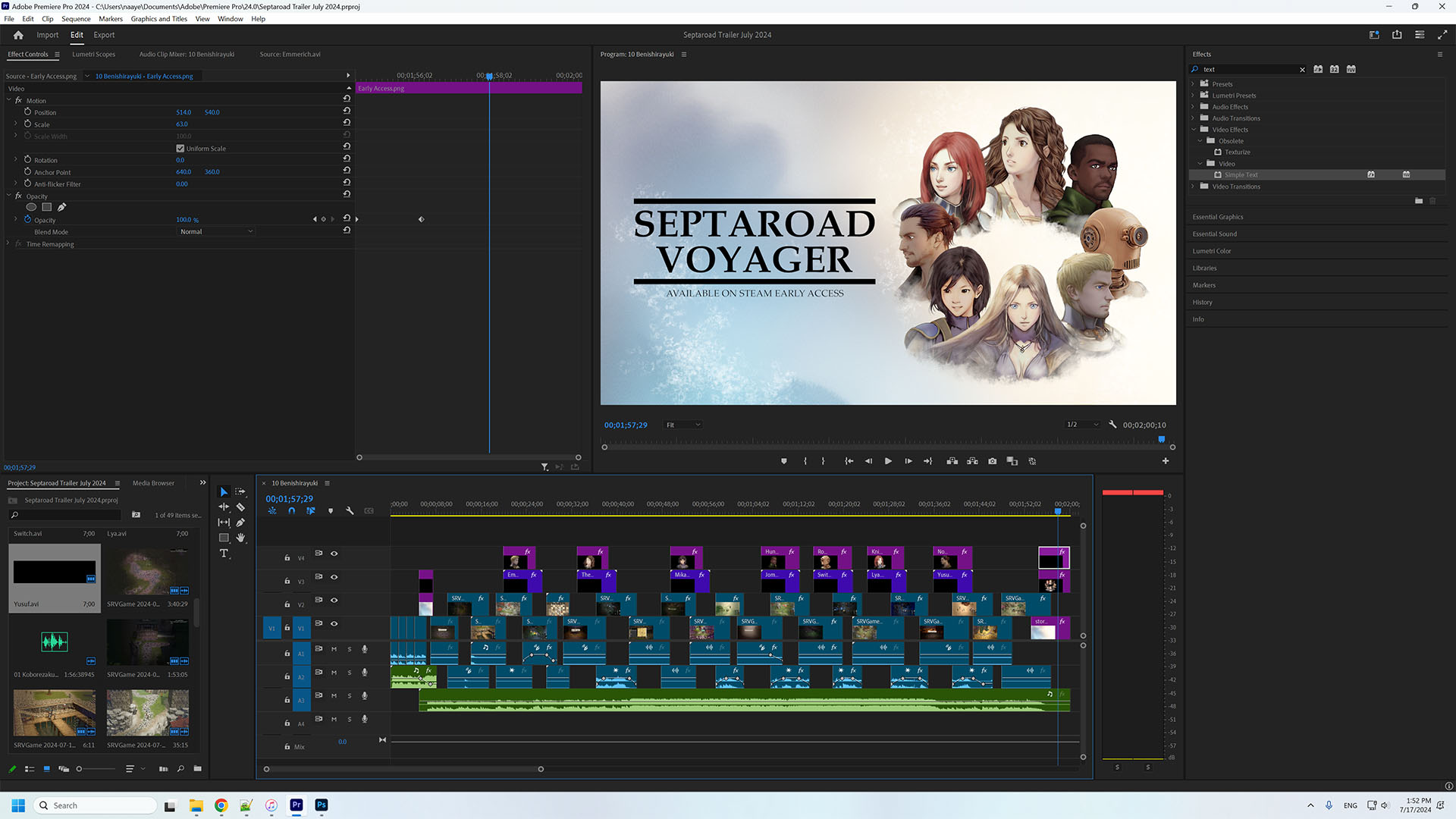
Made a new trailer for Septaroad Voyager. The game has had virtually no sales in its first year in Early Access. I'm hoping with the release of the main campaign prologues, I can finally get this game off the ground.


Here's the project in Adobe Premiere:
TrailerWorkspace.jpg

26 video clips, 12 static images, 7 prerendered AVI files, 2 songs. I feel like you have to keep the scenes moving along that quickly in order to keep someone's attention on Steam.

I don't claim to know everything though and I'm always glad to learn more. If anyone has any feedback, maybe I can do better on my next trailer.
 

Zeusington

Literate
Joined
May 3, 2024
Messages
16
Family and work stuff has been happening and I fell behind, but I've been checking the thread.

I did have another look at progression and it was a mess. I decided to merge talents and spells such that some talent slots become spell slots when in the command state and in the appropriate context, like a combat spell talent becoming a clickable spell when in combat. I then decided to tie HP, MP, slots, and talents themselves to a series of stats with ranks 1-6. Now you can pull up the stat menu, click a stat, and it'll bring up an option to level it up, reset it, and inspect / select any talents tied to it. Here's the mockup since I'm still working on some stuff:

edc7db06a9461760202f6d0e6889e1cfc43593ee.pnj


The diamond icons are talents and the glass spheres are spells. I put 'em all on each side but they can be in any of those slots (save for the two on the active character, those are locked and unique to that character). The twelve icons on the right are the talents you unlock per stat rank, so raising a stat to 2 will allow you to slot in rank II talents, etc.

Things have stabilized a bit so I should be updating the Steam page once this is all in and working.
 
Developer
Joined
Oct 26, 2016
Messages
2,287
How do you feel about smart pointers vs generational handles? Are all of you actually using generational handles with no shared_ptr?
I imagine that for larger games that handlers would work better than smart pointers. More optimal for lots of reasons like contiguous memory, batching, syncing to CUDA like systems etc.

I imagine it also depends a lot on the nature of the object being stored. For systems where you have lots of objects like particles, sprites, physics its going to be good to have a batch like system. For objects that are more singular in nature with more complex interactions less so.
 

Twiglard

Poland Stronk
Patron
Staff Member
Joined
Aug 6, 2014
Messages
7,509
Location
Poland
Strap Yourselves In Codex Year of the Donut
I imagine that for larger games that handlers would work better than smart pointers. More optimal for lots of reasons like contiguous memory, batching, syncing to CUDA like systems etc.
I'm gonna do contiguous memory for my smart pointer scheme. The idea is to allocate over-aligned memory and store metadata at the beginning of the page. But there's the option of using superpages, particularly on Windows. They're aligned to 1-2MB depending on superpage size so in theory I could allocate large chunks for each object type.
 
Developer
Joined
Oct 26, 2016
Messages
2,287
I imagine that for larger games that handlers would work better than smart pointers. More optimal for lots of reasons like contiguous memory, batching, syncing to CUDA like systems etc.
I'm gonna do contiguous memory for my smart pointer scheme. The idea is to allocate over-aligned memory and store metadata at the beginning of the page. But there's the option of using superpages, particularly on Windows. They're aligned to 1-2MB depending on superpage size so in theory I could allocate large chunks for each object type.
What API do you use that handles pages...Win32?
 

Hobknobling

Learned
Joined
Nov 16, 2021
Messages
472
I would appreciate any advice that would make my game look better, particularly if they're quick fixes

Some quick thoughts solely based off of this video:

- Generally avoid absolute blacks and whites unless deliberately used to appear more shocking and edgy (see games like Undertale). Just add a slight hint of grey to both. People won't notice this, but their brain does.
- Differentiate the bottom menu options "Character", "Journal", "Bestiary" and "Menu" with icons and/or colors. Does the "Menu" option even belong here?
- The cyan colored water obviously looks very unfinished, but I don't have knowledge of that topic.
- Differentiate character relationship status text in the dialogue menu ("Friendly" in the first screen) with color. Maybe make it even have a different color based on what the status is?
- I am not sure what you are going to do with animations, but maybe add a slash effect there for melee attacks and make the character quickly flash upon taking damage. Basically some stuff you can find in this ancient presentation: https://www.youtube.com/watch?v=Fy0aCDmgnxg
- Also add a death animation. You might get away with doing a fade-out at this point.
- Character menu looks pretty good, but you might want to experiment with splitting some of the panes and placing the buttons uniformly to the end of the line. Why do the "Attribute" levels have an explanation and the "Skill" levels don't?
- The red color for the dialogue choices looks a bit dark, but it might be my monitor and YouTube compression. Maybe tune up the brightness just a tiny bit. Now it reads to me like you have already explored all the options.
 

Zanzoken

Arcane
Joined
Dec 16, 2014
Messages
4,064
I would appreciate any advice that would make my game look better, particularly if they're quick fixes


Since you don't have any animations, maybe give each character a base like they're meant to be figurines? It looks like your game is turn- and grid-based, so lean into the board game feel. I would look at Battle Brothers or even real-life Warhammer style figures for inspiration.

If you don't want to go that route, then you need to do something with the "breathing" animation because it's really not adding much in its current state. Even going from 2 to 4 frames would help a lot, and you could try using stretching to create the illusion of the chest expanding and contracting without having to draw any additional art. I found a little clip which is 3D but I think the same techniques would apply. link

In fact I'd suggest experimenting with an overall more stylized approach to the character anatomy. This is personal preference obviously, but you can see from the 3D models I've made and posted in this thread that I'm partial to oversized heads and upper bodies. You don't have to go those same extremes, or maybe you want to do something else entirely, but personally I think anatomically correct characters are kind of flat and boring (unless they have really crisp and smooth animations like in Diablo or ToEE).

The water effect makes me a little bit motion sick so definitely not a fan of that. There is a game called Jotunn Bad North that has some cool (and I think relatively simple?) water effects. I found a Reddit thread where they discuss some aspects of how it was done. link

I would also change your use of color so that good guys wear blue and bad guys wear red. This is a common trope but you want the player to be able to readily identify who is who, and from the fight in your trailer it's hard to tell.
 
Joined
Jan 9, 2011
Messages
2,832
Codex 2012 Codex 2013 Codex 2014 PC RPG Website of the Year, 2015 Codex 2016 - The Age of Grimoire Make the Codex Great Again! Grab the Codex by the pussy Insert Title Here RPG Wokedex Strap Yourselves In Codex Year of the Donut Codex+ Now Streaming! Enjoy the Revolution! Another revolution around the sun that is. Serpent in the Staglands Dead State Divinity: Original Sin Project: Eternity Torment: Tides of Numenera Wasteland 2 Codex USB, 2014 Shadorwun: Hong Kong Divinity: Original Sin 2 BattleTech Bubbles In Memoria A Beautifully Desolate Campaign Pillars of Eternity 2: Deadfire Pathfinder: Kingmaker Steve gets a Kidney but I don't even get a tag. My team has the sexiest and deadliest waifus you can recruit. Pathfinder: Wrath I'm very into cock and ball torture I helped put crap in Monomyth
Shadows on the sprites. Right now everything (including backgrounds) looks like it's a paper cut out. A very readable, and quite pleasant looking cut out admittedly.
Also, your water is too blue. Looks like Cherenkov radiation in a pool, and not Mediterranean.
 

Twiglard

Poland Stronk
Patron
Staff Member
Joined
Aug 6, 2014
Messages
7,509
Location
Poland
Strap Yourselves In Codex Year of the Donut
I would appreciate any advice that would make my game look better, particularly if they're quick fixes
All men have Roman centurion officer helmets in the first scene. Your characters are Greek so instead use Greek helmets.

The character models are pretty good but maybe they could use some more embellishment.

I think the bright cyan water actually works well but it could use some tweaking.

In the second scene, the grass's contrast (too low) and saturation (too low or too high) makes it all look bleak compared to characters and walls, with nothing to stand out. Right now it looks only a bit better than Prelude to Darkness.

Third scene, the bright yellow grass actually works.

Fourth scene, rocky wall has ugly obvious tiling. Add a second or third wall tile so there's less seams and repetition. Make the wall stand out from the ground (such as vibrance/saturation).
 
Last edited:

As an Amazon Associate, rpgcodex.net earns from qualifying purchases.
Back
Top Bottom