-
Welcome to rpgcodex.net, a site dedicated to discussing computer based role-playing games in a free and open fashion. We're less strict than other forums, but please refer to the rules.
"This message is awaiting moderator approval": All new users must pass through our moderation queue before they will be able to post normally. Until your account has "passed" your posts will only be visible to yourself (and moderators) until they are approved. Give us a week to get around to approving / deleting / ignoring your mundane opinion on crap before hassling us about it. Once you have passed the moderation period (think of it as a test), you will be able to post normally, just like all the other retards.
You are using an out of date browser. It may not display this or other websites correctly.
You should upgrade or use an alternative browser.
You should upgrade or use an alternative browser.
Vapourware Codexian Game Development Thread
- Thread starter 20 Eyes
- Start date
Zanzoken
Arcane
- Joined
- Dec 16, 2014
- Messages
- 4,143
I was able to put in a few more hours this weekend and create some clothing and armor models. I made these all from the character mesh. The trickiest was the chest strap, which would have taken forever if not for Retopoflow.

Full list:
- Right pauldron w/ chest strap
- Right heavy arm wrap
- Left arm band
- Belt
- Underwear
- Loin cloth
- Heavy leg wraps
The models aren't super detailed but the game is going to have top-down combat so you won't see them up close very often. That's also the main reason behind the cartoonish, top-heavy design since it will make the character movements easier to track from a fixed camera perspective. Plus I think the gladiators being big and stronk looks cool.
I'm going to do a gladius and scutum next and then switch over to texturing. Feedback always appreciated! (even if just to say you think it's shit )
)

Full list:
- Right pauldron w/ chest strap
- Right heavy arm wrap
- Left arm band
- Belt
- Underwear
- Loin cloth
- Heavy leg wraps
The models aren't super detailed but the game is going to have top-down combat so you won't see them up close very often. That's also the main reason behind the cartoonish, top-heavy design since it will make the character movements easier to track from a fixed camera perspective. Plus I think the gladiators being big and stronk looks cool.
I'm going to do a gladius and scutum next and then switch over to texturing. Feedback always appreciated! (even if just to say you think it's shit
zwanzig_zwoelf
Graverobber Foundation

Released my Mordor-inspired microgame, expecting to sell exactly 3 copies, which should be enough to buy a coffee and focus on my other projects.

zwanzig_zwoelf do you still have to pay $100 just to put your game up on Steam?
zwanzig_zwoelf
Graverobber Foundation

Yes, but the money is returned once the game makes $1,000 in gross revenue. I think DLC and soundtracks also count towards that number.zwanzig_zwoelf do you still have to pay $100 just to put your game up on Steam?
Tavernking
Don't believe his lies

Slightly annoyed gamers automatically take 3D games more seriously than 2D, especially when it comes to pricing. My 2D Godot workflow is getting very good, not sure I want to go through another slow learning process to get up to scratch with 3D. What do you guys reckon?
So, for a very long time I have been thinking in jumping in the Game Dev band-wagon, but only recently I decided to take a look and see if I should or not dive into it, and in the last few days I was watching a bunch of youtube videos about engines, programming languages and etc.
And so far, IF I really decide to make a game, the first one would probably be a Card Battler (with strategy elements) and I would also probably use Godot, but from what I saw, most games made in godot not only look like crap, they also have bare-bones systems/gameplay mechanics (worst offender IMO)...
1) Is this a fact (limitations of the engine) or just too many incompetent game devs incapable of creating games with proper developed gameplay mechanics?
2) Maybe most of these games are for mobile, and thus my misunderstanding of the engine capabilities?
While Unity doesn't seem bad (and IIRC its easier to port for win/linux/mac/consoles), I don't like the idea of subscriptions, and that is because I don't know if I will drop the idea of gamedev in the middle of the process... or just decide to take it slow.
On the other hand, I saw a interview with a dude that made a "horror train" game (don't remember the name) with Unreal that ended being a hit and he said he didn't know anything about C++, he used only blueprints... and the game looks very nice.
Also, with Unreal, you only pay 5% after the first million... so, if you game don't make any/little money, you didn't lose anything besides time... and if it made past 1 million, for a solo dev, these 5% will not make any difference.
- Joined
- Nov 17, 2015
- Messages
- 5,660


Unity has betrayed devs at least once, who says they won't do it again?
RPK
Sawtooth Games

- Joined
- Apr 25, 2017
- Messages
- 382
Unity has definitely dropped the ball recently, however they have a new CEO who is changing the direction of the company.
you also don't need a subscription to anything to use it - if you make... I think 200k in one year, you have to talk about cutting them in, but at that point, that's a nice problem to have
you also don't need a subscription to anything to use it - if you make... I think 200k in one year, you have to talk about cutting them in, but at that point, that's a nice problem to have
Zanzoken
Arcane
- Joined
- Dec 16, 2014
- Messages
- 4,143
Slightly annoyed gamers automatically take 3D games more seriously than 2D, especially when it comes to pricing. My 2D Godot workflow is getting very good, not sure I want to go through another slow learning process to get up to scratch with 3D. What do you guys reckon?
I don't think 2D vs 3D matters that much commercially. Players judge games primarily on production values and whether it's fun to play.
The biggest driver should be what type of game you want to make, its requirements, and your skills (either what you have already or can reasonably develop). For example my project could work in either but I chose 3D because character customization is a key feature, it's a lot easier to do in 3D, and I didn't have any skills in 2D to bias me toward that. However if I was already a trained 2D artist I would have just done it in 2D.
So if I were you, I wouldn't switch unless the project I wanted to do simply wasn't feasible in 2D. Leverage your existing skill set and branch out from there, so you can spend your time creating instead of learning.
So, for a very long time I have been thinking in jumping in the Game Dev band-wagon, but only recently I decided to take a look and see if I should or not dive into it, and in the last few days I was watching a bunch of youtube videos about engines, programming languages and etc.
People will debate this endlessly but as someone who is also a fledgling at this, I don't think it's a good idea to pick Godot as your first engine. I think it's safer to learn on a more polished product with better tutorials, documentation, etc.
Unity is still the best option for beginners imo due to the breadth of knowledge and assets out there. It's also easier to code in C# than C++ which is what Unreal uses. I have heard you can make complete games in Unreal using just visual scripting and that even AAA studios use blueprints to design gameplay and such, but then you're really pigeonholing yourself in terms of your workflow and capabilities.
So unless your project has a compelling reason to use something else -- which for a card battler it probably doesn't -- then I think Unity is still the way to go.
The_Sloth_Sleeps
Arcane

- Joined
- Oct 26, 2016
- Messages
- 2,599
Good grief, how many times does it have to be said? Stop using UE and Unity already. If you're going to use an engine at least use one that you own.

Trying to come up with a formula for skill-up progression by usage. There's just no way to coherently predict what will work.
Going to have to write a shit ton of code to simulate how people level up, so I can tweak the formula.
While playing games, you think all design is filled with intention. But the reality is, only some. Other is just random shit.
Going to have to write a shit ton of code to simulate how people level up, so I can tweak the formula.
While playing games, you think all design is filled with intention. But the reality is, only some. Other is just random shit.
The_Sloth_Sleeps
Arcane

- Joined
- Oct 26, 2016
- Messages
- 2,599
This is the problem. Making the game assets and code is one thing. But the process of refinement, balancing and so on. That's huge.Trying to come up with a formula for skill-up progression by usage. There's just no way to coherently predict what will work.
Going to have to write a shit ton of code to simulate how people level up, so I can tweak the formula.
While playing games, you think all design is filled with intention. But the reality is, only some. Other is just random shit.
- Joined
- Mar 25, 2012
- Messages
- 2,336


Unity has betrayed devs at least once, who says they won't do it again?
Fun fact, Unity got a new CEO:
https://www.businesswire.com/news/home/20240501573979/en/Unity-Appoints-Matthew-Bromberg-as-New-CEO
From 2018 to 2021, he was on the board of directors of Fitbit (NYSE: FIT) where he was a member of both the compensation and nominating and governance committees. Between August 2016 to November 2021, Mr. Bromberg served as Chief Operating Officer at Zynga. Prior to Zynga, he held various leadership roles at Electronic Arts including Senior Vice President of Strategy and Operations of the company’s mobile division and Group General Manager for all BioWare studios worldwide. Earlier in his career, he pioneered the esports revolution as the President and CEO of Major League Gaming. Mr. Bromberg holds a B.A. in English from Cornell University and a J.D. from Harvard Law School.
From another article:
He also spent over four years at Electronic Arts. Between May 2012 and December 2014, Bromberg served as group general manager at BioWare, where he helped transitioned Star Wars: The Old Republic to a free-to-play model. After that, he became SVP of strategy and operations at EA Mobile, leading teams that worked on mobile titles based on the franchises such as Plants v. Zombies, The Sims, FIFA, and The Simpsons.
I wanted to blame him for Dungeon Keeper for iOS in 2014, but apparently that wasn't his doing :-P.
Zeusington
Literate
- Joined
- May 3, 2024
- Messages
- 16
New here, discord communities and twitter are proving to be hot liquid dogshit for any kind of input because they're afraid just say they don't like stuff, so I wanted to post some screenshots / videos here for some opinions. I'll trawl along elsewhere in the forum for some hot takes, but I pretty much came here for feedback.
Today's is pretty basic: How's the CRT shader look?
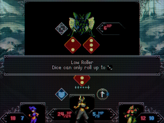
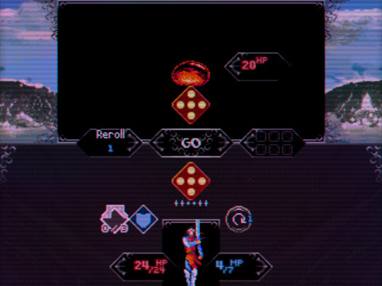
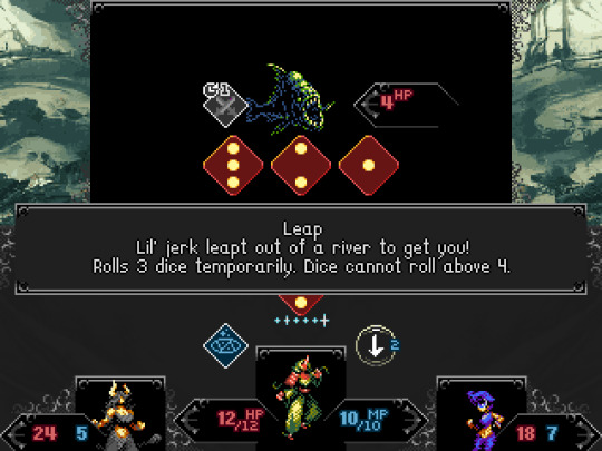
Here's a screen without it for comparison:
Today's is pretty basic: How's the CRT shader look?


Here's a screen without it for comparison:

ProphetSword
Arcane

While I'm normally a fan of CRT shaders, in these example pics the one without looks better, as the ones with the filter lack sharpness. But, that could be because the images presented here are too small to really make out the details.
Zeusington
Literate
- Joined
- May 3, 2024
- Messages
- 16
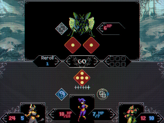
The blurriness comes from the texture filtering since I didn't want a really obnoxious glow pass. Here's some higher res shots of the two CRT presets and one without for comparison, all without texture filtering. I'll probably just add a filtering toggle. (The purple dot is the cursor point I use for debugging, not a glitch or artifact.)
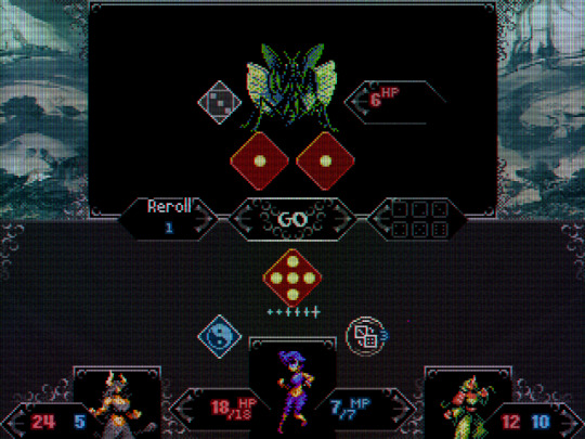
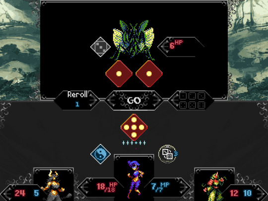


New here, discord communities and twitter are proving to be hot liquid dogshit for any kind of input because they're afraid just say they don't like stuff, so I wanted to post some screenshots / videos here for some opinions. I'll trawl along elsewhere in the forum for some hot takes, but I pretty much came here for feedback.
Today's is pretty basic: How's the CRT shader look?


Here's a screen without it for comparison:

As a whole image I actually really like the CRT shaders but when you look at the stats (HP etc.) it is hard to read.

I love CRT shaders. This is not a CRT shader.New here, discord communities and twitter are proving to be hot liquid dogshit for any kind of input because they're afraid just say they don't like stuff, so I wanted to post some screenshots / videos here for some opinions. I'll trawl along elsewhere in the forum for some hot takes, but I pretty much came here for feedback.
Today's is pretty basic: How's the CRT shader look?


Here's a screen without it for comparison:

The normal pipeline is taking a low-res picture, doing an integer upscaling the maximum number of times your screen allows, and applying a CRT shader on top. The image doubles-triples some pixels, and some of them are eaten up by CRT scanlines and other effects, but this is fine because they're redundant.
You took a small image and applied something on that exact image. It doesn't work. It ate up your actual pixels with info, resulting in loss of visual information. Or did you resize them to be so small? Why?
Also the white text font is not a pixel font, so it doesn't work. The outline doesn't help.
What specific retro aesthetic are you aiming to emulate?
When uploading screens for comparison, pls upload the same screen with/without shaders.
Zeusington
Literate
- Joined
- May 3, 2024
- Messages
- 16
I've gotten this feedback from elsewhere so I'm going to add some more contrast to the stat value colors in the next build.blah blah
As a whole image I actually really like the CRT shaders but when you look at the stats (HP etc.) it is hard to read.
Yeah, my last approved post (which you'll probably see way before this one) shows what it looks like without texture filtering on all three presets currently, lemme know if that looks better. I wasn't going for a specific look but the closest I'd say is PC-98 without the glow / curvature pass from the old monitors, may add some film grain to the corners to mimic that aspect but I think I should nail the contrast between important elements in the UI before adding more stuff on top of it.I love CRT shaders. This is not a CRT shader.blah blah
The normal pipeline is taking a low-res picture, doing an integer upscaling the maximum number of times your screen allows, and applying a CRT shader on top. The image doubles-triples some pixels, and some of them are eaten up by CRT scanlines and other effects, but this is fine because they're redundant.
You took a small image and applied something on that exact image. It doesn't work. It ate up your actual pixels with info, resulting in loss of visual information. Or did you resize them to be so small? Why?
Also the white text font is not a pixel font, so it doesn't work. The outline doesn't help.
What specific retro aesthetic are you aiming to emulate?
When uploading screens for comparison, pls upload the same screen with/without shaders.
I gotchu fam, I'm feeling people out and planning to keep at the demo over the course of a year before attempting to go gold, so even simple takes are important so I can enumerate them over time as "potential player sentiment" or whatever bullshit term people would use.Not sure if you should take my opinion, but i hate CRT shaders, i like CRISPY pixels
Communicating necessary information to players and making sure shit works is a stupid high priority. The game takes some UI and gameplay notes from RPGs but the game itself is pretty different and definitely has some sauce I just gotta convince people to taste, so don't hold back.
ProphetSword
Arcane

I think Bester hit it on the head. I normally would love a CRT shader, since sharp pixels wasn't the norm back in the day. But, the way you've done it doesn't lead to a great result.
The_Sloth_Sleeps
Arcane

- Joined
- Oct 26, 2016
- Messages
- 2,599
I played a game that gave the option of turning the CRT effect on and off. Its not to everyones taste.
Both crisp nu-pixel art and CRT-filtered pixels can be great looking art styles but it takes more than slapping on a shader to go from one to the other. Art that is intended to be displayed on a CRT-like display (real or simulated) needs to take into account of the resulting blending between pixels and take advantage of it where possible while counteracting it where it isn't desired (e.g. for small fonts). Even if there is an option (I'm all for options) the game will be designed primarily for one and not both.


