Putting the 'role' back in role-playing games since 2002.
Donate to Codex
Good Old Games
  • Welcome to rpgcodex.net, a site dedicated to discussing computer based role-playing games in a free and open fashion. We're less strict than other forums, but please refer to the rules.

    "This message is awaiting moderator approval": All new users must pass through our moderation queue before they will be able to post normally. Until your account has "passed" your posts will only be visible to yourself (and moderators) until they are approved. Give us a week to get around to approving / deleting / ignoring your mundane opinion on crap before hassling us about it. Once you have passed the moderation period (think of it as a test), you will be able to post normally, just like all the other retards.

Vapourware Codexian Game Development Thread

Joined
Dec 24, 2018
Messages
1,899
While adding basic support for cities I ran into some maddening buffer alignment issues and eventually discovered that glsl has some different struct packing rules from C++; namely, a 32-bit unsigned integer, which takes up 4 bytes, actually causes the addition of 16, and not 4, bytes to the stride of the struct it's part of. I could tell pretty much immediately by the symptoms I was seeing (most objects being positioned incorrectly, which told me the object data buffer wasn't being filled properly), but I thought the problem surely had to be on the CPU side and spent a very long time hunting through my renderer with a fine-toothed comb.
__attribute__((packed)) in gcc, https://en.cppreference.com/w/cpp/language/attributes for the rest. C++ standard allows compilers to insert any padding they want into non-packed structures for alignment purposes, and it can differ between compiler vendors and even versions, causing binary incompatibility. Joys of not having a C++ ABI.

If your code depends on exact size of a structure, you should add static_assert(sizeof(my_struct) == whatever_you_need). If you care about alignment as well, there's alignof.
My bad, in retrospect my first sentence was ambiguous and it wasn't clear which one had the padding. The extra padding for a 32 bit unsigned integer was taking place on the GLSL side, in the vertex shader code, not the C++ side. So I had a 100 byte struct in C++ (no padding), and a struct that should have been (as far as I knew) 100 bytes in the vertex shaders, but didn't realize the struct in the vertex shaders was actually 112 bytes until I inspected it in RenderDoc. One downside of CLion (otherwise a really nice IDE) is that there aren't really any good GLSL plugins, so far as I know. I've tried a few. I can hover over a struct in C++ and see its size and the offset of its members, but not in GLSL :(

EDIT:

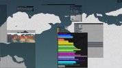
Added city icons. They use a sampler2Darray and the above mentioned integer to decide which texture to use in the fragment shader (this added render object component may be used later for tile terrain). Currently they can simply be assigned to a tile. Some more work is required to fine-tune them; in particular manual placement of their exact map coordinates would be ideal, and the user also needs to be able to specify whether they are minor or major cities, for generation purposes. I also went back in and tried async loading again; it now works properly, though there is a bit of a pause when loading finishes and the renderer has to do a ton of merging and batching. The pause takes less than a second, doesn't set off Windows "Not Responding" and is only visible because I have an FPS counter running (otherwise the screen is static), so I don't think it's an issue. Though I do think I'll want to consider parallelizing the actual loading/import code itself (it needs to be done in a particular way to keep the IDs assigned to each imported tile deterministic between runs). I'd also like to show the actual progress rate while loading.

The tile overview window is aligned better and also now includes a close button that makes the cartographer class deselect its currently selected tile, instead of having to click outside the map to get it to go away. Minor, but overdue. Also made the climate window work a bit better, though it could use some sort of colour analysis to determine when text should be black instead of white. Actually, I'll need that for coloured buttons in general, so that should probably be a high priority.
Untitled.jpg
 
Last edited:

beardalaxy

Educated
Joined
Jun 10, 2023
Messages
117
I finally got a quest finished that I was working on for about a week. There are a lot of moving parts and it takes place over several different locations, featuring a lot of different NPCs. Three of these NPCs are now totally integrated into the game with their own schedules and everything, including one that you can choose to fight. One of them serves a purpose in the main quest, which was done YEARS ago, so it's good to finally see him as a fully completed NPC instead of just a husk meant to serve the main quest and nothing else.

I also got something whipped up for those pointless doors, the ones where players aren't allowed to go through because there's nothing behind them. How do you think this looks? Is it a big enough sign to just stay away from them? If you click on one of these doors, you get a message saying "it would be pointless to enter here."

53a27753638e8643.png
 

RobotSquirrel

Arcane
Developer
Joined
Aug 9, 2020
Messages
2,125
Location
Adelaide
When too much is too much..
I wonder what your bottle neck here is. Maybe you need to cull some visuals so you can stream them in, there's no need to render parts of the map that aren't visible.
But anyway that is damn impressive though.

Split the map into sections and check if the player is inside one of those sections. A trick would be turn off the visuals and see if performance is better, if it is it means you're rendering too much. Otherwise its going to be you're running too much code on a per-frame-update basis and probably could stand to optimise it a bit (ie. make sure calls only occur when they're being used rather than all the time).
 

Zanthia

Novice
Joined
Jul 8, 2022
Messages
49
Location
Q3DM17
How do you think this looks? Is it a big enough sign to just stay away from them?
Looks good! I would try it the first time but it would be easy to remember after getting the message. Making the useless doorknob wood and not brass is a good touch, too.
 

beardalaxy

Educated
Joined
Jun 10, 2023
Messages
117
How do you think this looks? Is it a big enough sign to just stay away from them?
Looks good! I would try it the first time but it would be easy to remember after getting the message. Making the useless doorknob wood and not brass is a good touch, too.
Funny enough that wasn't even intentional, it just happened with the adjustments to the contrast/brightness I made.

Also funny enough, I am in the process of replacing all of the world graphics in the game. I posted a screenshot somewhere completely unrelated to game dev and the first response I got, almost immediately, was someone asking if it was RPG Maker. I have known for a while that having default assets is cause enough for people to skip over your game, because they see it's obviously RPG Maker and immediately dismiss it.

Apologies for the extreme amount of text here, but this is a rather large change to the game that requires a little bit of explaining as to why I'm even doing it in the first place.
TL;DR: I am swapping out the tileset graphics for new ones so that the game can stand out more, and it's going to take a lot of work to do so.

Story time. When I started making the game, I wanted to go all-out with a tileset that was completely made from scratch, but after talking to some artists found that they either lacked the skill to do something on such a level or it would cost more than I had money to pay for. At the time, RPG Maker MV had just come out and they updated their tiles to be 48x48 instead of the 32x32 that had been default for a very long time, so there wasn't really much to choose from in the way of asset packs you could just purchase. Because of this, I decided to just crunch up the RTP tilesets to make them look more retro with some scaling, and hoped that it would make them at least fit with the rest of the art in the game, which is more simplistic.

Again, I knew that this would be a detriment to the game's success. While not looked down upon much in the actual RPG Maker dev community, using default assets is always something that players will be able to sniff out and shit on. I'm sure a lot of people passed over something like Vampire Survivors because at first glance it looks like it does actually just use straight up stock RPG Maker graphics, even though it's not even made in that engine. I heard that complaint plenty of times. I just didn't want to change the graphics because, by the time it even became something that I thought would be relatively doable, I had already made hundreds of maps for the game and swapping to a brand new tileset would mean needing to recreate all of the maps from scratch.

That response, asking if it was RPG Maker, is what actually spurred me to come up with some better solution, though. I figured that if I could find a tileset that featured most of the things that the stock ones did, I could at least rearrange them into the same format and adjust colors and stuff if necessary. So, I went on an adventure to see what I could find. I came out with two different tilesets that looked like they could cover the majority of the things I needed them to, and I would just figure out something for the rest, whether that be manually editing the tiles or hiring an artist to do a few graphics if necessary that would match the new style.

So, I've been working on this for about 35 hours at this point, and I'm about 10% of the way done. Just chopping out pieces from the tileset packs I purchased and formatting them to fit the tilesets of the stock assets. I've actually had to do a lot of work to expand the tilesets into something that can actually replace what I was using. Lots of color edits, sprite edits, and even custom sprites I've made myself.

This is the latest update I made, a bunch of rocks for caves/dungeons. You'll be able to tell right off the bat that it is a lot more simple, a more flat art style. I was specifically going for this since all of the other art in my game, that I have had created by other artists from scratch, is way more simple and uses flat coloring/shading. This drastic shift in art style might look like a downgrade because it technically is, but it's what I was going for and the main goal is that it makes the game stand out compared to the slew of other RPG Maker games that use default assets. With this change, it will make nearly all of the art in the game completely custom, including the music and sound effects. About the only thing left resembling RPG Maker will be the menus, which I actually like for how simple they are. It's going to take a lot of work to do, but it will be totally worth it in the end to have something that looks different.

fd2145f2ceb11351.png
 

beardalaxy

Educated
Joined
Jun 10, 2023
Messages
117
Do you need starting equipment for your party? Or give money and they can buy it in the starting town?
In my opinion, if you don't give starting equipment to your party, then you better have a lot of different combinations of equipment for them to buy in the first town, and make sure the player knows that's what they have to do.
I could see this working best if you wanted to do away with a traditional "class" system, and have the player build their own class through the gear they purchase and the leveling they do. That would be a lot more like a western RPG.
 
Joined
Dec 24, 2018
Messages
1,899
I took a break from programming for a while (as I was burning out on that) to focus on building up the world a bit (determining the number and approximate locations of the races, ethnocultural groups, and nations - something which had to be sketched out at some point) but, having completed that, today I revisited the swapchain resize issue, did a bunch of refactoring to migrate various initialization / re-initialization procedures from being in the main Renderer to instead being in its Context, and getting the swapchain and its associated Vulkan objects rebuilt correctly when a rebuild is required. So dynamic resizing (clicking and dragging on the edge of the window) is now supported, although certain UI elements currently don't work quite right with it. I'll have to check in on that later because currently I'm uncertain if I want to express the UI as a static percentage of the window, or to have them be more fixed, absolute in size (with the user able to set an overall scale manually) and then simply occupy more or less of the window, but for now, probably back to generator stuff.
 

Justinian

Arcane
Developer
Joined
Oct 21, 2022
Messages
292
Gonna release my first game as soon as possible.* Ideally I would have at least gotten some reviews first but eh, it is what it is. I raised the price to 5 bucks, pending approval (link in signature if you want to get it at 3 bucks for now, otherwise wait for halloween sale), if I'm only gonna sell 1 copy a month then a 3 dollar game isn't worth it.

I did try my hand at making some Youtube shorts to advertise it a while back. Not a lot of views (maybe a couple hundred in total), but eh, it was kinda fun.

First (and worst) one I did, (esp the overlapping tags and text):


This one was the most popular:


This one was the second most popular, it was also the only one that got any downvotes, I guess I triggered some nerd's trauma:


I thought this one would be more popular but it got the least views:


Last one:


*looks like i have to either wait 30 days or not offer any launch discounts. i'll probably just wait 30 days.
 
Last edited:

PompiPompi

Man with forever hair
Patron
Developer
Joined
Jul 22, 2019
Messages
4,288
RPG Wokedex
This is a test trailer for Tomb of Goliath(not even the final name of the game)
It's not meant for public consumption, and might drive you instane.
But here it is...
What do you understand from this trailer?
You think it would convince you to wishlist the game?
(Apart from WIP issues that needs to be fixed)


beardalaxy

Educated
Joined
Jun 10, 2023
Messages
117
This is a test trailer for Tomb of Goliath(not even the final name of the game)
It's not meant for public consumption, and might drive you instane.
But here it is...
What do you understand from this trailer?
You think it would convince you to wishlist the game?
(Apart from WIP issues that needs to be fixed)


The voice over is bad and doesn't inspire hope in the project. You might want to think about getting someone with a cleaner accent and a higher quality microphone to do it instead.
The mouse cursor being shown is very unprofessional. I have no idea what that weird polygon in the middle is either.
The gameplay itself is not my thing, but I am actually not sure if I have seen a fully 3D dungeon crawler in this same vein before. I wouldn't be surprised if it had an audience somewhere, if niche. It would be in your best interest to cater to that niche audience as much as possible. I like the fact that you can interact with the environment as a means of slowing enemies or defeating them, and that certain enemies have their own ways around those things too. The addition of physics is a good touch as well.
The animations could perhaps use a little bit more work. They just look extremely basic right now. Serviceable, but they look weird when juxtaposed against how smooth the physics are. If you could use physics-based animation, perhaps it would be better, although I'm not entirely sure what that would entail as I've never personally worked with 3D before.
 

Zed

Codex Staff
Patron
Staff Member
Joined
Oct 21, 2002
Messages
17,068
Codex USB, 2014
The voice over is bad and doesn't inspire hope in the project. You might want to think about getting someone with a cleaner accent and a higher quality microphone to do it instead.
The mouse cursor being shown is very unprofessional. I have no idea what that weird polygon in the middle is either.
Looks like it could be a fun crawler but I second the above from a pure selling standpoint.
 

PompiPompi

Man with forever hair
Patron
Developer
Joined
Jul 22, 2019
Messages
4,288
RPG Wokedex
Yea, this is a test trailer.
Voice over will be commissioned by a professional.
Not sure why the mouse in the video is bad, since it make it more obvious it's real gameplay? This isn't a pure cinematic.
Yea, I could do a better thing than the 3D ray
 

Aemar

Arcane
Joined
Aug 18, 2018
Messages
6,320
This is a test trailer for Tomb of Goliath(not even the final name of the game)
It's not meant for public consumption, and might drive you instane.
But here it is...
What do you understand from this trailer?
You think it would convince you to wishlist the game?
(Apart from WIP issues that needs to be fixed)


Placeholder voice acting aside, I think it looks quite good. It's definitely something that I would wishlist especially if I had more info on the game. It already looks better than those shitty VR games you can find on Steam on every corner. I also subscribe to most of what beardalaxy has already said.

How many shekels do you plan to charge for your game btw? How many hours does it take to complete it?
 

PompiPompi

Man with forever hair
Patron
Developer
Joined
Jul 22, 2019
Messages
4,288
RPG Wokedex
This one is a big project, so the stages are like this:
1. Announcement trailer, collecting wishlist.
2. Demo
Demo would be basically as big as I could possibly make.
The Demo would be almost it's own game.
If people don't like the Demo, I have no point to make a bigger game.
So I will not make the full game, then cut down Demo.
I will just make as much content as possible, and then shove most of it into the Demo.
3. After Demo shows more success, gonna add mote content.
At this stage most of the features of the game needs to be complete, because the Demo should be big on it's own.
So it's only more content, like longer campaign, and more stuff.

I basically treat the Demo as it's own game.

If the Demo is gonna be big and succesful enough. Full game will be at least 20 USD, up to 30 USD.
 

Aemar

Arcane
Joined
Aug 18, 2018
Messages
6,320
Wishlist? You need to figure out by yourself the kind of game you want; you're making the game according to your own ideas, you're not making other people's game. If you're short of ideas, I'm sure there are wishlist threads attached to similar games on Steam.

Also, why concentrate your efforts on doing a bigger demo when you can make a smaller one instead that would contain the main features?

About the price, a lot of popular games are somewhat cheaper than what you propose.
 

PompiPompi

Man with forever hair
Patron
Developer
Joined
Jul 22, 2019
Messages
4,288
RPG Wokedex
Wishlist? You need to figure out by yourself the kind of game you want; you're making the game according to your own ideas, you're not making other people's game. If you're short of ideas, I'm sure there are wishlist threads attached to similar games on Steam.

Also, why concentrate your efforts on doing a bigger demo when you can make a smaller one instead that would contain the main features?

About the price, a lot of popular games are somewhat cheaper than what you propose.
Wishlists, did you ever use Steam?
Players "wishlist" the game, when they want to hear updates about it. Not that I let player say their wishes what they want the game to contain. Or it's not a birthday wishes list.

Steam puts weight on the amount of time spent on a Demo. If people enjoy the Demo and play it long enough, this is a good sign the game will be very successful.

Not sure which games you mean.
 

Tavernking

Don't believe his lies
Developer
Joined
Sep 1, 2017
Messages
1,264
Location
Australia
Developers who have released a game on Steam - how accurate is this steam game revenue calculator for you?

I compared it with iron tower studio's 2020 financial report and it seemed somewhat accurate.
Dungeon rats made $248,012 and the tool predicted $237,215
Age of Decadence made $1,946,234 and the tool predicted $2,616,440 (ok, so it's way off here)

But keep in mind I'm comparing Iron Tower's 2020 data with 2023 review counts and 2023 full price. Age of Decadence is likely around $2,100,000 in 2023 which isn't too far off the tool's prediction.
 

PompiPompi

Man with forever hair
Patron
Developer
Joined
Jul 22, 2019
Messages
4,288
RPG Wokedex
Developers who have released a game on Steam - how accurate is this steam game revenue calculator for you?

I compared it with iron tower studio's 2020 financial report and it seemed somewhat accurate.
Dungeon rats made $248,012 and the tool predicted $237,215
Age of Decadence made $1,946,234 and the tool predicted $2,616,440 (ok, so it's way off here)

But keep in mind I'm comparing Iron Tower's 2020 data with 2023 review counts and 2023 full price. Age of Decadence is likely around $2,100,000 in 2023 which isn't too far off the tool's prediction.
Probably more accurate to at least 200 reviews and up.
 
Developer
Joined
Oct 26, 2016
Messages
2,289
Developers who have released a game on Steam - how accurate is this steam game revenue calculator for you?

I compared it with iron tower studio's 2020 financial report and it seemed somewhat accurate.
Dungeon rats made $248,012 and the tool predicted $237,215
Age of Decadence made $1,946,234 and the tool predicted $2,616,440 (ok, so it's way off here)

But keep in mind I'm comparing Iron Tower's 2020 data with 2023 review counts and 2023 full price. Age of Decadence is likely around $2,100,000 in 2023 which isn't too far off the tool's prediction.
Nice find. It seems to be accurate enough. Although there are simply too many factors that could affect the gross, sales, price variability, etc. to ever get it more accurate.

I would use such a tool to look at games most similar to the one I am creating and plug in the number to get an estimate of what would be an optimistic outcome. It seems I am looking at 100k revenue if it comes out as a 7/10.
 

beardalaxy

Educated
Joined
Jun 10, 2023
Messages
117
I've been hard at work replacing all of the tileset graphics in my game, making it look more unique instead of just using the stock assets. It is a lot more work than I thought it was going to be because of the amount of object I have either had to hodgepodge together or create from scratch. I started work with the dungeon tilesets, and I have the feeling that they are going to be the hardest ones just because the tileset packs I purchased don't actually have a lot of dungeon content in them. They have plenty of exterior and interior things; in fact I think it covers the majority of the default assets of the engine in those regards. Dungeons have just been difficult.

As a little preview, here are some statues. The angels were made by my artist, but I had to change them up a bit to get them to fit and get the outline around them looking decent enough.
image.png

I also made this jail cell barred wall thing from scratch, since I couldn't find anything even close for this purpose.
image.png


It's not all I have done recently. I've been working on pillars, signs, chests, and foliage as well. I'm excited to see how it turns out, but honestly I'm a little bit worried it will look horrible and I'll have to scrap everything. I'm optimistic, but I've still got that lingering doubt in the back of my mind.
 

PompiPompi

Man with forever hair
Patron
Developer
Joined
Jul 22, 2019
Messages
4,288
RPG Wokedex
Preparing half mockup screens for the store page.


Screen1Web.jpg
 

As an Amazon Associate, rpgcodex.net earns from qualifying purchases.
Back
Top Bottom