After PFK I've grown disenchanted with the strict isometric thing. I like spinny-rotatey and zoomey-in-and-outey now (with mod and high rez NPC textures - kindly supplied to the modder by Owlcat).
The art quality difference is still there a bit. POE2 really does look amazing in places. But it's not like the difference is night and day (like it used to be with NWN vs. BGII, for example) and the D:OS games and PFK (and DA:I's Frostbite loveliness for that matter) show that full 3-d is very close to being just as artistically pretty as the modern Infinity-inspired games. Going back and playing POE recently, it felt quite psychologically cramped by comparison.
Full 3d games can look good, but they still can't be compared to what can be (and has been) achieved in terms of beauty with 2d pre-rendered hand-painted backgrounds. D:OS 2 can be gorgeous at times, but it still looks plastic and cartoonish (in a bad way) when compared to old IE games or to the two PoE games.
They can't be compared because they use two completely different artistic mediums. It's like comparing two different forms of art: there obviously are magnificent sculptures, but, since I'm more of a painting guy, I will always take a good painting over a good sculpture.
I don't think that's the essential difference - I said this on the other thread in which I responded on this topic, but I'll reiterate it again. There's no artistic difference, and the building blocks are the same (the 2-d environments are done in 3-d first, after all, and digital painting is digital painting, whether directly on a 2-d surface or on a texture to be used over a mesh).
The difference is that
each environment in the 2-d isometric system can afford to look absolutely unique. There's less necessity to re-use assets for the sake of economy (e.g. the grass, the bottles, the knick-knacks, the doodadery, can afford to look
completely different in one area than in another). That means there's more artistic freedom in a sense, but it's just a function of time, effort and higher resolution, not some magic fairy dust pertaining only to to 2-d.
Take any single area in Deadfire and any single area in Kingmaker, ignoring assets reuse (we are looking at a single area, after all). The Deadfire one will always look a thousand times better.
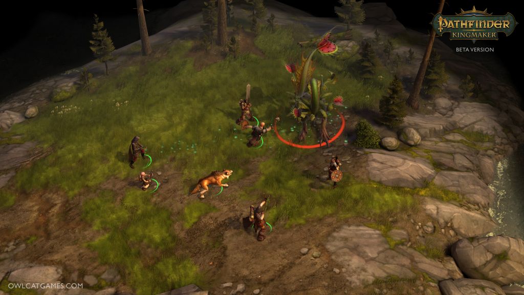
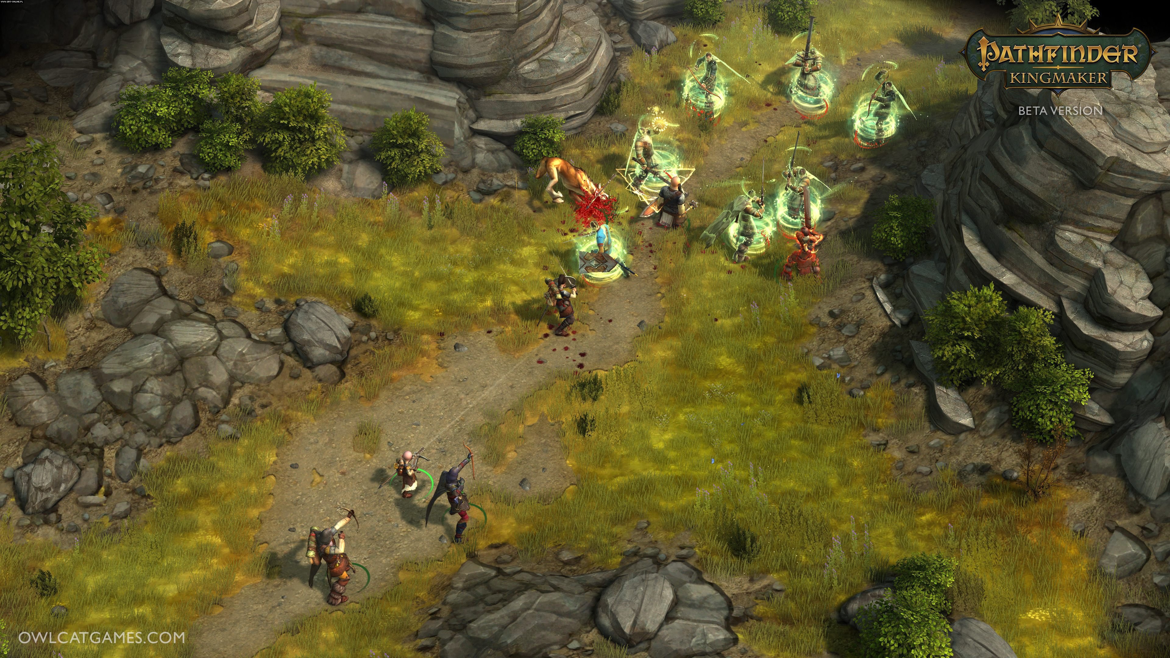
First four Kingmaker screenshots I found on Google:
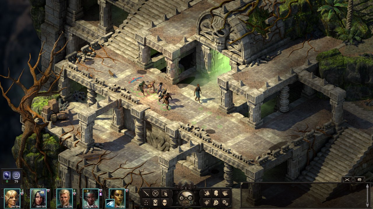
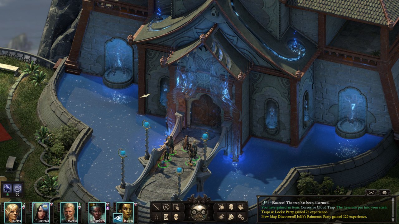
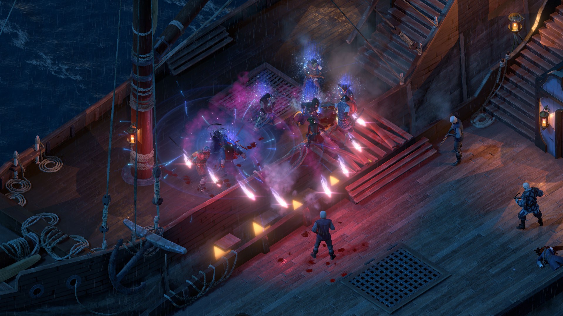
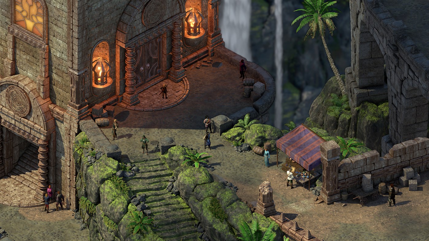
The same thing, but for Deadfire:
I mean, come on. Look at a single column in a Kingmaker screenshot and then do the same in a Deadfire one.
I agree with you that it's a function of time and effort, but those two things are a function of the same resource: money. With infinite money, Wrath of the Righteous could look better than Deadfire, but money is always finite and Owlcat will never be able to reach the same level of detail Obsidian did, because they need to make low-detail reusable assets that needs to be viewable from any angle (a sculpture), while in Deadfire you have a fixed image that you can look at only in a single way (a painting). Again, take a brick from a Kingmaker screenshot and compare it to one from Deadfire: not only they don't feel unique because they have to be reused, they also are simply uglier, because the same level of detail is unattainable in 3d without a huge investment of resources.




![Glory to Codexia! [2012] Codex 2012](/forums/smiles/campaign_tags/campaign_slushfund2012.png)


