Setting the Stage
POSTED: 10/14/2017
Hi everyone, Paul here with the next installment of our look at building a vertical slice. Last go-around, Colin McComb took us through the high-level concept (and iterations on it) of the Everest Hotel. In this entry,
and just in time for #Blocktober, level designer Alex Kerr takes us through the process of building that concept into reality - of crafting a game zone that captures the intent of the design. Fair warning: if you want to remain spoiler-free about this part of the game, skip past the next section!
Take it away, Alex!
Building the Everest: Level Design & Setting the Stage
What does "Level Design" mean, exactly? It depends on the project, but my approach is this: “Enable the player to use the game’s mechanics to their fullest extent.” This is a very broad definition, but I like it because it covers everything from Tactical RPGs to Match 3 puzzle games. Basically, our job is to make it easy to play the game in the most fun ways possible.
We’ve seen a lot of the Everest Hotel recently, so rather than covering the interior, we’re going to take a look at part of this zone’s exterior scene: the Suicide Forest.
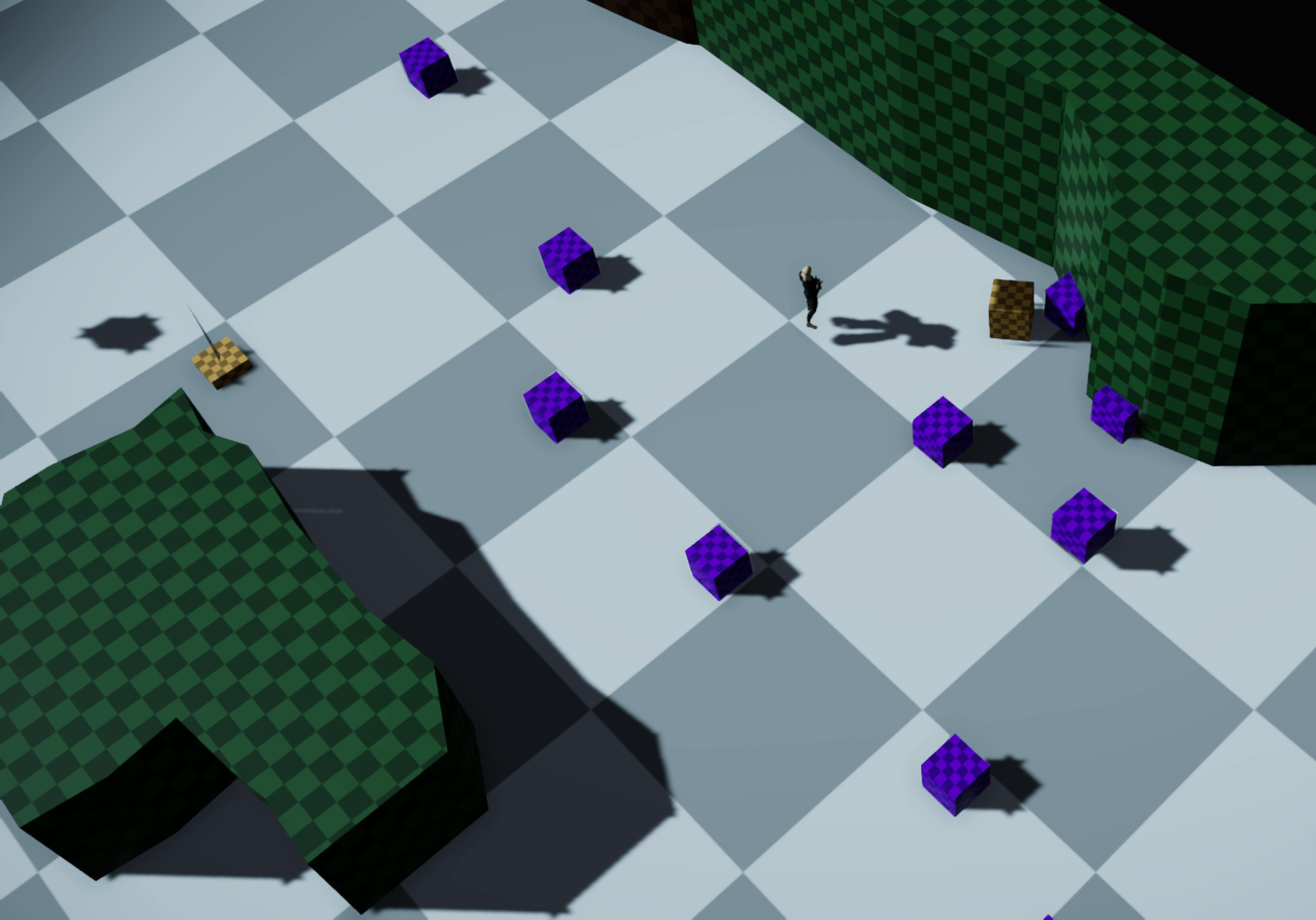
What you're looking at is blockout level geometry, which is the rough draft we use to quickly iterate on design, layout, and scale. Sometimes this is called a "gray box" or "block mesh" pass. Either way, the idea is to get a functional version of the level early, so we can test our assumptions and make big changes before getting the art department involved (we'll delve into the art process in a later update).
The Suicide Forest is a large scene, and it's seen a lot of changes. In fact, we've even had a few changes since we started prepping this update. Today, we’ll just cover two related sections of the scene which make up some of its optional content: the exploration-focused Abandoned Camp and the combat-heavy Missing Hunters.
Overall Flow
When the player reaches the Abandoned Camp, they enter a clearing. Exploring it reveals tattered tents and spatters of blood lead down a rocky path – clues that will lead to answers about what happened to its inhabitants, a group of hunters.
Once the Rangers discover the missing hunters, new information and a change in the circumstances force them to make a difficult choice. Depending on the decisions players make, the party may find itself facing off against several well-armed enemies, fighting to the death against an inhuman opponent, or leaving without firing a shot.
Abandoned Camp
The focus for this area is enabling exploration. The Rangers have just come across a small set of tents set up deep in the forest. Who was here? Where have they gone? The Rangers can find clues pointing to the answer.
Those purple blocks will be trees.... someday.
When it came time to playtest our initial blockout, we made a number of tweaks to the layout and flow.
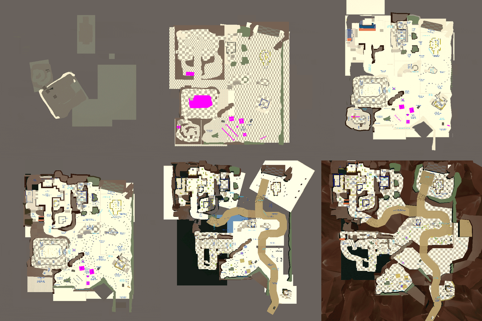
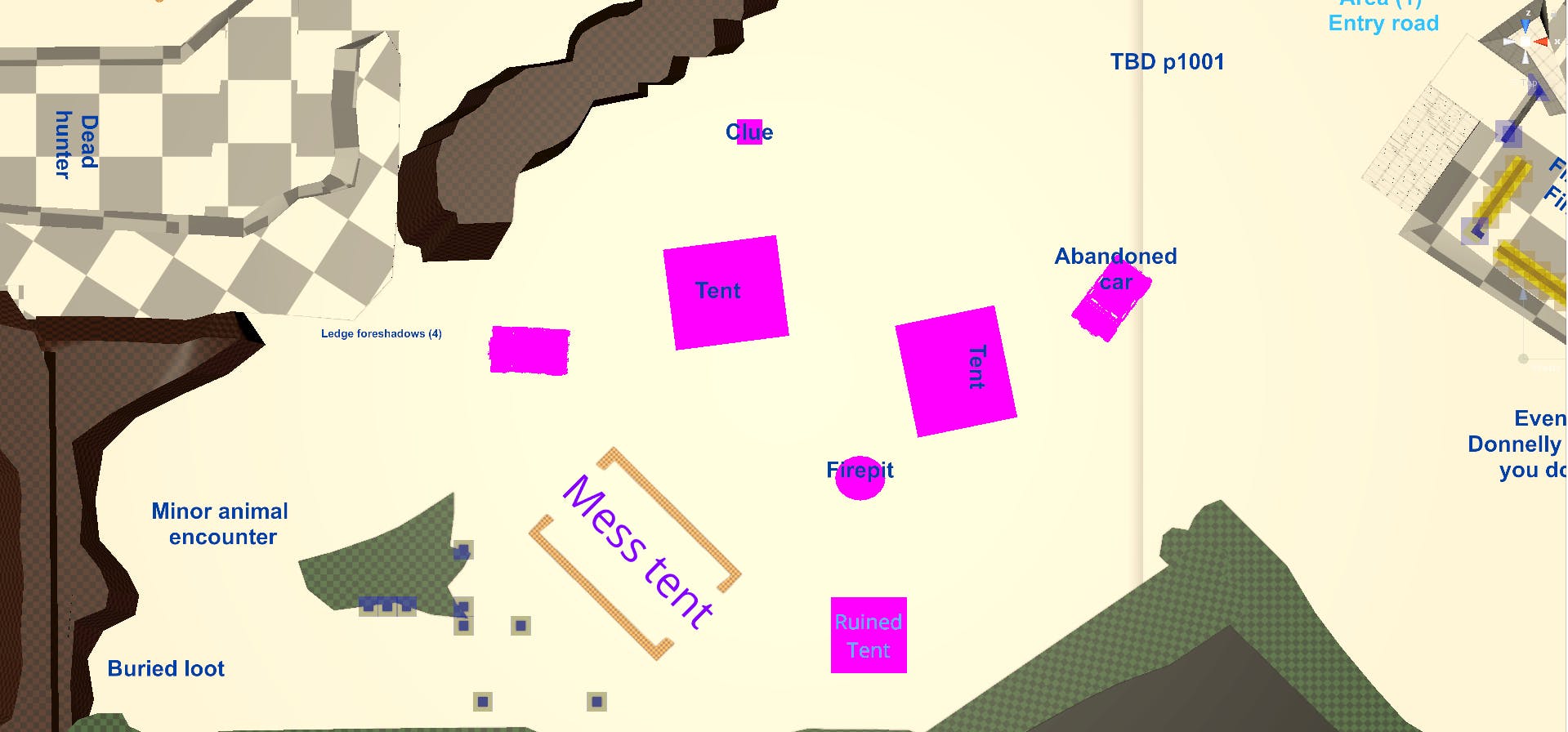
Here's what the layout of the Abandoned Camp looked like in its first iteration:
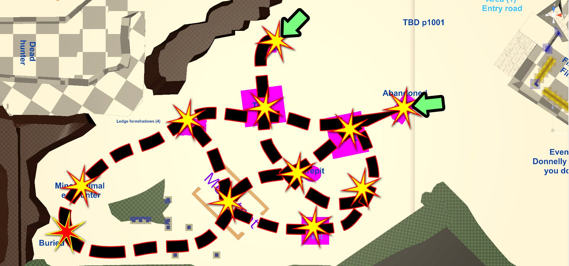
It's kind of hard to tell what's going on, so below is the same image with some markup that show how players typically move through the area:
Green arrows represent entry points, yellow stars represent clues the player can uncover, and the red star represents a small combat encounter. Dotted lines represent the
potential paths between points of interest: each clue is within the visible range of at least one other clue, letting players move between them freely. If it's a multiplayer session, then players can split up and independently uncover new clues.
Setting up the clues in this way was a deliberate strategy on our part: players choose which clues to pursue and in what order, but they'll eventually be led through the forest and back to an entrance.
This first version of the Abandoned Camp had two entrances, which also served as exits. As we began building the area, though, we felt that we could introduce this area better if the player had a single point of entry. After the revisions, we had a single main entrance, a single main exit, and a one-way entrance which is closed on your first visit (that long, gray passage on the bottom left), which made it easier to include more tactical and exploration options inside the area.
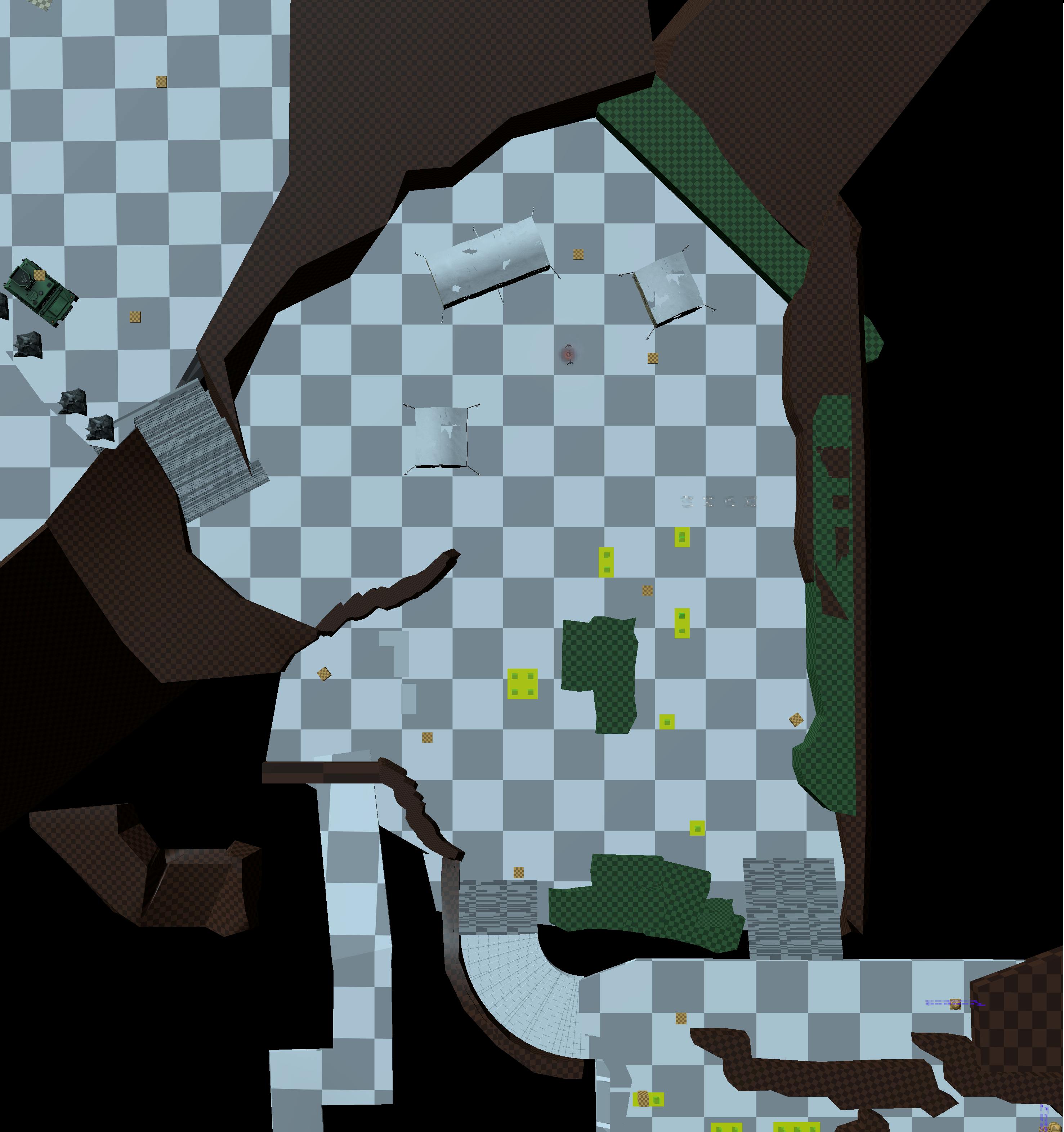
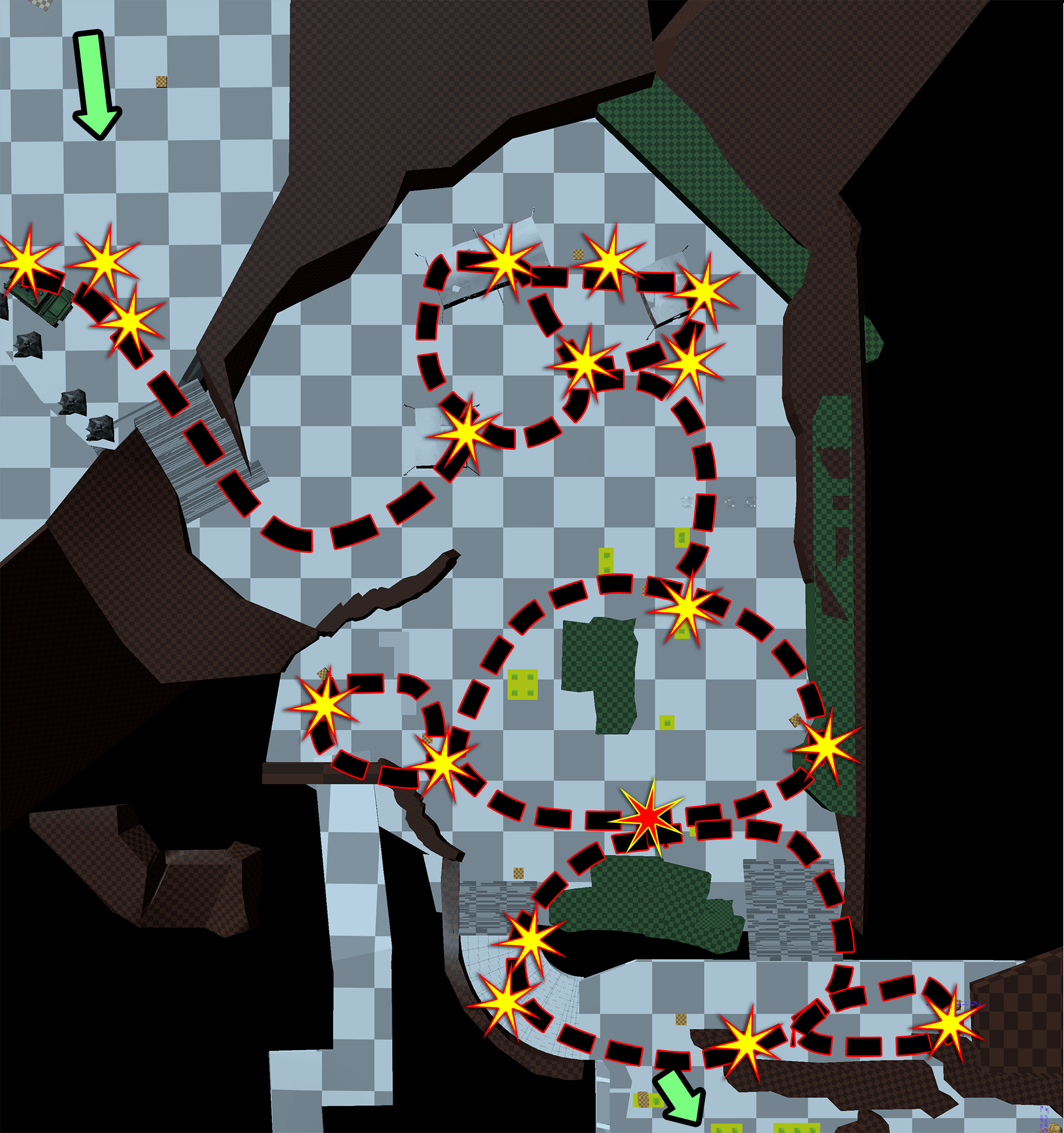
Here's the current iteration of the camp:
You’ll notice that there were also major changes in orientation and placement, but the camp itself hasn't changed much (although we did remove the large "mess tent", which didn't make sense for such a small group). Initially, the pathing looks quite different, but the philosophy behind it is still the same:
In both versions, when Rangers have completed at least half of the exploration phase, they’ll discover a hungry bear (marked by a red star on the screenshot above). Initially this seems like it might be the reason the hunters have gone missing, but as players discover more clues, they'll learn pretty quickly that there's more to the story.
Missing Hunters
Heading into the next area, the Rangers know (via some radio transmissions, and the clues encountered earlier) that the hunters are nearby and are seeking assistance.
What are our goals for this area?
- Let players really go to town with one (or more!) interesting combat scenarios.
- Pay off the mystery from before (which can lead to combat)
- Deal with an unnamed twist that may put the players at odds with the hunters (see above).
Once you’ve found a few of the clues, it’s pretty easy to find the missing hunters. However, the story takes a dangerous turn, prompting a new question: what do you do with them?
- Depending on how you decide to handle things – or, depending on your past choices, how things want to handle you – the Rangers may end up
- (1) simply walking away from the situation
- (2) engaging in combat with the hunters
- (3) engaging in combat with something else.
(1) Leaving the situation has its own set of consequences that require quite a bit of thought and scripting to handle within the mission itself, but from a geometry perspective, the player simply needs to be able to turn around and leave. So: can the players turn around and leave? Looks like it. Great! Mark #1 done. From a level layout standpoint, at least.
(2) Okay, so what if they engage in combat with the hunters? This may sound a little odd, but there are developments in the mission that actually can make this a reasonable course of action.
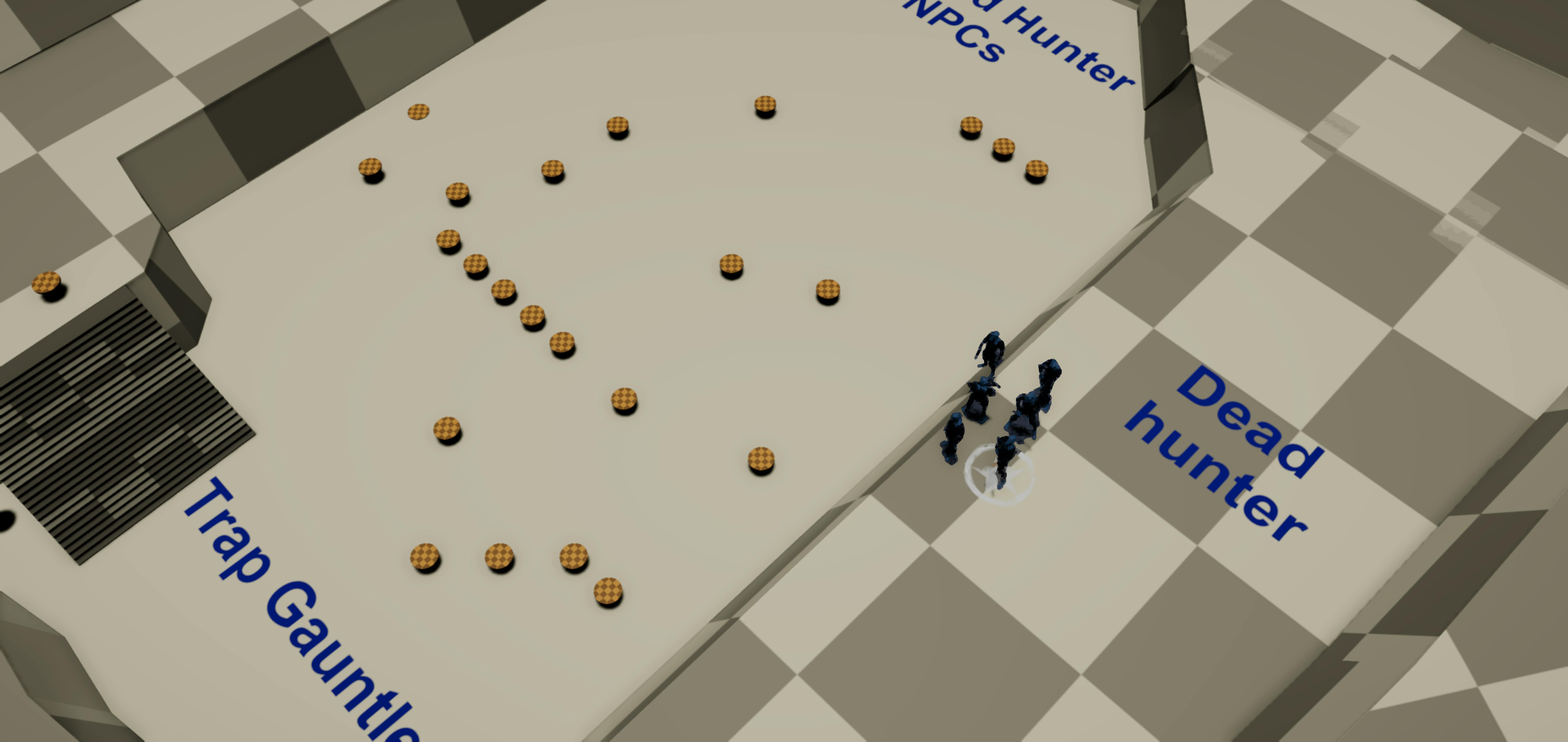
To do this, the player will need to make their way through a trap-filled gauntlet (the kind of traps that the hunters are using work just as well on Rangers as they do on prey), then they'll need to take on three very well-equipped outdoorspeople. This is a variation on a typical “advance” scenario: braving a heavily fortified position. I’ll leave the details of combat design to a future developer diary by our combat designers, but for our purposes, we basically need an interesting approach that provides opportunities for clever tactical thinking that will offset your disadvantages.
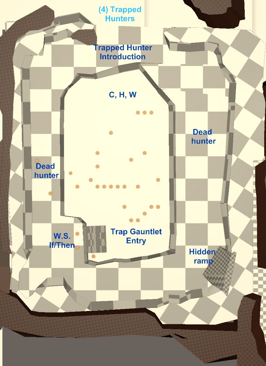
Here’s what the Missing Hunters area looked like at first:
This looked like it had potential, but as we playtested things, it felt a little small.
Also, as we ran it past more people, a story issue cropped up: it didn’t seem plausible that the hunters were really trapped. The ledge wasn't very steep, and if they were able to evade the
something else long enough to set up their crazy trap gauntlet, surely they could have backtracked instead of digging in. We had several plausible explanations for why they ended up in the current situation, but that wasn’t the point of the mission: we needed players to look at the area and instantly think “oh yeah, you could end up in a bad situation here.”
I’m not going to show you the revised version yet, though, because it also ties into choice #3…
(3) Engaging in combat with the
something else.
Internally, I’d been referring to this as the “ledge fight,” because it took place in the same area, but on the upper rim of the valley, wrapping around the trap gauntlet.
This concept was a lot of fun, but in practice, the limited width of the cliff edges, the large amounts of running around from edge to edge, and the lack of differentiation between each of the four sides led to unexciting playtests. So: big red flag, needs revision!
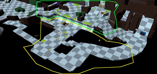
We made major changes to address the issues in both combat scenarios. A big part of this was adding more verticality to the fight itself by increasing the distance between the two sub-areas. We also decided to move the two combat areas alongside each other, rather than overlapping. Here’s the latest revision:
Section “A” (yellow circle) is where players can fight the hunters, which is spread out over a larger space to better leverage the hidden traps, and now shares only a single border with section B.
Section “B” (green circle) is where players can fight the unnamed adversary, which is now a limited to one side of the cliff, but has multiple variations in height and more potential cover.
The right-hand path connecting these areas contains the beginning of the ‘trap gauntlet’, as well as a special cave which can be accessed depending on the player's skills and equipment. We’ve also enlarged the upper middle area and added a one-way exit at the bottom. This eliminates the need to backtrack once you're ready to return to Suicide Forest. Also, the entire space has been flipped and rotated to better align with the rest of the level layout.
Overall Flow
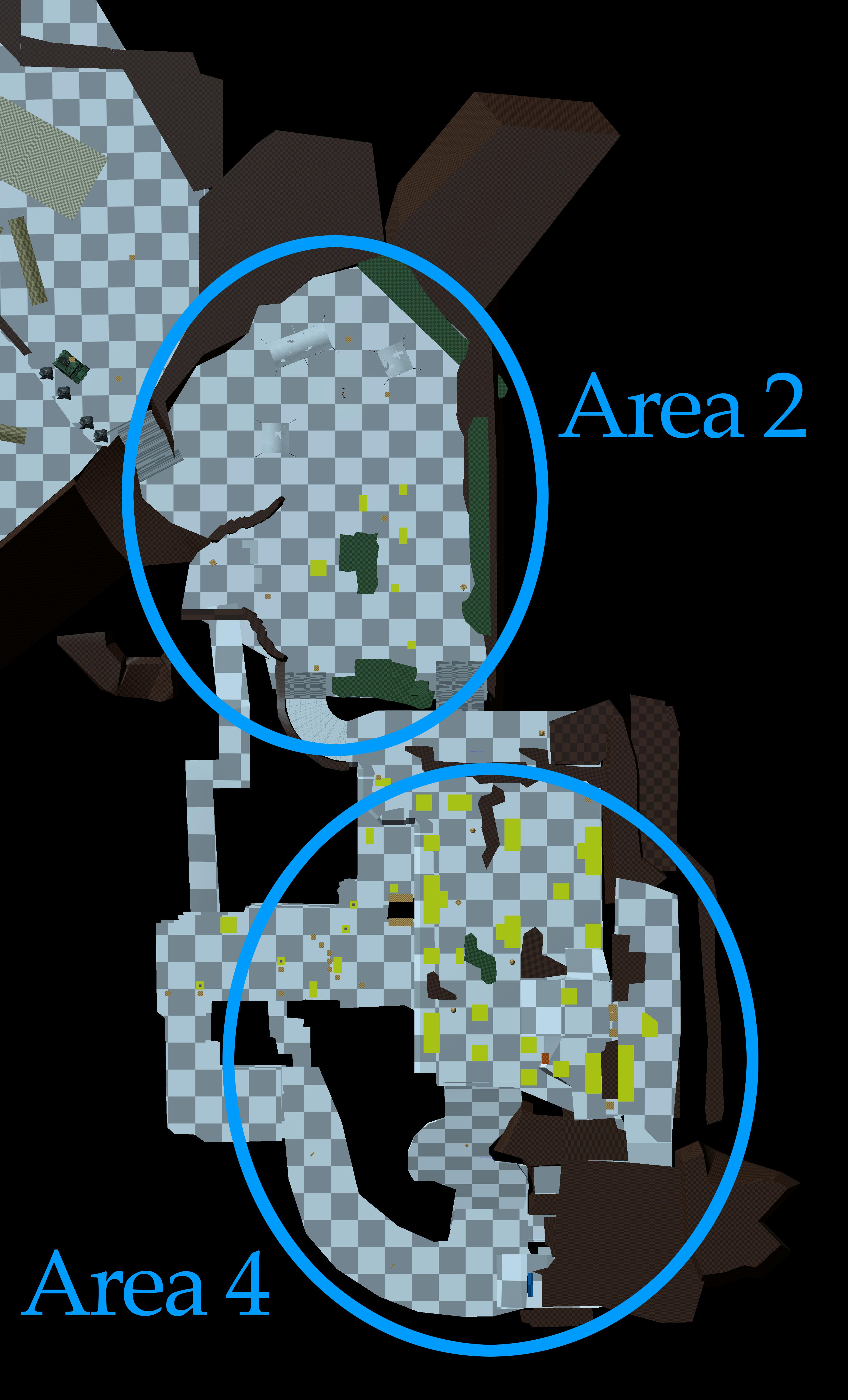
Let's wrap up with one of the biggest changes: altering both sections so that the Abandoned Camp and the Missing Hunters are sequential.
Originally, the camp and missing hunters could be found in any order. In that case, the missing hunters functioned fine, but the camp served as story “back-fill” instead of foreshadowing. Which
technically is fine… but what stuck in our collective craw was that players never CHOSE the order of events: it was random chance. To put it another way: if a game asks you to flip a coin, you're not “choosing” heads. It’s just something that happened, but could have gone the other way.
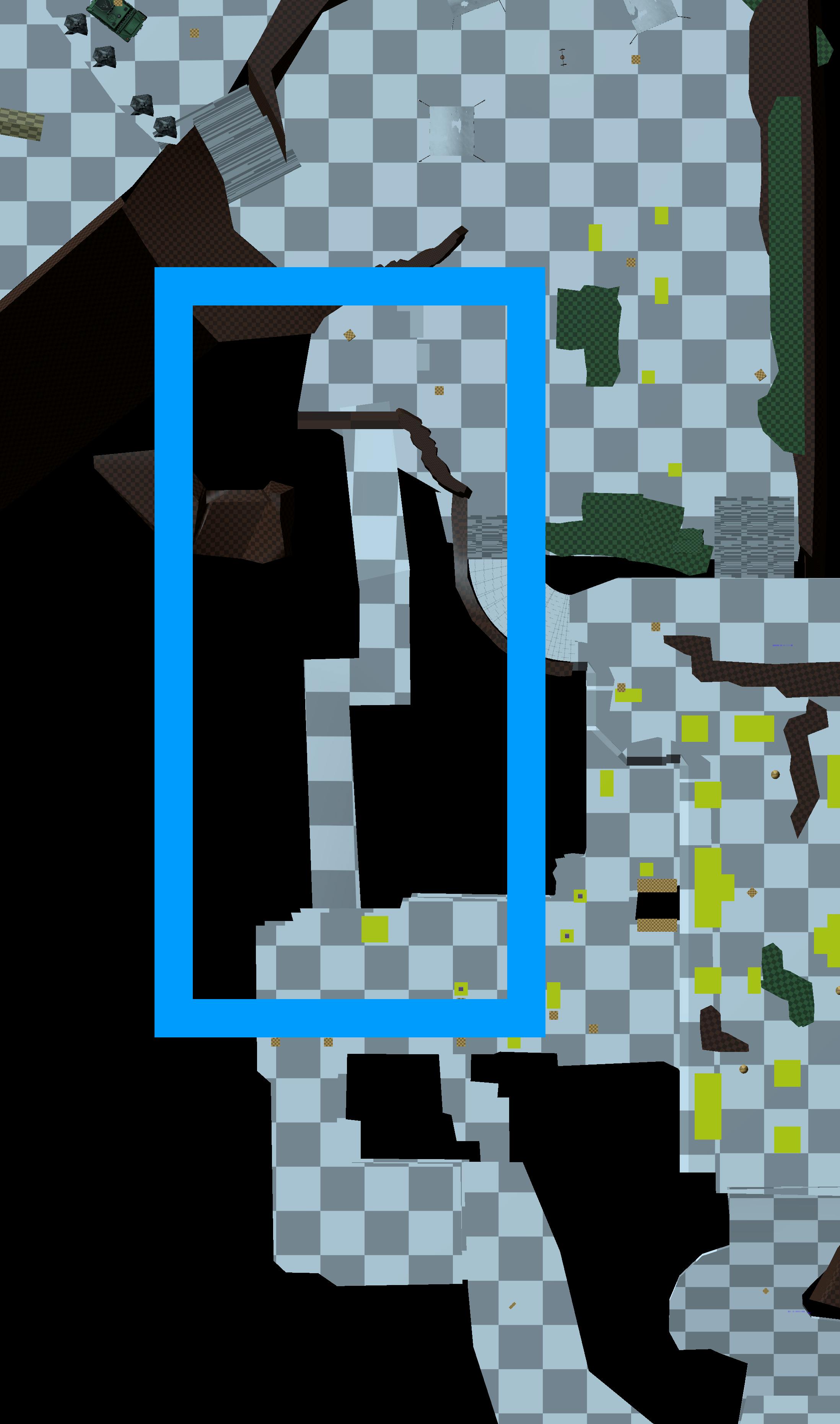
Also, as we continued the development process, it became clear that the player's choice in the trap gauntlet was much more impactful if they already had some context from visiting the abandoned camp before-hand. I revised the map so that forest behind the abandoned camp leads to a ridge, which leads into the area containing the missing hunters. This required rotating both areas and elongating the connective paths, but the new layout came together quickly and we could immediately feel the difference during our playtests.
One side-effect of this revision, however, was that it introduced the potential for some lengthy backtracking, so we added a one-way gate exiting the missing hunters area, leading back into the camp, placing players very close to the first entrance. It's a little quality-of-life feature that players appreciate (and it's one we're also making use of in The Bard's Tale IV).
The new one-way gate that makes backtracking a thing of the past.
All together, these revisions achieved their goal: creating an optional area of the map with a tight gameplay loop that allows for a lot of exploration, discovery, and choice along the way. This iteration process is common throughout all of our level design, and almost every area of the game undergoes these types of changes and refinements towards best realizing our gameplay.
...Of course, things are far from complete, and I'm looking forward to see how things improve between today and launch. Visually, things are already looking much better, because the art team has starting working on this scene.
They'll detail their progress in an upcoming post, but for now, here's a very early work-in-progress screenshot:
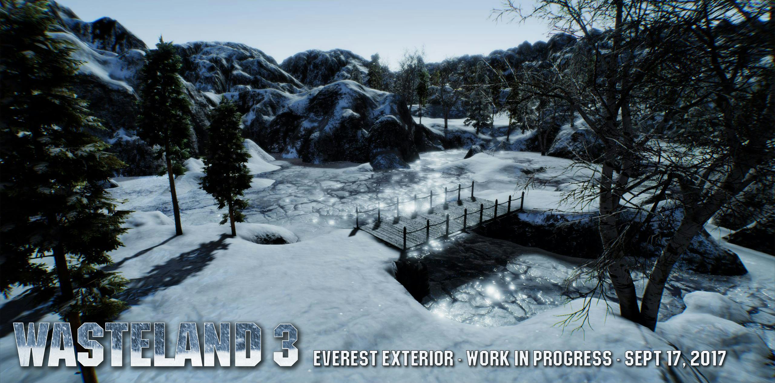 First pass art by Erika Sass
Thanks for reading, everyone!
Alex Kerr
Level Designer
The Wasteland Population Grows
Hi all, Paul back for the rest of the update.
Since the game entered production a short while back, the Wasteland 3 team has expanded. Our first and biggest hire was Stewart Spilkin, who joins the team as Senior Producer. This is a return home for Stewart, who was previously at inXile a few years back and was a Producer on our titles Hunted: The Demon's Forge and Choplifter HD. Stewart is a 20+ year game industry veteran. His production work includes Capcom's Resident Evil 2 and more than seven years producing Rockstar's Red Dead franchise. As Senior Producer, Stewart serves a key role in making sure all the different teams (Art, Design, and Engineering) are working in tandem and hitting their various production and milestone goals. Over the coming updates, we will be announcing more of our new team members!
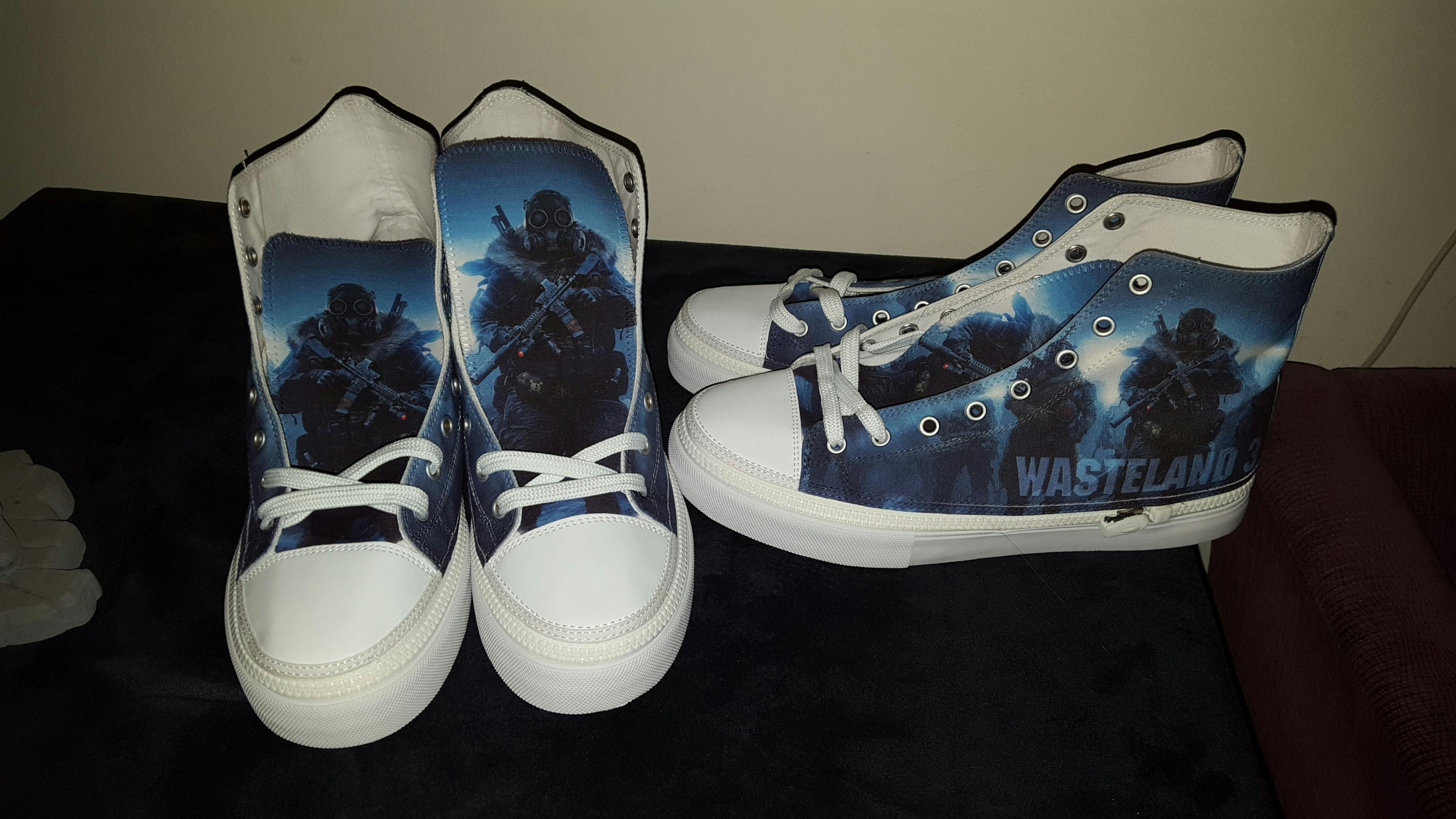
Wasteland 3 Physical Goods Update
We've continued to work on backer rewards. One of those that we completed recently and shipped out were the
Wasteland 3 Fan Kicks.
We liked how they turned out, and according to the feedback from our backers (
https://twitter.com/primalnacl/status/901508824229527552), they're pretty happy as well!
Crowdfunding Corner
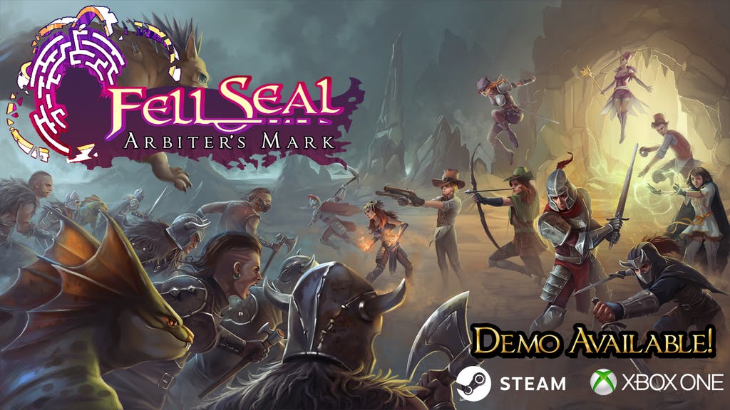
Our entry this month is a Fell Seal: Arbiter's Mark, a slick-looking sRPG from indie developers 6 Eyes Studio. In the best tradition of the genre, the customization options are deep with a strong storytellign component. It looks great to us and we're rooting for the project to succeed. For more information,
click here or on the picture below.
Meanwhile, our friends at Larian recently released their own successfully crowdfunded title - Divinity: Original Sin 2! The game is already a critical and commercial success, and with great reason - Larian has put together a game that any RPG fan would love. Congrats to Swen and the whole Larian team! If you're interested in learning more about the game,
click here or on the picture below.
Thanks to Alex for his excellent write-up, welcome again to Stewart, and thanks to you all for reading along! Until next time!
Best,
Paul Marzagalli
Public Relations & Community Manager
inXile Entertainment
@phimseto
Follow Us:
Facebook |
Twitter





 As Brother None put it


