I've been interested in your game for a while, since before release but have not gotten around to trying it yet.
As far as commenting on why the game might not have sold much, I've never made a game or sold one so I know nothing, but I do buy a lot of games on steam, so commenting from that perspective I'd say that one thing that stands out is your banner, which I'd say is the equivalent of a digital box art.
Taking a look at some other small indie games that have been mentioned in here:
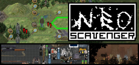
Distinctive logo, most of the banner is made of up of screenshots that give you an immediate idea of the basic gameplay as well as a glimpse at the setting and mood of the game.
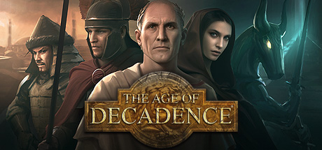
Very professional illustration that immediately gives you a sense of the historical-fantasy setting that AoD has. Tells you the game is SERIOUS.
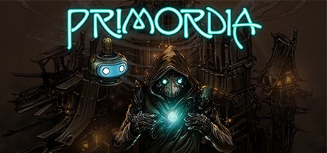
Again, very professional and distinctive illustration that immediately draws the eye in. Gives a good sense of all the elements of the setting.
and then this
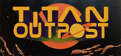
The difference in quality is quite glaring. When I see this banner art the kind of game that immediately comes to mind is this:
Now days on steam I think that almost equally as important as signalling the good points of your game is simply assuring people as quickly as possible that your game is not unity asset flip bundle fodder mobile trash, and the banner art can be the best way to do that. While I've never necessarily purchased a game based soley on the store page illustrations, I am definitely more likely to go to a games store page and spend more time looking into the game if I see an attractive illustration that hints at what sort of atmosphere the game may have, or stirs some feeling of curiosity about the game. (it may seem like the screenshots are enough, but remember that people actually need to click through onto the store page and take the time to look through the screenshots, whereas banner and store page art are immediate)
Your game is hard sci-fi with what seems like a somber tone to it, but your logo looks very cartoonish. You said that you are trying to evoke a retro 70s science fiction aesthetic, but nothing else on the store page points towards that, so I wouldn't bother trying to push it with the banner image, far better to push the hard science fiction angle, that more people would recognize anyway, while simultaneously giving some indication of tone. Your banner image also gives no indication to the type of game this is, which while not always necessary or even possible, at least in this case when combined with the cartoony logo immediately makes me assume this is some sort of puzzle game, or as someone else already mentioned a mobile shovelware.
Since you probably don't have the money to hire someone who knows what they are doing, you'd probably be better off using a screenshot from your game rather than trying to design a fancy logo, since some of the screens are quite evocative and would certainly set the game apart when browsing through the endless list of games on the steam store all with fancy logos.
To give an idea of what I mean. A less cartoonish but still distinctly sci-fi font. The 3D character model lets you know its not a puzzle game or some mobile trash. And the noxious yellow atmosphere and industrial equipment in the background clues you into the somber, hard sci-fi tone of the game.
Anyway I wrote too much about what is a very minor thing, and I really don't want to give an impression that I am trying to tell you what to do with your game. This is just my opinion as someone who makes a lot of choices based on book covers, and who has experience browsing through long lists of steam games and clicking onto the store page based solely on banner image. (you can think about it like this: people who only care about gameplay won't give a shit about visual details either way, but people who are more superficial may end up exploring a game they otherwise would not if it has some better presentation, so you lose nothing.)


![Glory to Codexia! [2012] Codex 2012](/forums/smiles/campaign_tags/campaign_slushfund2012.png)


