I really liked the original game. I made some comments in a conversation as I was watching this gameplay video, I'll paste them in below:
Just the new narrator is already lame, the articulation feels too intentionally tawdry, and I can't help but suppose that it's a woman because there must be ‘representation’ now.
Zarok's castle looks so cartoonish.
The visual style has that pastel-cartoon-fantasy look, doesn't it? Even the camera movement in the original version was better, it was more prompt because it didn't need to linger on that fly through the interior of the castle.
Zarok looks clown-like instead of menacing and old now. And those textures
aren't good, why are they panning in on them? Those angular eye-balls. And those dumb
ahs and
hums they added.
Were they unable to stop those particles of water mist from displaying for a moment?
They used a generic walking animation for Zarok's approach to the cliff, didn't they? The iconic tolling of the bell is gone.
That paved-stone texture planted on top of a different paved-stone texture... and it's receiving lighting differently...
The way the villagers' eyes and mouths lighted up in the original version looked creepy, this doesn't.
What's with the letters at the entrance to Fortesque's crypt? And the colour excess just makes the style uninteresting.
And cu-raaazy looking zombies.
The menu ‘demo’ has nothing on the original's atmosphere either.
Low-resolution, blurry normal maps still visible. This is never going to go away on consoles, is it?
The gargoyles are overstylized.
The graphics just look like
Dota 2-Diablo III-
Torchlight-something. What is it with this same style being used by so many games?
The world map is
ugly. Who cares if it's three-dimensional?
How could they make the combat feel so weak too? All the sparks and flashes and the mismatched sounds make it look completely dumb; the other impact particles look bad. In the original the sounds and impacts were rather satisfyingly juicy and the way the enemies would flash when hit wasn't so excessive, from what I recall.
The cemetery doesn't look interesting. What's the use of all the new graphics technology if things just look more incongruous (especially how inconsistently different neighbouring objects receive lighting)? Throw it all into the bin.
The whole landscape is bathed in purple haze now. It might be an interesting effect, but it spoils the mood.
The life founts look less interesting too.
Zarok's gesturing at the Hilltop Mausoleum looks so embarrassing.
They've toned down the music's characteristic style in order to make it more measured and serious, I suppose, but why? It just doesn't have much personality now and matches the pace of the gameplay poorly. They certainly didn't have any reservations about making the visual style more ‘zany’.
It seems like they've made the fat charging zombies easier to deal with.
* * *
From a different video (
https://youtu.be/bwUE9AsrmXM ):
The stained windows aren't colouring the light that's passing through them.
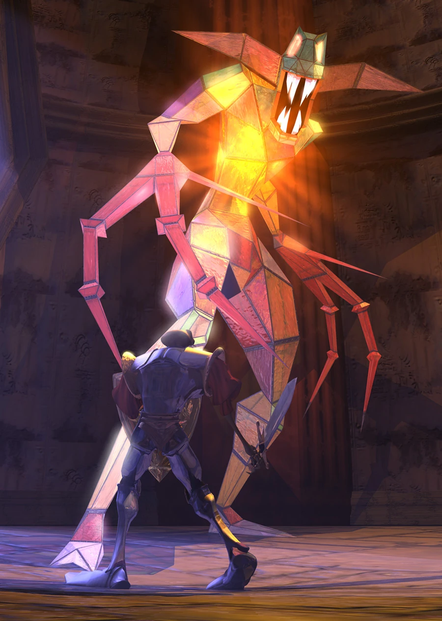
The Stained Glass Demon looks much less interesting also. I assume this was a render made with assets from the original:
The new one:


