Putting the 'role' back in role-playing games since 2002.
Donate to Codex
Good Old Games
  • Welcome to rpgcodex.net, a site dedicated to discussing computer based role-playing games in a free and open fashion. We're less strict than other forums, but please refer to the rules.

    "This message is awaiting moderator approval": All new users must pass through our moderation queue before they will be able to post normally. Until your account has "passed" your posts will only be visible to yourself (and moderators) until they are approved. Give us a week to get around to approving / deleting / ignoring your mundane opinion on crap before hassling us about it. Once you have passed the moderation period (think of it as a test), you will be able to post normally, just like all the other retards.

Interface

MF

The Boar Studio
Patron
Developer
Joined
Dec 8, 2002
Messages
915
Location
Amsterdam
A lot has been said about Titan Outpost's interface.

I'm the first one to admit that Titan Outpost's interface is clunky. For the next game I'll definitely prioritize heuristics over style.

Why?

  • I went for a 1970's sci-fi inspired aesthetics, I love the color scheme and so did many players, but it's hard to provide clarity and contrast with this palette. I've learned a lot and should have reversed the contrast, but what's done is done. I added some accessibility options for people who have problems with it.
  • Most of the screens mimic in-world holograms or holographic pads. After a few iterations I dialed down the hologram aspect, but it's still a matter of being painted into a corner by a stylistic choice.
  • The game combines mechanics and genres in a novel way, and for some of those mechanics I didn't have decades of interface history to fall back on.
  • The world map is a globe, both in presentation and underlying logic. This was mathematically challenging to develop, but it was even more challenging to give the player three degrees of freedom on a map without getting disoriented. Something like Google Earth fixes this by constantly realigning the axes under the hood to face the camera, but even that starts spinning the camera when longitude reaches zero. Since Titan Outpost mostly takes place on the moon's north pole, I can't use that workaround without changing the world's logic.
  • The 90's style point-and-click is something most of us here like, but it rubs a lot of people the wrong way, especially if it's not fully responsive and immediate. I think I finally fixed that, though.

That said, it's improved a lot since release. I've added progress bars, hotkeys, improved layouts, decreased transparency, etc. etc.

The biggest interface improvement in the coming update is probably 100% responsiveness on the interactables. The game used to have a smoothing system where the character would slow down and move into a halting animation before settling into a position, which made it look a little bit more realistic, but I finally decided to just get rid of that entirely. If you click on something, your character walks over and the interaction is instant. Feels much better.

At this point I can't redo the entire interface, but maybe there's still a bit of extra usability to be squeezed from the Titan Outpost UX.

I think it's nearing its final iteration and I've already started to work on a new game, but there are still a few improvements I suppose I could make.

For example, a lot of players mentioned that the interface felt 'too big', but when expounded on I always got different specifics, so I think it's a general sense that stems from a combination of font size, button size, panel footprint etc. Thanks again to everyone here who gave me constructive feedback on that.

I'm experimenting with a reduced footprint. This is the current dialogue interface.

fulldialogueinterface-e1596307406899.png


Here it is scaled way down and moved to the right

dialoguesmallinterface-e1596307422750.png


I think I can safely say that it looks less clunky, but I'm not sure if I like it better. Making this an option is doable but hard for technical reasons, but even then, what should be the default?

Another thing I've done is provide a tiny toolbar. This is not an experiment, this is an actual option in the next update:

tinytoolbar-e1596357378802.png


This is the toolbar halved in size. The option will be in the video settings in the coming update.

It will also be a little easier to track your resources through the inventory panel in the latest version. I experimented with those values being a permanently visible UI element somewhere, but so far that hasn't resulted in anything that felt good.

What do you think of the scaled down dialogue interface? Is the tiny toolbar an improvement?
 
Last edited:

Butter

Arcane
Patron
Joined
Oct 1, 2018
Messages
8,637
Dialogue covering the whole screen isn't a big deal because there isn't anything else going on at the same time that necessitates looking at the character models. If readability becomes an issue with the smaller dialogue interface, it's probably not worth it. However from an aesthetic angle, I like the smaller, right-justified dialogue window. I really like that the buttons for each option don't have huge amounts of unused space on either side of the text.
 

laclongquan

Arcane
Joined
Jan 10, 2007
Messages
1,870,184
Location
Searching for my kidnapped sister
On Font space (kerning)

The distance between each letter is a bit too small. You feel it's like a whole word sticking together. And looking from afar it's harder to read.

I am recommending a double the current space size.
 

MF

The Boar Studio
Patron
Developer
Joined
Dec 8, 2002
Messages
915
Location
Amsterdam
Dialogue covering the whole screen isn't a big deal because there isn't anything else going on at the same time that necessitates looking at the character models. If readability becomes an issue with the smaller dialogue interface, it's probably not worth it. However from an aesthetic angle, I like the smaller, right-justified dialogue window. I really like that the buttons for each option don't have huge amounts of unused space on either side of the text.

Thanks. Readability isn't affected that much. This screenshot is scaled down from a 1920x1080 resolution to fit the forums here, so the text is a lot clearer in game. Good point about the buttons. As you know some dialogue options are a bit more verbose so smaller buttons will cause a few options to spill over into multiple lines. I kept a uniform approach, but you're right that the empty space isn't very pleasant either.

A lot of people tend to associate large buttons with console interfaces or touch-friendly mobile interfaces. I never owned a console after the NES, but I've seen enough Bethesda games to know what that gripe is all about. I agreed with that sentiment and drastically reduced the size of buttons after version 1.05 or so, but apparently it's still got a bit of that vibe going on in certain places.

On Font space (kerning)

The distance between each letter is a bit too small. You feel it's like a whole word sticking together. And looking from afar it's harder to read.

I am recommending a double the current space size.

Thanks. I think you're right, but it's not that easy. I've experimented with spacing, but mostly in the font itself. It's a custom font I made based on an open source character library. I defined kerning pairs for my font, but that doesn't matter.

Why? The Unity UI library supports line spacing, but not letter spacing.

Disco and PoE have it, so I think they use something like TextMesh Pro, which unfortunately is something I can't integrate without rewriting half the UI code at this point. I would actually consider that if it didn't mean another round of testing. I'm glad the game is stable now.
 

AdolfSatan

Arcane
Joined
Dec 27, 2017
Messages
2,028
UI changes look great and are much appreciated, will use the expansion as an excuse to replay the game.

Some thoughts:
The right panned dialogue seems like a good idea, but its proportions are super awkward. Why is the portrait so big? Why is it halfway in, halfway out? What's up with all the wasted vertical space (around the box in general, and between NPC name and dialogue)? Why are the buttons (which contain far less text) wider than the NPC dialogue box? Its current position somewhere between 1/3 and 1/4 of the screen is kind of off-putting too, I'd try to push it into taking and entire third to see if it looks more harmonious.

A possible solution to the font kerning issue could be switching for an opensource monospace (fifteentwenty/alma mono/inconsolata perhaps?). Mad respect for baking your own font, but, even sharing and understanding the obsession with controlling every part of a process, that was bit overkill for a first solo indie game.
 

laclongquan

Arcane
Joined
Jan 10, 2007
Messages
1,870,184
Location
Searching for my kidnapped sister
On Font space (kerning)

The distance between each letter is a bit too small. You feel it's like a whole word sticking together. And looking from afar it's harder to read.

I am recommending a double the current space size.

Thanks. I think you're right, but it's not that easy. I've experimented with spacing, but mostly in the font itself. It's a custom font I made based on an open source character library. .

As long as you make the fix before releasing open beta/demo version it's fine. It's a killing issue if your reviewers show a screenshot of blocks and blocks of unreadable text.

When the dialog is full screen the kerning issue is not apparent. When you reduce it to a corner of total screen acreage... it become quite critical.
 

MF

The Boar Studio
Patron
Developer
Joined
Dec 8, 2002
Messages
915
Location
Amsterdam
UI changes look great and are much appreciated, will use the expansion as an excuse to replay the game.

Some thoughts:
The right panned dialogue seems like a good idea, but its proportions are super awkward. Why is the portrait so big? Why is it halfway in, halfway out? What's up with all the wasted vertical space (around the box in general, and between NPC name and dialogue)? Why are the buttons (which contain far less text) wider than the NPC dialogue box? Its current position somewhere between 1/3 and 1/4 of the screen is kind of off-putting too, I'd try to push it into taking and entire third to see if it looks more harmonious.

A possible solution to the font kerning issue could be switching for an opensource monospace (fifteentwenty/alma mono/inconsolata perhaps?). Mad respect for baking your own font, but, even sharing and understanding the obsession with controlling every part of a process, that was bit overkill for a first solo indie game.

Thanks, awesome.

That right-justified example was more of a quick proof of concept than an actual attempt at making that layout work. I really have to commit to the idea if I want to get it right. Sticking to a rule of thirds is a great idea, I'll try that.

As for baking my own font. Yeah, that was probably a bit much in retrospect. ;) I don't think I'm ready to kill that darling quite yet, but I'll toy around with an optional monospaced font if I can't whip Unity into submission. That Commodore font is a cool suggestion.

As long as you make the fix before releasing open beta/demo version it's fine. It's a killing issue if your reviewers show a screenshot of blocks and blocks of unreadable text.

When the dialog is full screen the kerning issue is not apparent. When you reduce it to a corner of total screen acreage... it become quite critical.

The game was released a year ago and even though this is a pretty big expansion update and overhaul, it's still just that: an update. It's not a new release.

You're right, the spacing is something that will have to be resolved if I want to shrink the UI.
 
Last edited:

MF

The Boar Studio
Patron
Developer
Joined
Dec 8, 2002
Messages
915
Location
Amsterdam
NewDialoguestyle.png


This is a radically different approach. I'm not shrinking it down too much, but I got rid of the response buttons (they're still used as highlight indicators), made the background underneath the text darker and got rid of the outside frame. I also increased the portrait size, but I'm not sold on that yet. Still trying to implement kerning, but if I'm not shrinking it down any further that's not as critical.

I'm also putting that darker shade of brown underneath other text-dense areas like research descriptions.
 

V_K

Arcane
Joined
Nov 3, 2013
Messages
7,714
Location
at a Nowhere near you
NewDialoguestyle.png


This is a radically different approach. I'm not shrinking it down too much, but I got rid of the response buttons (they're still used as highlight indicators), made the background underneath the text darker and got rid of the outside frame. I also increased the portrait size, but I'm not sold on that yet. Still trying to implement kerning, but if I'm not shrinking it down any further that's not as critical.

I'm also putting that darker shade of brown underneath other text-dense areas like research descriptions.
I definitely like this one best of the three.
 
Joined
Jan 14, 2018
Messages
50,754
Codex Year of the Donut
Wide dialogue boxes like this made more sense when monitors were 4:3 rather than 16:9.
Here's a screenshot of Planescape Torment's dialogue at its native resolution(640x480):
image.png

It already has a good bit of padding on the left and right to begin with. In widescreen at high resolutions there's far too much width.

What game should you look to for inspiration?
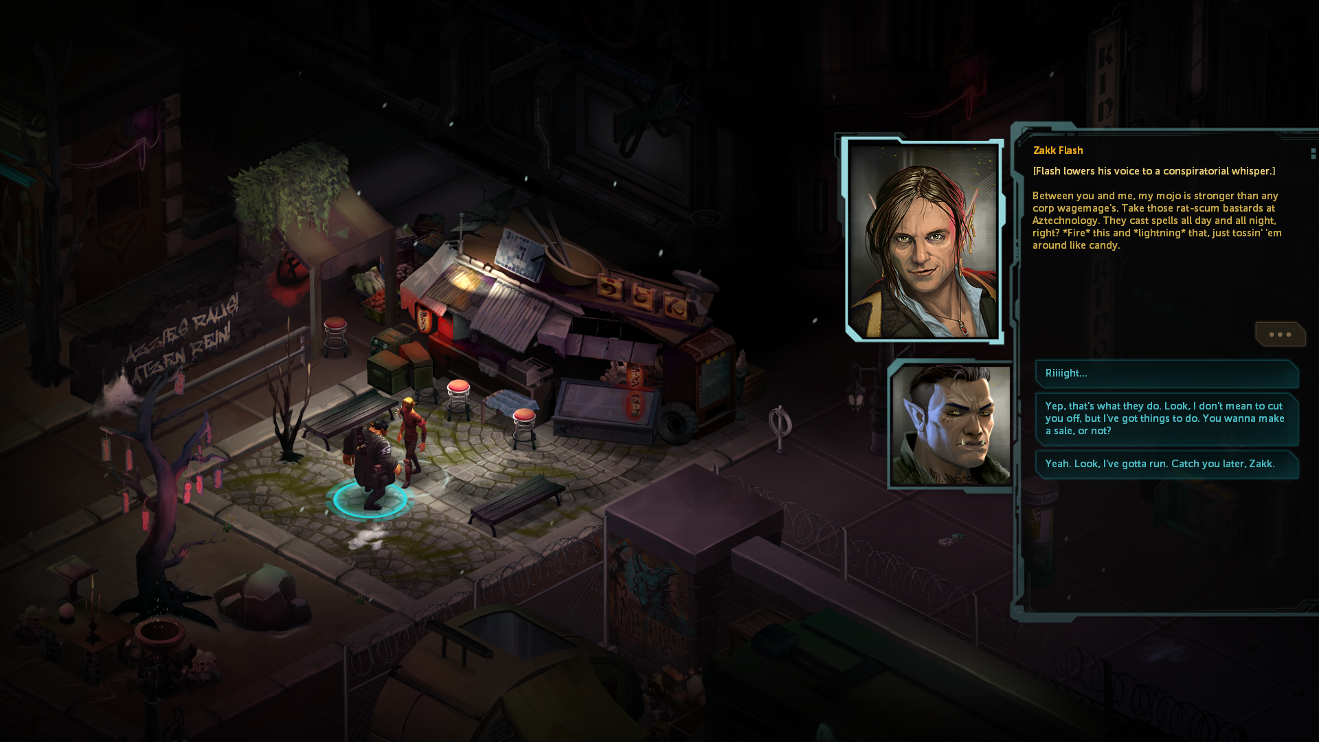
IMO the Shadowrun games
dragonfall-dialogue.png
 

MF

The Boar Studio
Patron
Developer
Joined
Dec 8, 2002
Messages
915
Location
Amsterdam
Wide dialogue boxes like this made more sense when monitors were 4:3 rather than 16:9.

Thanks for the two comparisons. New version is about as wide as Torment's in terms of word count, which is probably OK. I'll fiddle with it some more but I'm on the right track. For Shadowrun size or even a third of the screen I'd definitely need to fix the font. I played Shadowrun Returns on an iPad in the back of a tour bus, by the way, so my memory of that interface is tainted.


The darker shade of brown as a new contrast color works wonders for other parts of the interface as well. Wish I'd slackened the leash on the 'UI is a light source' idea sooner.
 

As an Amazon Associate, rpgcodex.net earns from qualifying purchases.
Back
Top Bottom