I spent an evening with this game. It's doubtful I'll play any more of it.
This game rips off Aquaria wholesale and then steals many pages from Dark Souls, both in terms of gameplay and aesthetics. It does absolutely nothing new, so the big question is whether it does something well.
With combat being the centerpoint of the game, it's good to know that they didn't screw that up. Enemies are varied enough that things never get dull, though I have to remark that getting above enemies and hacking downwards seems to be a universally viable tactic. The controls are simple and fluid enough that a keyboard works fine.
But sadly Hollow Knight has two major problems.
The first is the map system. In order to get a map you need to find the cartographer. Then you buy the map from him, then he directs you to a vendor in the starting town whom sells all the accessories for the map, like markers, the option to update the map and even something as basic as being able to tell where you are on the map has a price tag on it. Buying the accessories is a one-time affair, but for every new zone in the game the "find the cartrographer and buy the map from him"-thing needs to be done EVERY SINGLE TIME. This is easily the dumbest implementation of an in-game map system I've seen in years. I can understand doing it once, but until you've secured a map of the zone you're in you have NO MAP at all - even though you've spent good money buying everything needed to make your own map! And once you do find the cartographer and buy his map, your own map is automatically added to his, making the whole effort absolutely meaningless! (And being unable to add your own markings to a map in a metroidvania game is inexcusable.) I have good spatial awareness but even I ended up going in circles a few times in mapless zones, and the biggest reason for that lies in the second major problem of the game.
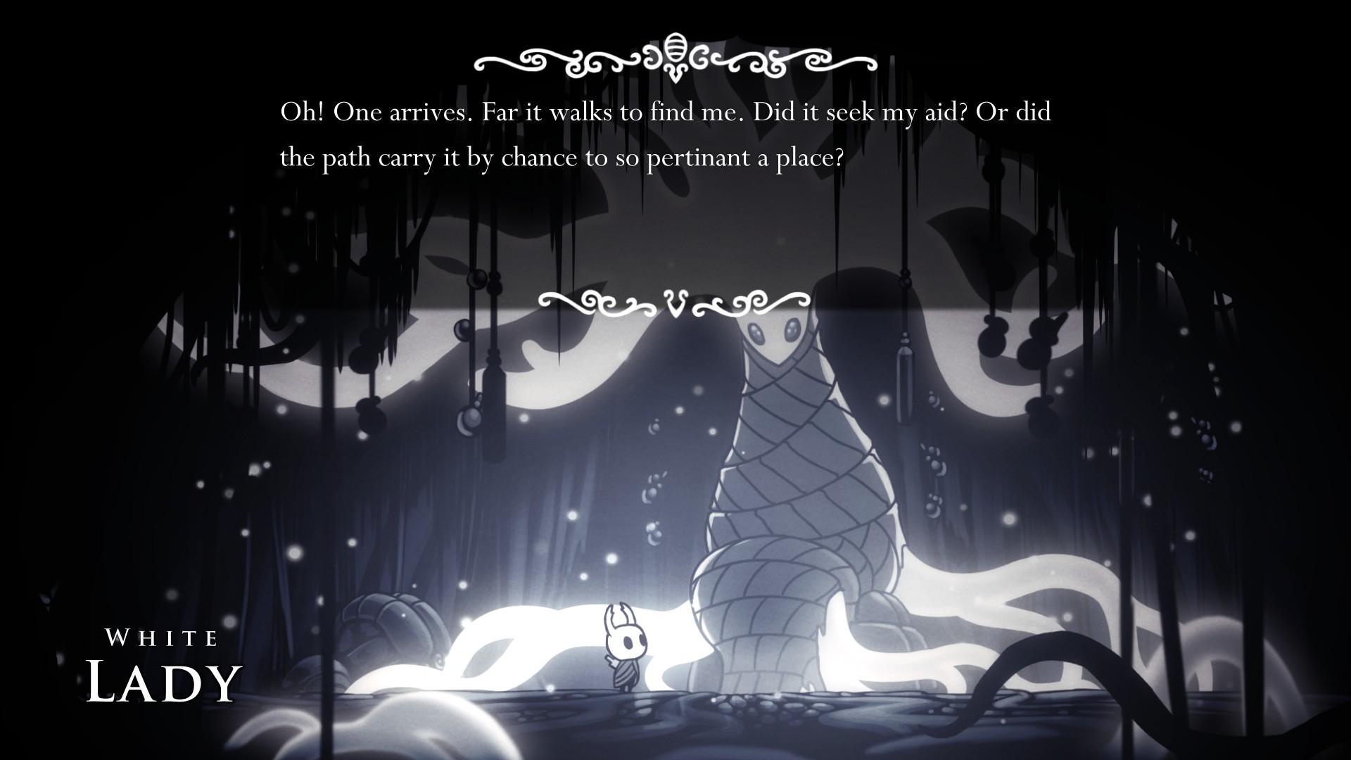
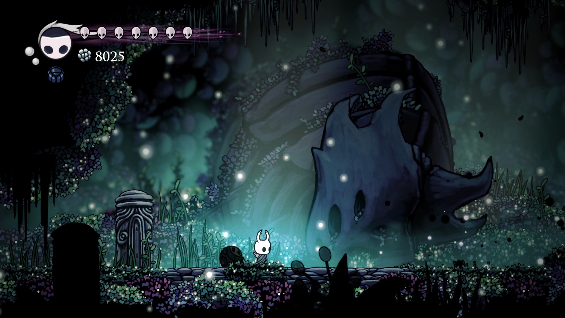
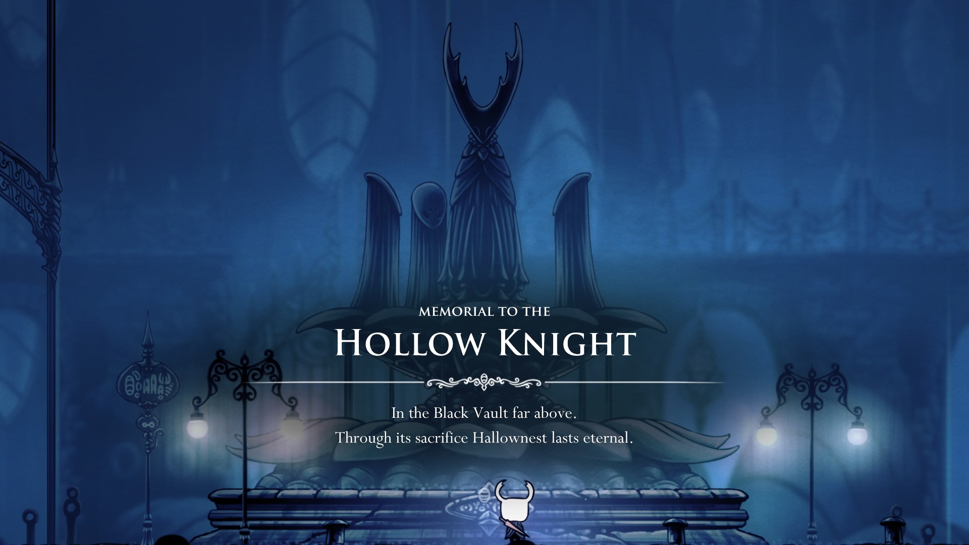
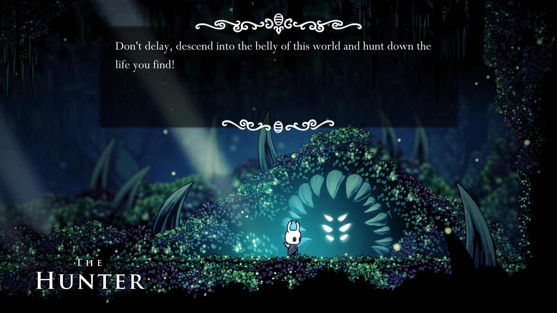
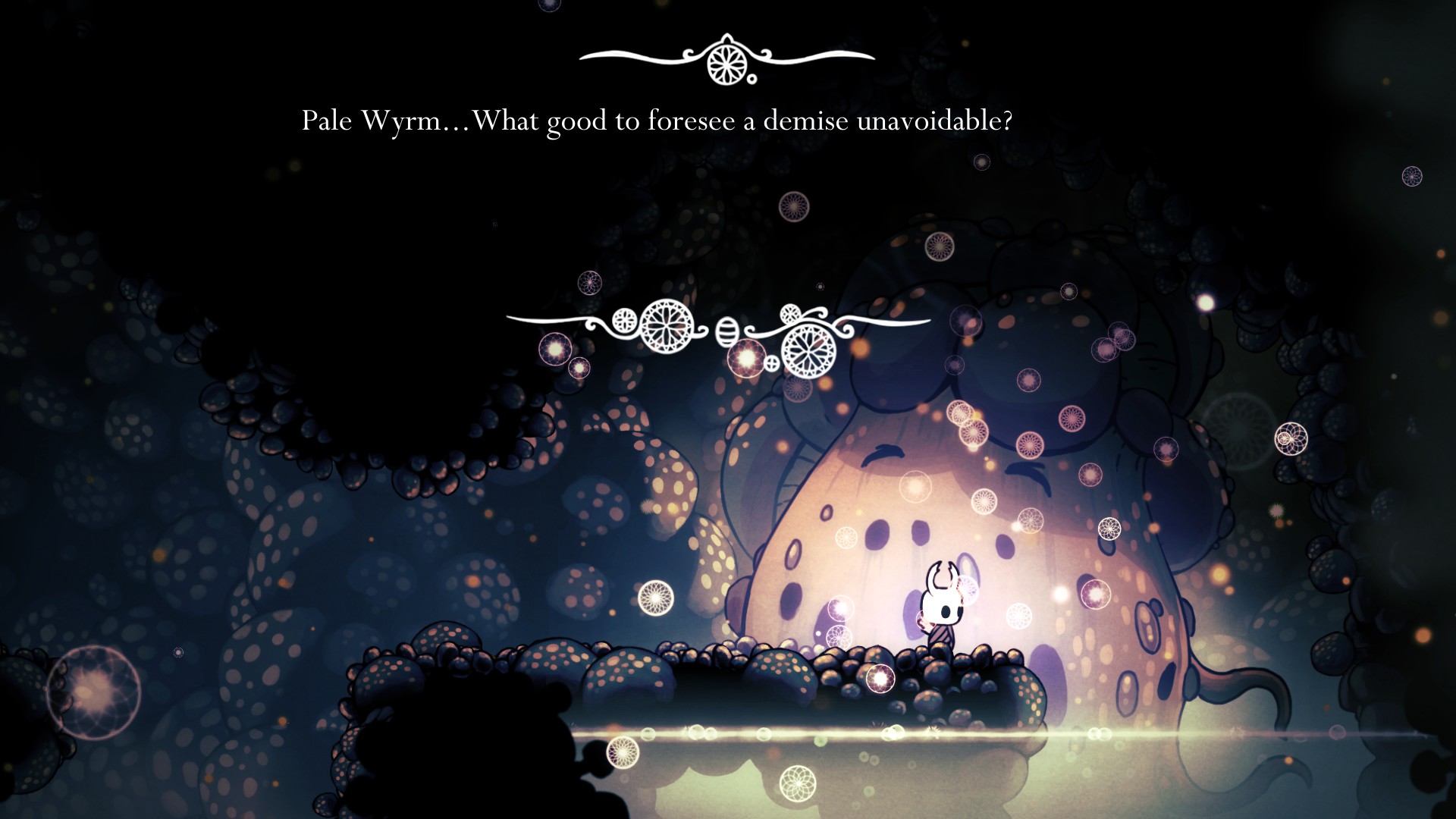
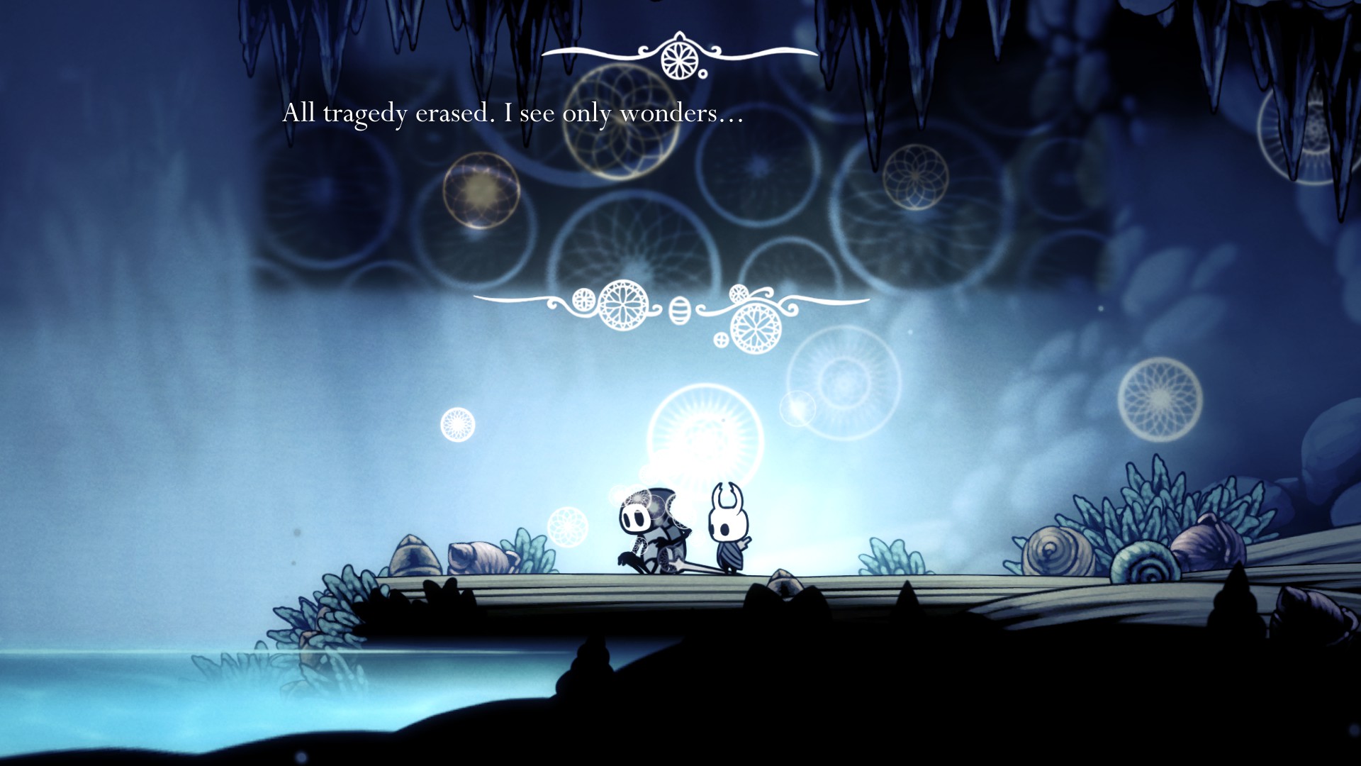
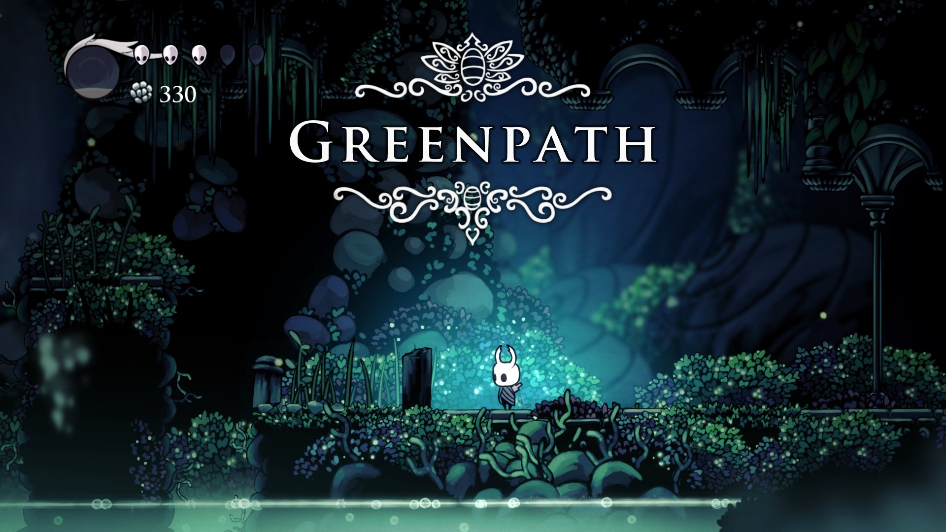
The second problem is the aesthetics. To put it bluntly they're dull. It's dull and grey, then it's dull and blue, then it's dull and green, then it's dull and brown, then it's dull and grey AGAIN, etc. Both Aquaria and Dark Souls have environments that made you stop and admire them from time to time. Hollow Knight has environments that make you want to kill yourself as they're all monotonous, uninteresting and look the same. This is not a game that motivates you to keep playing.
Pretty much everything else that I haven't mentioned is "meh". The music is "meh", the plot and story are "meh", the characters you meet are "meh", the inventory system is "meh". Nothing to talk about, really.
I'm sure this game will have its fans and be enjoyable to some, but to me it's just a hollow "meh". It's not a bad game per se, but I've played better and more interesting games than this.







![The Year of Incline [2014] Codex 2014](/forums/smiles/campaign_tags/campaign_incline2014.png)

