- Joined
- Jun 10, 2017
- Messages
- 1,467

Twitter: https://twitter.com/AloftStudio/
Site: https://www.aloftstudio.com/hazelnutbastille
Dev thread: https://forums.tigsource.com/index.php?topic=56748.0
Interview: https://www.indiegraze.com/2018/01/23/interview-hazelnut-bastilles-dennis-varvaro/
Site: https://www.aloftstudio.com/hazelnutbastille
Dev thread: https://forums.tigsource.com/index.php?topic=56748.0
Interview: https://www.indiegraze.com/2018/01/23/interview-hazelnut-bastilles-dennis-varvaro/
Interview: Hazelnut Bastille’s Dennis Varvaro
As a metroidvania game drawing from the feel of the iconic titles of yesteryear, Hazelnut Bastille brings an immediately-accessible level of polish to the table. Having played and enjoyed the demo, I chatted with developer Dennis Varvaro on his process and the challenges being tackled by Aloft Studio.
Erik Meyer: On the surface, Hazelnut Bastille has the top-down perspective of classic SNES games like Secret of Mana or The Legend of Zelda: A Link to the Past, but I see highly tuned, vast amounts of items, NPCs, and puzzles, so as you’ve developed the project, what do you see as the scope of what you’re creating, and as you’ve gone along, where have you had to rein content in?
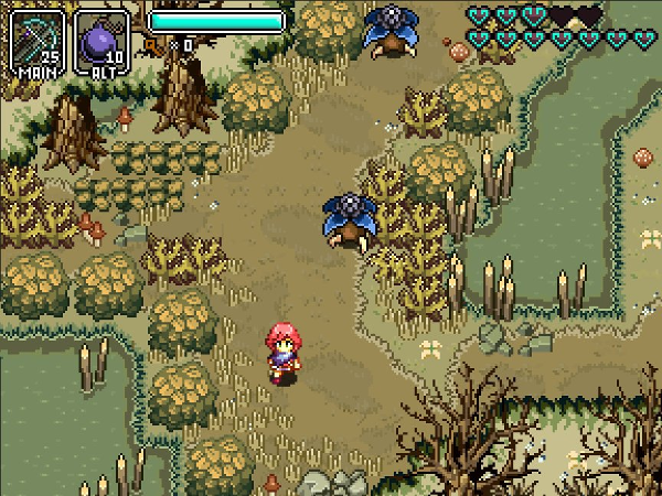
Dennis Varvaro: With regards to items, they are pretty numerous, but they fit into a small number of distinct classes, all of which are meaningful to game progress. Some of them are the familiar “dungeon treasure” tools a player will recognize as being fairly similar to the ones from the Zelda series. They each have their own distinctive puzzle and combat uses that further the gameplay along, and allow you to reach that one place you saw six hours back, and squirreled away in your mind for later, in classic metroidvania fashion. There are also “trophy” style items, which are relevant to the progression of the story, and sometimes give our heroine various small boosts or abilities. Then we have another kind of item, our “rings”, which are probably natural for a Dark Souls player to quickly grasp. You can equip a limited number of these, and they give various small boosts to the base character controller. These are generally acquired through exploring the side story, and meant as rewards for players who delve the deepest into the lives and troubles of the NPCs. Our last style of item is made up of collectibles which can be combined for potion or buff items, or be traded barter-style with NPCs; this last mechanic serves as a jump-off point for breaking the ice with several of the NPC storylines.
“Feature creep”, or the tendency to constantly be “+1’ing” new content into the development is something we really have to wary of. There is this constant drive to add all of these new features to pad out the fullness of the experience, but as a small team with limited time resources, it is a real enemy past a certain point. Well-meaning fans often request new features to be added in, and it is easy for us to get swept away in their positive energy, too. It is a tough line to walk, wanting the experience to be as rich as possible, but also manageable in scale to realize.
EM: From a challenge and experience standpoint, what makes for the best, most satisfying boss battles? Conversely, what kinds of boss battles do you find repellent?
DV: With level design in general, it is good to look at it as a series of lessons, quizzes, and tests players don’t realize they are taking. You introduce a new concept in a safe environment where the players can focus on it, and are forced to integrate it into their minds in order to advance. Later on, after an interlude, you remind them of it. A bit later still, you see if they remember it, even under stress.
A good boss battle fits into this paradigm. Everything the player needs to know to defeat the boss, they picked up elsewhere in the level or quest, but now they need to do that same stuff with skill and ease. This is the base minimum of what you need. Beyond this, it is good to let the level be the hype-man for the boss, building it up. It helps to make the players feel like they are outclassed, or that the boss is somewhat unfair, or at a tremendous natural advantage, like trying to face a shark in the ocean. While players will often complain about this, they will also feel a tremendous amount of satisfaction for having triumphed over seemingly stacked odds. If the players feel like they will easily best the boss, there is no real drama.
Beyond this, a boss should not overstay its welcome. Fights which stretch on to 10-15 minutes are generally missing the point, unless they are a mid-point or a final fight. The player should not be made to repeat the same process more than 8-10 iterations, because beyond that, it is no longer a test, so much as an endurance contest. Bosses should probably have some level of determinism, as well. A skilled player should probably be able to predict what the boss may likely do any given point (but also, it shouldn’t be too obvious, or the boss will also feel artificial to new players as well- it is a tricky balance). Most players are looking to engage in a game of skill much more than a game of chance, so whether the player triumphs over the boss or not should probably have a limited amount of chance events involved, as well.
EM: On Twitter, I see you doing a lot of game balancing (color studies, exact collision refinements, etc), so as you add items, assets, locations, and weapons, how much do you focus on balancing content with what already exists in the project, as opposed to balancing content entirely on the merit of its own aesthetics and engagement?
DV: The largest amount of the studies have to do with the game’s look; there is a certain character we are striving for, which balances ease of reading a game scene’s parts and edges, and adding an organic character of living detail which doesn’t obscure this readability. Since we are currently working on finishing up the base of all the major tilesets for the game, we are working through all of the art at once. Oftentimes, a detail will look good in one context but won’t fit another scene, so making environment tile assets sort of involves a god’s eye view process, where I look at a giant matrix of dozens of game scenes at once, and then change a detail, and then see how it looks in each of the contexts it appears in. Some of it is probably down to me being a bit neurotic about it all, hehe.
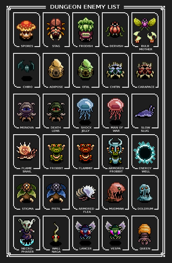
In terms of the actual gameplay balancing, that is something we are engaged in now, as well. We have a stage of development we call the “Sandbox”, where we take special debug levels with all of the game’s enemies, traps, items, and plausible environments, and jumble them together in a ton of different scenarios. This allows us to do meta-testing for how the enemies, items, and character controller interact in these sundry situations, and to test out what different tunings of each feel like. The hardest thing to balance is probably the items, since we want each of them to be useful in some way for combat, but also not to become the default tool the player will use for every game situation. To some extent though, it is also a positive experience for a player to start feeling a bit powerful toward the end of a metroidvania, so we also are trying to heavily stack the most obviously powerful items later in the experience.
EM: All else aside, your website, with its homage to 1990s game magazines, is incredible (both in its layout and its content), so how did that piece of the media outreach puzzle come to be, and what is your philosophy behind creating a face for yet-to-come projects?
DV: The site design is meant to be a sort of parody of the old Nintendo Power magazine our contemporaries will remember, complete with its cheesy one-liners, gushing hype, and goofy graphic style. We are very much trying to recreate the 16bit era throughout our entire process, and Nintendo Power was a big part of that experience for a lot of our younger selves. You can’t really remove the experience of Donkey Kong Country from seeing the hilariously bad early 3D art of the game on a classic NP cover, or the fact that a lot of gamers’ first introductions to some of the more obscure SNES titles were in the middle pages of that publication. It seemed like a natural thing to parody when we were thinking of ways to dress up our landing page! Each of our titles is sort of its own thing, so how we approach the peripheral media for each will probably tie into the central spirit of each, and immersing the user in the experience of each of those media styles.
EM: In general, games seem torn on whether or not to release demos, but yours gives a solid example of gameplay mechanics and player experience. That said, what do you see as the advantages to giving gamers a taste of the product, and which elements do you feel are key to receiving positive feedback and beneficial prepress?
DV: There a lots of good reasons not to release a demo. It can kill necessary hype a bit too early, by allowing players to dive into your content and satisfy their itch. For some games, it can also grant them access into the development cycle at a time when things are far less polished. So given this, why did we choose to release a series of demos?
A big part of it is that as a studio, we are largely unknowns. There have been innumerable recent cases where a small unknown studio has oversold their ability to realize an ambitious product. For us, we viewed releasing a demo as due-diligence in this climate. It allows us to make the immediate case that we are capable of and competent at doing what we claim here. We don’t want supporters to have to take our claims on faith.
Putting the demos out there is also part of our early development process as well. Getting it into players’ hands allows us to see exactly how people experience things. How well did we provide intuitive information that helps the player to solve future puzzles? What curious ways will players find to break the experience by doing something we as the developers wouldn’t think to do, because we already know the answers? How fluid and rewarding is the experience of the combat? What happens when they use hardware or controllers we haven’t encountered yet?
We received so much information that allowed us to refine the player experience in profoundly positive ways that we can’t see not having done it now.
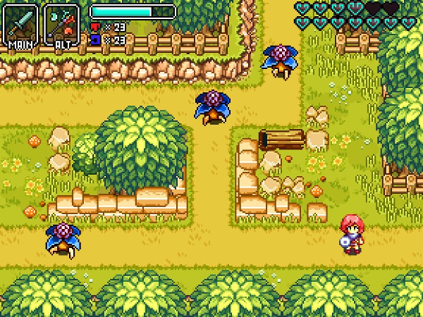
In terms of what elements were key to receiving good feedback, I would say it was presenting a full level experience which fully recreated our gameplay, providing them situations which served as a crash introduction to our main game mechanics and controls, and creating enough varied situations where there was enough play data to get an impression of the meta-game details like overall combat feel.
EM: Beyond your work in game design and art, you have a background in architecture, so I’m interested in what kinds of overlap you experience between these disciplines. What strategies and concepts do you find hold true in these professional areas, and what feels unique about your current role within Aloft Studio?
DV: These overlap in ways that people probably wouldn’t think about. The most obvious way of course is that each of them is heavily design oriented, both in terms of the graphic sense, and also in crafting an entity that shapes and directs the experience of the user as they interact with it. I had to learn a few new skills and tools in order to transition my knowledge from one sphere to the other, but there are also a lot of tools and programs which are common to each discipline, such as 3D modeling and raster image manipulation. But then 3D assets for a game also have special concerns and constraints, and traits only relevant to game worlds, such as LOD’s, topology compatible with 3D engines, and the extreme need for optimizations and performance budgeting.
What is probably less obvious to people is that architecture firms as a business are less focused on design itself, and more focused on managing every aspect of a building’s creation. There are schematics to design. There are integrated systems like HVAC generally done by a specialized engineer, there are structural concerns for larger public buildings that are also often the province of their own professional structural engineer. There are safety and building codes to adhere to that the licensed architect has to be aware of at all times, and which change every year. There are contractors bidding on various aspects of the construction, there are materials to order and deliver, some of which need to be tooled across the world. There are site visits and inspections. There are concrete-boring samples to study. The public thinks of architects as people who draw, and I have heard this in bars a few times, hehe; the reality is that architects are people who manage a complex dance of dozens of disciplines and systems which all create one final product together.
Running a complex project like this is very analogous. There are about a dozen parallel concerns which all have to be met at once, and there are a large number of professionals to interact with and manage, all of whom are counting on the full picture coming together in order for their contributions to be rewarded.
There are contractors, publishers, legal, business interests, and media contacts and interactions, and all of this on top of core development.
Another parallel between the two pursuits is the idea of a fiduciary responsibility. With architecture, a major responsibility of the firm is that it is entrusted with the client’s money, in order to spend it wisely and efficiently for their interests. It is in some ways similar to a medical relationship, where some things are shared in confidence, and the professionals have a responsibility to care for the patients / clients the best they know how.
Making a product intended for public use and enjoyment is like this in some ways. We must ensure we release a product that doesn’t cause harm to the users or their hardware, and which faithfully fulfills the experience it was marketed as, as we would expect from other developers.
EM: Game lore has become something of a preoccupation for me (as well as the gaming community), so as you’ve created the game’s narrative, what level of historical depth have you created for the Hazelnut Bastille universe? And as you’ve added locations, what has felt the most natural, in terms of revealing underlying truths?
DV: As most writers practice, we have a pretty involved “internal” story, which is the complete view of the world and its events, its history, its reasons, etc. The story as you experience it as the user is like a window into that larger background story, where you get an overview of the most important points. But those other details shine through in ways that never get verbally explained, like a certain environmental detail which has a distinctive reason for being there related to the history of the game world. In some ways, the story has to have a great sense of economy and brevity in order to fit this particular medium, but we are trying to give it as much depth as allowable, as well.
EM: Great games have a way of having twists that change the way you view the characters, if not the entire experience. In Fallout, that moment (for me) came when reading through holodisks in The Glow. In The Legend of Zelda: A Link to the Past, using the Magic Mirror and arriving in the Dark World as a pink rabbit blew my mind. While great implementations can draw gamers in, great narratives and profound moments stick with an audience for life, so what do you use as your compass when you set out to create a story we won’t soon forget?
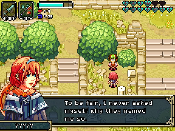
DV: There are certain shorthand tropes which appear again and again in good stories, and with logical reason. Strong emotions, especially sadness or loss, are very difficult to genuinely evoke even in a receptive viewer. These particular emotions take a very long time to develop, and they take a lot of time in the moment to be occasioned properly. A common trick writers use is to lean on experiences common to all humans, to allow them to understand how the characters are feeling by comparing it to that time in their own life, or when something analogous happened to them. We use a similar technique at the times when we need to create the biggest impact. The user can instantly understand the character because they can relate by virtue of merely being a human and already having the proper emotional context.
Beyond this, there are also general situations which people tend to feel on a very visceral level… the betrayal of a trusted friend, the redemption of someone seemingly beyond all hope, the act of causing great harm without realizing it, learning the motives of the big bad, which suddenly humanize them on a profound scale… these are all like standard weapons a writer can seed for, and get a strong reaction with almost every time, because they speak to human universals as well. In the scope of the story we can convey with a game of this particular scale, our story needs to directly connect to our users and their own lives in a way that is afterward readily apparent to them, but which they probably didn’t see coming.
As a metroidvania game drawing from the feel of the iconic titles of yesteryear, Hazelnut Bastille brings an immediately-accessible level of polish to the table. Having played and enjoyed the demo, I chatted with developer Dennis Varvaro on his process and the challenges being tackled by Aloft Studio.
Erik Meyer: On the surface, Hazelnut Bastille has the top-down perspective of classic SNES games like Secret of Mana or The Legend of Zelda: A Link to the Past, but I see highly tuned, vast amounts of items, NPCs, and puzzles, so as you’ve developed the project, what do you see as the scope of what you’re creating, and as you’ve gone along, where have you had to rein content in?
Dennis Varvaro: With regards to items, they are pretty numerous, but they fit into a small number of distinct classes, all of which are meaningful to game progress. Some of them are the familiar “dungeon treasure” tools a player will recognize as being fairly similar to the ones from the Zelda series. They each have their own distinctive puzzle and combat uses that further the gameplay along, and allow you to reach that one place you saw six hours back, and squirreled away in your mind for later, in classic metroidvania fashion. There are also “trophy” style items, which are relevant to the progression of the story, and sometimes give our heroine various small boosts or abilities. Then we have another kind of item, our “rings”, which are probably natural for a Dark Souls player to quickly grasp. You can equip a limited number of these, and they give various small boosts to the base character controller. These are generally acquired through exploring the side story, and meant as rewards for players who delve the deepest into the lives and troubles of the NPCs. Our last style of item is made up of collectibles which can be combined for potion or buff items, or be traded barter-style with NPCs; this last mechanic serves as a jump-off point for breaking the ice with several of the NPC storylines.
“Feature creep”, or the tendency to constantly be “+1’ing” new content into the development is something we really have to wary of. There is this constant drive to add all of these new features to pad out the fullness of the experience, but as a small team with limited time resources, it is a real enemy past a certain point. Well-meaning fans often request new features to be added in, and it is easy for us to get swept away in their positive energy, too. It is a tough line to walk, wanting the experience to be as rich as possible, but also manageable in scale to realize.

EM: From a challenge and experience standpoint, what makes for the best, most satisfying boss battles? Conversely, what kinds of boss battles do you find repellent?
DV: With level design in general, it is good to look at it as a series of lessons, quizzes, and tests players don’t realize they are taking. You introduce a new concept in a safe environment where the players can focus on it, and are forced to integrate it into their minds in order to advance. Later on, after an interlude, you remind them of it. A bit later still, you see if they remember it, even under stress.
A good boss battle fits into this paradigm. Everything the player needs to know to defeat the boss, they picked up elsewhere in the level or quest, but now they need to do that same stuff with skill and ease. This is the base minimum of what you need. Beyond this, it is good to let the level be the hype-man for the boss, building it up. It helps to make the players feel like they are outclassed, or that the boss is somewhat unfair, or at a tremendous natural advantage, like trying to face a shark in the ocean. While players will often complain about this, they will also feel a tremendous amount of satisfaction for having triumphed over seemingly stacked odds. If the players feel like they will easily best the boss, there is no real drama.
Beyond this, a boss should not overstay its welcome. Fights which stretch on to 10-15 minutes are generally missing the point, unless they are a mid-point or a final fight. The player should not be made to repeat the same process more than 8-10 iterations, because beyond that, it is no longer a test, so much as an endurance contest. Bosses should probably have some level of determinism, as well. A skilled player should probably be able to predict what the boss may likely do any given point (but also, it shouldn’t be too obvious, or the boss will also feel artificial to new players as well- it is a tricky balance). Most players are looking to engage in a game of skill much more than a game of chance, so whether the player triumphs over the boss or not should probably have a limited amount of chance events involved, as well.
EM: On Twitter, I see you doing a lot of game balancing (color studies, exact collision refinements, etc), so as you add items, assets, locations, and weapons, how much do you focus on balancing content with what already exists in the project, as opposed to balancing content entirely on the merit of its own aesthetics and engagement?
DV: The largest amount of the studies have to do with the game’s look; there is a certain character we are striving for, which balances ease of reading a game scene’s parts and edges, and adding an organic character of living detail which doesn’t obscure this readability. Since we are currently working on finishing up the base of all the major tilesets for the game, we are working through all of the art at once. Oftentimes, a detail will look good in one context but won’t fit another scene, so making environment tile assets sort of involves a god’s eye view process, where I look at a giant matrix of dozens of game scenes at once, and then change a detail, and then see how it looks in each of the contexts it appears in. Some of it is probably down to me being a bit neurotic about it all, hehe.
In terms of the actual gameplay balancing, that is something we are engaged in now, as well. We have a stage of development we call the “Sandbox”, where we take special debug levels with all of the game’s enemies, traps, items, and plausible environments, and jumble them together in a ton of different scenarios. This allows us to do meta-testing for how the enemies, items, and character controller interact in these sundry situations, and to test out what different tunings of each feel like. The hardest thing to balance is probably the items, since we want each of them to be useful in some way for combat, but also not to become the default tool the player will use for every game situation. To some extent though, it is also a positive experience for a player to start feeling a bit powerful toward the end of a metroidvania, so we also are trying to heavily stack the most obviously powerful items later in the experience.

EM: All else aside, your website, with its homage to 1990s game magazines, is incredible (both in its layout and its content), so how did that piece of the media outreach puzzle come to be, and what is your philosophy behind creating a face for yet-to-come projects?
DV: The site design is meant to be a sort of parody of the old Nintendo Power magazine our contemporaries will remember, complete with its cheesy one-liners, gushing hype, and goofy graphic style. We are very much trying to recreate the 16bit era throughout our entire process, and Nintendo Power was a big part of that experience for a lot of our younger selves. You can’t really remove the experience of Donkey Kong Country from seeing the hilariously bad early 3D art of the game on a classic NP cover, or the fact that a lot of gamers’ first introductions to some of the more obscure SNES titles were in the middle pages of that publication. It seemed like a natural thing to parody when we were thinking of ways to dress up our landing page! Each of our titles is sort of its own thing, so how we approach the peripheral media for each will probably tie into the central spirit of each, and immersing the user in the experience of each of those media styles.
EM: In general, games seem torn on whether or not to release demos, but yours gives a solid example of gameplay mechanics and player experience. That said, what do you see as the advantages to giving gamers a taste of the product, and which elements do you feel are key to receiving positive feedback and beneficial prepress?
DV: There a lots of good reasons not to release a demo. It can kill necessary hype a bit too early, by allowing players to dive into your content and satisfy their itch. For some games, it can also grant them access into the development cycle at a time when things are far less polished. So given this, why did we choose to release a series of demos?
A big part of it is that as a studio, we are largely unknowns. There have been innumerable recent cases where a small unknown studio has oversold their ability to realize an ambitious product. For us, we viewed releasing a demo as due-diligence in this climate. It allows us to make the immediate case that we are capable of and competent at doing what we claim here. We don’t want supporters to have to take our claims on faith.
Putting the demos out there is also part of our early development process as well. Getting it into players’ hands allows us to see exactly how people experience things. How well did we provide intuitive information that helps the player to solve future puzzles? What curious ways will players find to break the experience by doing something we as the developers wouldn’t think to do, because we already know the answers? How fluid and rewarding is the experience of the combat? What happens when they use hardware or controllers we haven’t encountered yet?
We received so much information that allowed us to refine the player experience in profoundly positive ways that we can’t see not having done it now.
In terms of what elements were key to receiving good feedback, I would say it was presenting a full level experience which fully recreated our gameplay, providing them situations which served as a crash introduction to our main game mechanics and controls, and creating enough varied situations where there was enough play data to get an impression of the meta-game details like overall combat feel.

EM: Beyond your work in game design and art, you have a background in architecture, so I’m interested in what kinds of overlap you experience between these disciplines. What strategies and concepts do you find hold true in these professional areas, and what feels unique about your current role within Aloft Studio?
DV: These overlap in ways that people probably wouldn’t think about. The most obvious way of course is that each of them is heavily design oriented, both in terms of the graphic sense, and also in crafting an entity that shapes and directs the experience of the user as they interact with it. I had to learn a few new skills and tools in order to transition my knowledge from one sphere to the other, but there are also a lot of tools and programs which are common to each discipline, such as 3D modeling and raster image manipulation. But then 3D assets for a game also have special concerns and constraints, and traits only relevant to game worlds, such as LOD’s, topology compatible with 3D engines, and the extreme need for optimizations and performance budgeting.
What is probably less obvious to people is that architecture firms as a business are less focused on design itself, and more focused on managing every aspect of a building’s creation. There are schematics to design. There are integrated systems like HVAC generally done by a specialized engineer, there are structural concerns for larger public buildings that are also often the province of their own professional structural engineer. There are safety and building codes to adhere to that the licensed architect has to be aware of at all times, and which change every year. There are contractors bidding on various aspects of the construction, there are materials to order and deliver, some of which need to be tooled across the world. There are site visits and inspections. There are concrete-boring samples to study. The public thinks of architects as people who draw, and I have heard this in bars a few times, hehe; the reality is that architects are people who manage a complex dance of dozens of disciplines and systems which all create one final product together.
Running a complex project like this is very analogous. There are about a dozen parallel concerns which all have to be met at once, and there are a large number of professionals to interact with and manage, all of whom are counting on the full picture coming together in order for their contributions to be rewarded.
There are contractors, publishers, legal, business interests, and media contacts and interactions, and all of this on top of core development.
Another parallel between the two pursuits is the idea of a fiduciary responsibility. With architecture, a major responsibility of the firm is that it is entrusted with the client’s money, in order to spend it wisely and efficiently for their interests. It is in some ways similar to a medical relationship, where some things are shared in confidence, and the professionals have a responsibility to care for the patients / clients the best they know how.
Making a product intended for public use and enjoyment is like this in some ways. We must ensure we release a product that doesn’t cause harm to the users or their hardware, and which faithfully fulfills the experience it was marketed as, as we would expect from other developers.
EM: Game lore has become something of a preoccupation for me (as well as the gaming community), so as you’ve created the game’s narrative, what level of historical depth have you created for the Hazelnut Bastille universe? And as you’ve added locations, what has felt the most natural, in terms of revealing underlying truths?
DV: As most writers practice, we have a pretty involved “internal” story, which is the complete view of the world and its events, its history, its reasons, etc. The story as you experience it as the user is like a window into that larger background story, where you get an overview of the most important points. But those other details shine through in ways that never get verbally explained, like a certain environmental detail which has a distinctive reason for being there related to the history of the game world. In some ways, the story has to have a great sense of economy and brevity in order to fit this particular medium, but we are trying to give it as much depth as allowable, as well.

EM: Great games have a way of having twists that change the way you view the characters, if not the entire experience. In Fallout, that moment (for me) came when reading through holodisks in The Glow. In The Legend of Zelda: A Link to the Past, using the Magic Mirror and arriving in the Dark World as a pink rabbit blew my mind. While great implementations can draw gamers in, great narratives and profound moments stick with an audience for life, so what do you use as your compass when you set out to create a story we won’t soon forget?
DV: There are certain shorthand tropes which appear again and again in good stories, and with logical reason. Strong emotions, especially sadness or loss, are very difficult to genuinely evoke even in a receptive viewer. These particular emotions take a very long time to develop, and they take a lot of time in the moment to be occasioned properly. A common trick writers use is to lean on experiences common to all humans, to allow them to understand how the characters are feeling by comparing it to that time in their own life, or when something analogous happened to them. We use a similar technique at the times when we need to create the biggest impact. The user can instantly understand the character because they can relate by virtue of merely being a human and already having the proper emotional context.
Beyond this, there are also general situations which people tend to feel on a very visceral level… the betrayal of a trusted friend, the redemption of someone seemingly beyond all hope, the act of causing great harm without realizing it, learning the motives of the big bad, which suddenly humanize them on a profound scale… these are all like standard weapons a writer can seed for, and get a strong reaction with almost every time, because they speak to human universals as well. In the scope of the story we can convey with a game of this particular scale, our story needs to directly connect to our users and their own lives in a way that is afterward readily apparent to them, but which they probably didn’t see coming.


