Putting the 'role' back in role-playing games since 2002.
Donate to Codex
Good Old Games
  • Welcome to rpgcodex.net, a site dedicated to discussing computer based role-playing games in a free and open fashion. We're less strict than other forums, but please refer to the rules.

    "This message is awaiting moderator approval": All new users must pass through our moderation queue before they will be able to post normally. Until your account has "passed" your posts will only be visible to yourself (and moderators) until they are approved. Give us a week to get around to approving / deleting / ignoring your mundane opinion on crap before hassling us about it. Once you have passed the moderation period (think of it as a test), you will be able to post normally, just like all the other retards.

Broken Age - Double Fine's Kickstarter Adventure Game

Joined
Apr 19, 2008
Messages
3,060
Location
Brazil
Divinity: Original Sin
So do they have something written for this game yet?

They only show some screens, that's all we have to judge by now. So we'll judge accordingly, specially since they burned the money and showed nothing worth... I'm not saying the game will be bad, maybe tim's creativity will be apparent in the story/dialogue/puzzles. But they didn't show anything about that. And to be honest, I've seen adventure games made for free with more appealing graphics anyway, or at least on the same level.

The problem is the burnt money, and the prognostic is this will be like half-life 2 episode 2. That is, we'll never ever see the conclusion. And valve is swimming in money.
 

GhostBadger

Guest
For me, it's like this:

I don't have hang-ups about the childish graphics.

Dexter nailed that with the screenshots from games like DoTT and Sam & Max, etc.


And Gakkone expressed it eloquently:

The game looks nice. The art I mean. Luckily I stopped caring about whether things appear childish or not when I grew up.

I don't mind that we haven't seen diddly squat for the plot of this thing.

What started making me feel queasy was the goofy-and-not-in-a-good-way videos, the running out of money, the game carved into halves bullshit and generally seeming like they couldn't run their business if it was being chased by a panther.

Let's call it what it is: For this project, I think serious mistakes are being made and these guys are not inspiring confidence in us, their investors. It's that simple. Fuck the graphics, I can't judge that part of it based on these stills.

What happens from here, I don't know. We took the gamble and it's largely out of our control.
 

DalekFlay

Arcane
Patron
Joined
Oct 5, 2010
Messages
14,118
Location
New Vegas
Yeah I don't have a problem with "kiddy looking" stuff. Up is one of my favorite movies of the last decade and the original Lucasarts adventures looked animated as all hell.

I just don't like the style this game is using.
 

FeelTheRads

Arcane
Joined
Apr 18, 2008
Messages
13,716
seeing a few pictures of respective LucasArts games taken out of any narrative or story context and not yet having played any of them back in the day:

Cartoony is not the problem. Shitty cartoony is the problem. None of those games looks in any way close to Broken Age.

And whoever used that crappy filter on Sam&Max should be hanged.
 

felipepepe

Codex's Heretic
Patron
Joined
Feb 2, 2007
Messages
17,312
Location
Terra da Garoa
Yeah I don't have a problem with "kiddy looking" stuff. Up is one of my favorite movies of the last decade and the original Lucasarts adventures looked animated as all hell.

I just don't like the style this game is using.
Exactly. They could make a new Freddi Fish game that I wouldn't care, but this looks like some hipster educational shit, not something fun.
 
Joined
Apr 19, 2008
Messages
3,060
Location
Brazil
Divinity: Original Sin
What do you mean, "something written"?

Plot, script, dialogue, story... in game.
I mean, the premise of the game has been spelled out pretty clearly, along with the intro, described in detail in Game Informer magazine.

Not sure what you're looking for? Like a brief walkthrough with a conversation, in-game?

I'm looking for nothing. Just the style doesn't inspire me an urge to play. Right now, gameplay remind's me of point and click adventures where you just click on stuff on the screen and gets reactions, like botanicula, or theose multimedia CDs with educational content from the 90's. where's the multiple/different actions like talk/look/use? Of course this is kind of obsolete but I loved how a menu of actions gives you different outcomes. I hate when you click an item and the game decides if the item is to be used, opened, or picked.

An intro cutscene would be good... has it been released, you say? It's no lucasarts oldschool without cutscenes. Are they spending money on voice actors?
 

bertram_tung

Arcane
Patron
Joined
Jul 6, 2012
Messages
1,254
Location
Sunco Gasoline Facility
Insert Title Here
seeing a few pictures of respective LucasArts games taken out of any narrative or story context and not yet having played any of them back in the day:

Cartoony is not the problem. Shitty cartoony is the problem. None of those games looks in any way close to Broken Age.

And whoever used that crappy filter on Sam&Max should be hanged.

Exactly... Acting like the art style from Broken Age is anything like the art style from the classic lucasarts games is retarded. Posting pictures of lucasarts games and asking the inane question "what would you have thought back then" is also retarded. I was blown away back then because it looked fucking awesome and cutting edge. Broken age looks like a neutered, cheap version of a tim burton creation minus any of the gothic influence that gives it character.

Double agree on the filter usage. Oh, and posting a picture from Maniac Mansion Enhanced instead of the real Maniac Mansion reveals a lot of ignorance. Someone needs their adventure game license revoked.
 

suejak

Arbiter
Patron
Village Idiot
Joined
Aug 16, 2012
Messages
1,394
I dunno, it's hard to make a modern adventure game that isn't intentionally retro like Wadjet Eye's games. There's no visual style I can think of that will please everyone.

Can you name a non-retro-stylized adventure game with a visual art style you like?
 

FeelTheRads

Arcane
Joined
Apr 18, 2008
Messages
13,716
Deponia and Whispered World - cartoony done well, without being too childish.
Rabbit's Apprentice - childish cartoony done well.
Broken Age - hipster shit

/daedalicblowjob
 
Joined
Apr 19, 2008
Messages
3,060
Location
Brazil
Divinity: Original Sin
I'd say that telltale games did a good job with 3d in sam and max and tales of monkey island. But if must be 2d, the ones mentioned by feeltherads are ok, and it's a style that matches lucas arts oldies, but with a higher resolution.
 

tuluse

Arcane
Joined
Jul 20, 2008
Messages
11,400
Serpent in the Staglands Divinity: Original Sin Project: Eternity Torment: Tides of Numenera Shadorwun: Hong Kong
I dunno, it's hard to make a modern adventure game that isn't intentionally retro like Wadjet Eye's games. There's no visual style I can think of that will please everyone.

Can you name a non-retro-stylized adventure game with a visual art style you like?
The Longest Journey, when it came out, was clearly not retro. Full 32 bit color. 3D characters and animated backgrounds. I don't why someone couldn't just keep moving forward from that. Higher resolution, better 3D models, etc.
 

suejak

Arbiter
Patron
Village Idiot
Joined
Aug 16, 2012
Messages
1,394
I don't like the visual styles of TLJ, 3D Sam & Max, or the new Monkey Island games.

I'll agree that Whispered World and Deponia are beautiful.

I guess the key is a really traditional 2D hand-drawn look. Broken Age is a little too stylized for some.
 

bertram_tung

Arcane
Patron
Joined
Jul 6, 2012
Messages
1,254
Location
Sunco Gasoline Facility
Insert Title Here
I dunno, it's hard to make a modern adventure game that isn't intentionally retro like Wadjet Eye's games. There's no visual style I can think of that will please everyone.

Can you name a non-retro-stylized adventure game with a visual art style you like?

I think Spaceventure looks great. Mark Crowe's a fantastic artist. But that's 3D of course.

As for something 2D, I think that a game with an art style in the vein of any old classic Lucasarts/Sierra adventure (but with higher resolution and smoother animation) would look great and there would be nothing "retro" about it. You know, the kind of thing that Tim Schafer misled everyone into believing he was going to make.

Primordia is a game where I loved the concept art and high resolution images that were released, and I wish it could have looked like that instead of the retro-pixelated style it ended up with.

A 2d adventure game doesn't need to be pixelated to be good, even though that's a popular trend these days.

I don't like the visual styles of TLJ, 3D Sam & Max, or the new Monkey Island games.

I'll agree that Whispered World and Deponia are beautiful.

I guess the key is a really traditional 2D hand-drawn look. Broken Age is a little too stylized for some.

Edit: You put it well with "traditional hand-drawn look". Of course it doesn't HAVE to look that way but I think it's a lot less likely to disappoint than whatever the fuck Broken Age is supposed to be.

You also have to frame it in the context that this whole Kickstarter was based totally on nostalgia. The backers wanted something from Tim Schafer that reminded them of his older classic creations. He hasn't delivered on that at all, which is why there is negative backlash (at least on the codex, I don't really pay attention to other forums). That and his apparent total lack of ability to manage a project efficiently.
 
Last edited:

buzz

Arcane
Joined
Apr 1, 2012
Messages
4,234
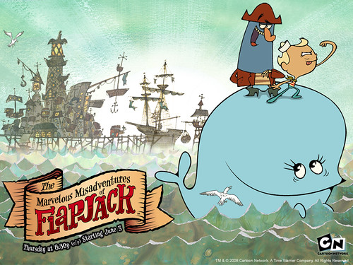
You guys have no idea how cartoons look nowadays
5239fa7b36ce8d83ce1335668bd80172.png

2928565884_09f15261af.jpg

Chowder1.jpg

fosters_home_for_imaginary_fiends_3204.png

adventure-time-with-finn-and-jake-on-its-way.jpg

ps2g.jpg

The-Amazing-World-of-Gumball-Episode-22a-The-Phone.jpg

The_Campers.jpg

3.jpg


phineas_and_ferb2.png

fairly-oddparents.jpg

SANJAY-AND-CRAIG.jpg

And this is considered the decent, half-watchable stuff on CN and Nick nowadays :(. The alternatives are ugly-looking 3D cartoons or live action bullshit. Just so you know where it's more likely that Double Fine drew inspiration from.
 

Dexter

Arcane
Joined
Mar 31, 2011
Messages
15,655
You guys have no idea how cartoons look nowadays
5239fa7b36ce8d83ce1335668bd80172.png

2928565884_09f15261af.jpg

Chowder1.jpg

fosters_home_for_imaginary_fiends_3204.png

adventure-time-with-finn-and-jake-on-its-way.jpg

ps2g.jpg

The-Amazing-World-of-Gumball-Episode-22a-The-Phone.jpg

The_Campers.jpg

3.jpg


phineas_and_ferb2.png

fairly-oddparents.jpg

SANJAY-AND-CRAIG.jpg

And this is considered the decent, half-watchable stuff on CN and Nick nowadays :(. The alternatives are ugly-looking 3D cartoons or live action bullshit. Just so you know where it's more likely that Double Fine drew inspiration from.
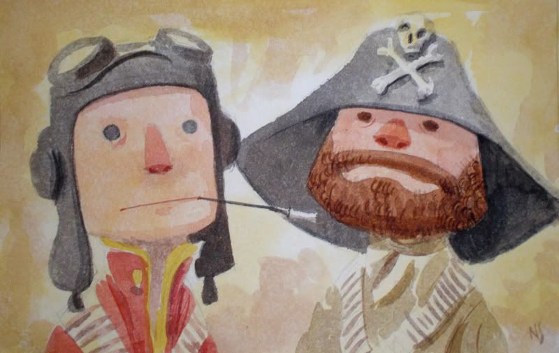
I thought we had been over this already, they "drew inspiration" from the drawing style of their main artist Nathan "Bagel" Stapley and said this from the very beginnings of the campaign: http://www.rpgcodex.net/forums/inde...ter-adventure-game.69252/page-19#post-2571993

Moon+Framed.jpg

commutinggiant.jpg

fairy.jpg

randall.jpg

Nathan-Stapley-Speed-Dating-Duos.jpg

1109-4.jpg

1109-5.jpg

1109-6.jpg

Broken-Age1-630x349.jpg

1109-11.jpg
1109-10.jpg
 
Last edited:

buzz

Arcane
Joined
Apr 1, 2012
Messages
4,234
And Nathan Stapley came with that artstyle out of his own ass apparently, it certainly has nothing to do with a recent trend with cartoonists.
edit: To be fair, Broken Age looks ten times better than that visual barf called Adventure Time.
 

Skunkpew

Augur
Joined
Jun 17, 2013
Messages
138
Location
Ontario
I can live with the style of graphics. However I don't particularly like the look of either main character, and I have little interest in playing as either of them.

Every other character seems to have something interesting going on, but the main characters just look plain.
 

J_C

One Bit Studio
Patron
Developer
Joined
Dec 28, 2010
Messages
16,947
Location
Pannonia
Project: Eternity Wasteland 2 Shadorwun: Hong Kong Divinity: Original Sin 2 Steve gets a Kidney but I don't even get a tag. Pathfinder: Wrath
I can live with the style of graphics. However I don't particularly like the look of either main character, and I have little interest in playing as either of them.

Every other character seems to have something interesting going on, but the main characters just look plain.
I think this is only true for the boy. The girl looks pretty good.
 

Dexter

Arcane
Joined
Mar 31, 2011
Messages
15,655
I can live with the style of graphics. However I don't particularly like the look of either main character, and I have little interest in playing as either of them.

Every other character seems to have something interesting going on, but the main characters just look plain.
With that I can agree wholeheartedly and I've said it a couple of times throughout the thread already. My main concern is not if the game comes out or what happens to its budget or whatever but that it'll end up being some mundane "coming of age" story and in that way is more conceived for children, rather than through its art style.
 

keppj0nes

Educated
Joined
May 4, 2008
Messages
77
New update today. Now I'm actually interested in watching the employees reassure themselves that episodic was the "right" way to go. There isn't a dissenting voice anywhere in those videos. If there was one employee who ever voices what they think is a bad idea, the videos would seem more authentic, but as all the episodes have been so far they all seem like cult members.
 

As an Amazon Associate, rpgcodex.net earns from qualifying purchases.
Back
Top Bottom